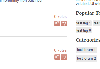
They are basically like the the ones you see in Digg.

I also thought about using arrows (like in StackExchange sites), but I think people are more used to thumbs these days (due to Youtube, Facebook and Digg).
I didn't make the thumbs-up button green because I couldn't find a green that looks good with the main red color. I also think that probably the thumbs icons are too small.
I would like to know if the user will notice the meaning of those buttons at first glance?
EDIT:
Is this better?


