0

I am developing an application for visualizing graphs that contain technical data.

The user can move the graphs left or right with 4 buttons:

  • fast step backward - symbol = "<<"
  • slow step backward - symbol = "<"
  • fast step forward - symbol = ">>"
  • slow step forward - symbol = ">"

For example, when the user presses "<<", the viewport is moved to the left of the graph by a large amount.

By how much should the viewport move?

Something like the following would seem reasonable to me:

  • << and >>: move the viewport by 80% of the visible width of the graph
  • < and >: move the viewport by 20% of the visible width of the graph

Are there some recommended percentages?

1
  • 1
    Personal opinion, I would simplify things by replacing >> with >| (that moves them all the way right). That way if they're exactly halfway in the middle of the graph they can inch right with the > button or it where they want to be is closer to the right they can >| and then inch back with <.
    – DasBeasto
    Commented Oct 20, 2016 at 13:59

3 Answers 3

2

The answer depends on what you want to achieve,your data and how much complexity you want to introduce to your app; consider the following:

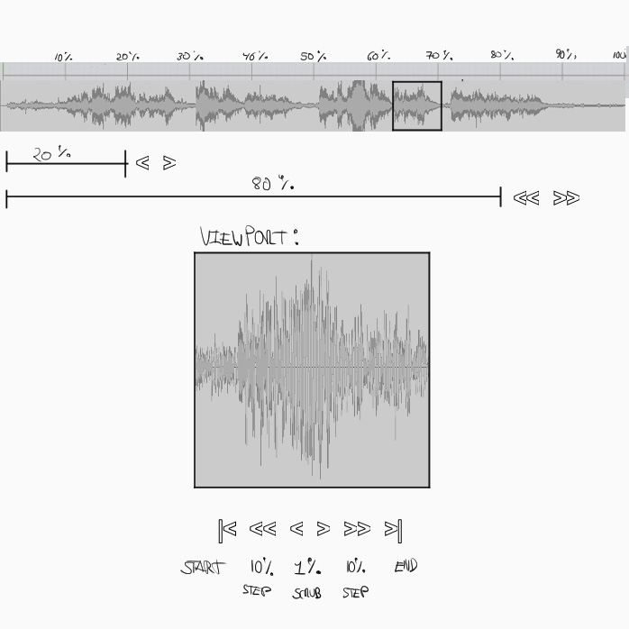
Let's start with your proposal, I am using a waveform as data and a square viewport:

enter image description here

  • At first I thought your 20% and 80% increments seemed reasonable, but then I realized that 80% will send you almost always to the end or beginning, and the 20% will jump all over the place, so you might not be able to zoom into a specific range.

  • A scroll has been proposed, problem is with a long waveform your user will be scrolling for a while.

  • So then I thought about an accelerating scroll control, (Like the seek on some mp3 players), problem is I always overshoot.

At this point the problem (at least to me ) became clear, send the user to a specific place in the graph in the least amount of steps.

So my proposed solution is the following:

  • |< Start End >|
  • << 10% Steps >>
  • < Fine Scrub >

This way the user can jump around and fine tune the final viewport frame.

Note: I am assuming you will leave a compressed view of the whole waveform visible, so the user knows where in the graph he or she is.

2
  • 1
    +1, but let me play devil's advocate for a minute: the 10% steps are logical, but in practice they might be not the solution. Therefore, first thing needed is to know what kind of measurements are we dealing with, and the ranges. Based on this, we can implement percentages (as in your answer) or absolute values. For example: if the unit of measurement is time, and the range is 0 to 5 minutes, 10% could mean 0.5 minutes or 30 seconds. In cases like this, you could use X seconds steps which is a way easier to visualize implementation since users can accurately point to it
    – Devin
    Commented Oct 20, 2016 at 21:47
  • @Devin: I agree, in some Daws and Video Editors you can switch the scale units and step range size (i.e. frames vs minutes), another nicety is the ability to let the user define a range via handles and drag that to find information, I left these ones out since while they cover more cases, they also introduce more complexity, but it's a valid argument.
    – Keno
    Commented Oct 21, 2016 at 0:01
0

You have an overflowing container and want a way to move the content inside. If you're asking for the standard, correct way to do this, the answer is almost certainly a scrollbar.

It solves your "movement amount" issue in two ways:

  • It gives the user agency over the amount of scrolling.
  • It expresses what portion of the graph is currently being viewed.
0

The graph displayed is wider than the screen width and a scrollbar would probably be more intuitive.

However, if the solution you need is with buttons, instead of thinking about percentages I would think about units. For example, a unit the user can move could be the full width of the screen. Similarly to how Netflix makes the user scroll horizontally:

Netflix scroll

When you click the right arrow, the screen moves all its width (3 images in this case) to the right. There is also a reference for how many of these screens there are (top right).

A secondary button for moving less distance would translate the graph one element only ("one element" depends on your graph and what it is displaying). In the case of the Netflix scroller it would move one image at a time.

Your Answer

By clicking “Post Your Answer”, you agree to our terms of service and acknowledge you have read our privacy policy.

Not the answer you're looking for? Browse other questions tagged or ask your own question.