3

I am designing a mobile app that involves a large list of exercise names. Each exercise can be categorized by either primary muscle type or many muscle types–biceps, triceps, shoulders, lower back, etc. Today this exercise list includes the 'muscle type' as tags for each exercise. However if an exercise has many muscle types it will either wrap multiple lines or truncate, neither of which are great solutions.

My current proposed solution and hypothesis is to eliminate the textual tagging and replace them with uniquely colored circles with abbreviated tags that could be expanded to the full view when clicked on the list item. However, I am hesitant as the arbitrary nature of color coding ~16 muscle types may be too many to remember and process even if there are abbreviations.

Would love any insight on this topic of tagging and categorization views, thanks.

1
  • Be aware that the number of distinct colors you can expect to be seen as different on a generic device is quite small. I would suggest 4 colors only. Given plainclothes' example below, you can get away with as few as one.
    – msw
    Commented Jan 4, 2016 at 23:15

5 Answers 5

2

The maximum colors that can be used for color coding is something between 7 - 9. For maximum efficiency and learnability only 3-5 colors must be used. You should also consider that approximately 4% of the population is color blind.

Another alternative is to use icons as tags. Each icon will represent a specific muscle. Use simple shapes that resemble as much as possible the represented muscle. Use only two colors, grey to represent the part of the body, and red to represent the muscle.

6

Maximize information density

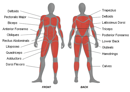
Tags are great for categorizing, but tough for quick scanning. If your goal is to enable users to quickly find an exercise to sculpt a specific muscle or region, try a visual approach.

Create a standardized map of the body that is small enough to fit your UI, but large enough that users can distinguish the muscle groups. For each exercise, highlight the targeted ares. This pattern could also serve as a filtering control.

Map of the body's muscle structure
Not exactly like this, but you get the idea.

2

Classifying in terms of Goals

Users with limited knowledge and who want to quick start and see benefits might start off with a Goal in mind. Their goal might be "loose fat around tummy" or "how to get 6 packs fast"

Hence, If this classification can be abstracted to models that beginner can grasp and relate to, it will be most useful.

So I would suggest getting to know your user base. Apart from this also do some research around how Motivation drives the continual usage of fitness apps. This will drive the User interface design appropriately.

0

What is the goal of showing the list of muscle types? Will your users potentially choose an exercise based on the type that it targets? In other words, are the tags to be used in concert with a filter? Perhaps a user comes in saying "I want to work on my biceps, which exercises should I choose?".

How about a 'map' of all the muscle groups, with a filled in area for the group(s) targeted by the particular exercise. I'm thinking of a small standing human silhouette, with the areas in a contrasting color indicating the type(s) that an exercise targets.

4
  • The muscle types are meant to help sort through the list. Today there is a filter option that users can use to narrow their list. To be honest, this simple question makes me want to remove showing the tags but then I look at stackexchange and notice the tags below the questions and realize it lets me browse more easily without going in and out of different tags. So to answer that, the goal of showing the tags is to help users browse and discover new exercises more easily. I also mean to keep muscle type more pronounced as analytics about muscle types can be viewed elsewhere.
    – occur
    Commented Jan 4, 2016 at 22:05
  • I'm hearing three different uses for the tags: filtering, showing filter results, and discovering related exercises. Perhaps each of those three uses could be split out and accomplished differently. What about a "Related exercises" link/button?
    – TScott
    Commented Jan 4, 2016 at 22:19
  • sorry I think my problem stems from this specific use case of tags. In this use case that I am talking about, the purpose of showing tags is to allow the user to browse the list of exercises while being informed of which muscle type is being worked.
    – occur
    Commented Jan 4, 2016 at 22:21
  • @plainclothes has illustrated the idea perfectly, ux.stackexchange.com/a/88716/74045
    – TScott
    Commented Jan 5, 2016 at 22:54
0

Please make sure of such deep muscles categorization will work good for your users. Are they really so educated and such details has sense for them? Most fitness apps use more general muscles categorization, like ABS, Core, Upper body, etc.

Having not so deep knowledges in a field, I suggest each of the exercises has primary target (a muscle or a couple of these), and also can affect some other muscles. That is the reason you have so many exercises.

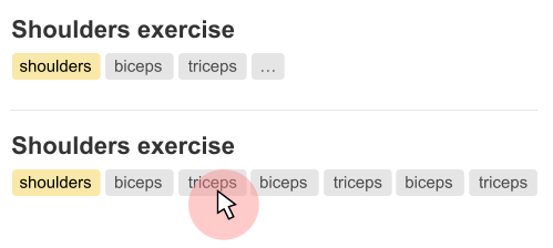
My suggestion is to display all the primary targets, as well as the limited numbers of the affected muscles. Then disclose all the tags on mouse over interaction.

enter image description here

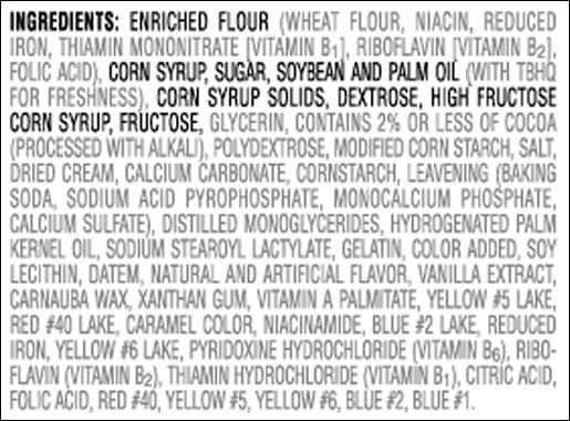
Such approach works good for the ingredients list on goods package. Indeed, they should point the main ingredients in the beginning, so in most case you need no read all the list (you see palm oil in the beginning of the list and put the product back on the shelve):
enter image description here

3
  • Whatever that is, it sounds delicious! ‧∘˳°∗˚ (( ×﹏× )) Commented Jan 4, 2016 at 22:34
  • 1
    Mobile app... Mouse over? How would that work?
    – Rolf ツ
    Commented Jan 4, 2016 at 22:54
  • @Rolfツ yep. I missed that Commented Jan 4, 2016 at 23:19

Your Answer

By clicking “Post Your Answer”, you agree to our terms of service and acknowledge you have read our privacy policy.

Not the answer you're looking for? Browse other questions tagged or ask your own question.