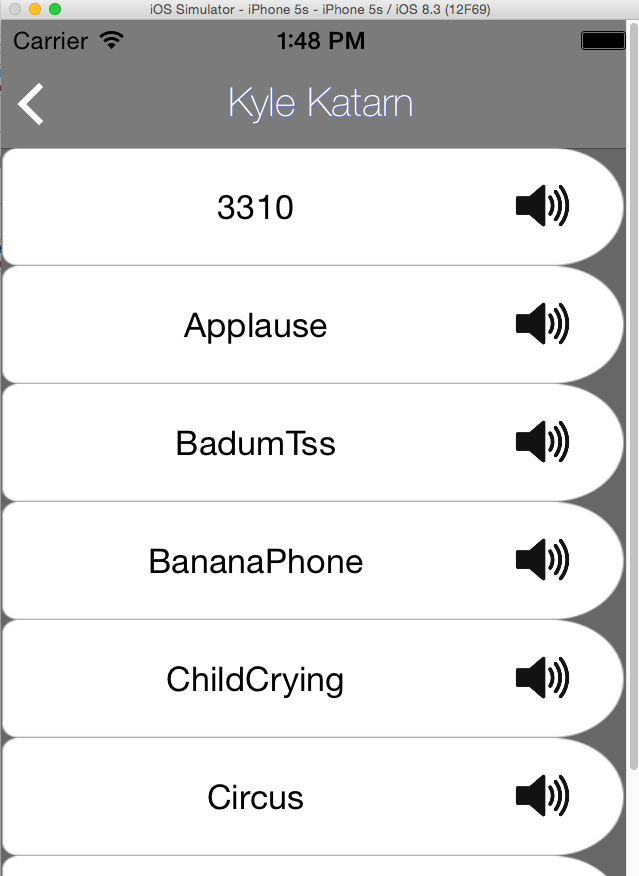
I'm presenting a list of different sounds in a list, on mobile (specifically iPhone-only)
Each cell is rectangular and has a simple one-liner label (the name of the sound), and a button on the right side of the label.
The whole cell is blank (except for the black label) and the button is a "speaker" icon.
Pressing the speaker allows you to listen to the sound and you can see it's progress while playing.
Tapping anywhere else sends the sound. (It's sent to a user chosen in a previous screen).
This isn't the final design nor the final flow, but I thought it was a decent base for the beta. I have about 20 people testing.
I've had several feedbacks saying the sound sending/listening isn't super intuitive/user friendly/nice. No one can explain it clearly or offer a solution, but no one likes it that's for sure.
I'm really bad at this game of guessing, I'm more of a coder than an artist. What could make this list of sound a better experience for my users?
I was thinking that the final design for the button would help (and look more like a button), but it doesn't make it clearer that tapping the cell will actually send the sound. I think that is the part that my users don't like.
Here is a screenshot. Please note that I'm still only working with the bone structure, nothing is visually final, except the skeleton. (That means it can get prettier but everything should be functionally close-to-final at this stage).

