5

I'm trying to redesign the progress bar of a long application process. It is currently designed with a "top level" progress bar with 6 steps. As the user goes through each step, a separate "sub-level" progress bar appears for multiple steps within each part in the "top level" progress bar.

The way it's currently designed today, the "sub-level" progress bar isn't always there. Each step just appears as you get to it, so it doesn't do a good job setting expectation the user for how much work they actually have to do.

I think it's also relevant to mention that with this application form, the user cannot jump around. It's important that they fill out the form in order because they need to go through multiple "checks" during the process.

Anyway, I want to redesign this progress bar. I'm wondering if providing this "dual level" progress indicator for a long application/form is a good idea. For example I'm thinking something like Turbo Tax might be a good example, but is this a good approach to take?
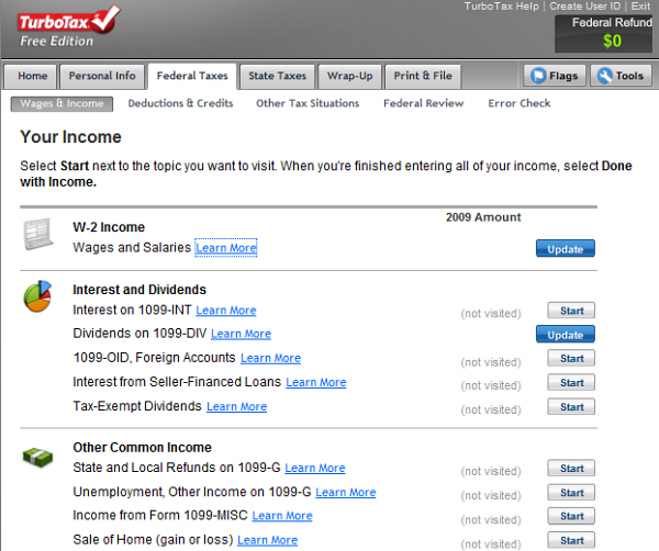
enter image description here

2
  • I've restructured your question around whether or not this approach is a good idea, rather than just requesting examples of this pattern. As a Q&A site we need questions that can be answered and marked as 'correct' (or at least be answerable in some form or other). Requests for examples don't fit such a Q&A structure as there is no 'correct' answer. Feel free to re-edit your post if you're not happy with the approach I took (provided you still stick to the Q&A style question not requests for examples of X)
    – JonW
    Commented Mar 9, 2015 at 17:17
  • 1
    Got it, thanks JonW. I think the edits you made are reflective of what I am asking. Commented Mar 9, 2015 at 17:18

1 Answer 1

6

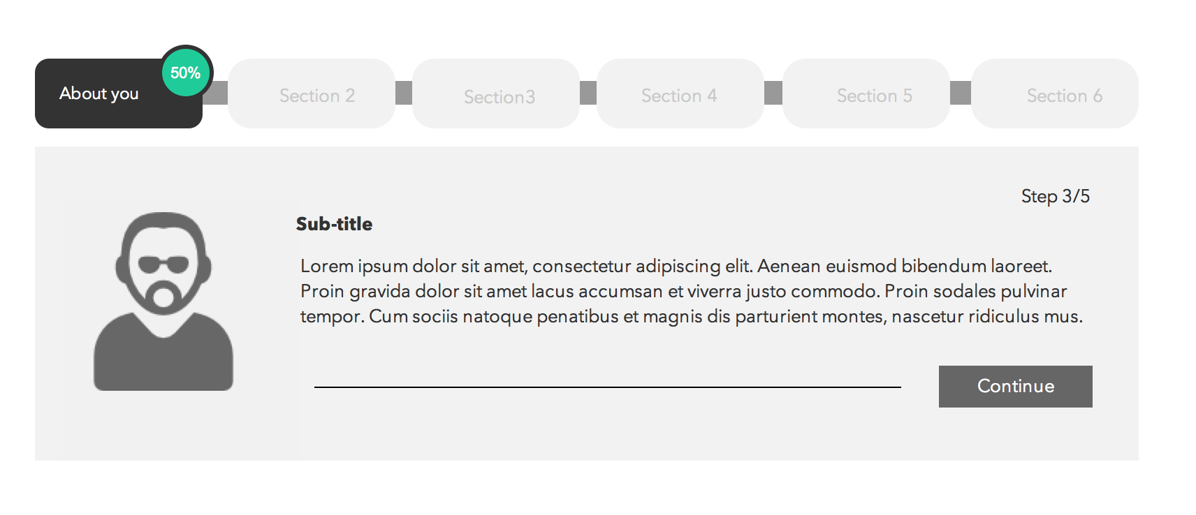
I think having sub-steps within a wizard with a progress tracker is not desirable but achievable as long as the pattern used to depict progress is different for main steps and sub-steps. That being said, you could reduce form complexity and increase ease of use by:

  • Capturing information about users in a profile section before they are asked to go through the process.
  • Provide users with option to save progress or automatically save progress for them (inform them when this is done).
  • Give users early notice within the form workflow about documents they need to prepare; for example, if references from official documentation is needed in step 3 of section 2 then at the beginning of section 2 tell them about it.

Below is an idea of a progress indicator:

enter image description here

4
  • 1
    +1. I like this approach because it properly collocates sub-flow progress with overall progress in a single nav tab. The TurboTax approach spreads out progress over different X- and Y- axes and different locations, which barely helps the user with orientation.
    – tohster
    Commented Mar 9, 2015 at 19:07
  • 1
    tohster, that's a really good point.... When I posted this I was really only looking at the top bar as an example to what I was asking about. But I didn't really look at the main content and see that they also had the Y axis dimension of info! Commented Mar 9, 2015 at 20:07
  • 1
    @tohster totally agree! A real challenge with complex forms designed to deal with official business (taxes, insurance) like the turbo tax is dealing with jargon, a jargon buster could prove useful here. Lauren Dankiewicz hope you don't have much jargon to deal with :)
    – Okavango
    Commented Mar 10, 2015 at 6:54
  • What's the best way to do this when you're on mobile and don't have the screen real estate? Commented Jan 1, 2018 at 21:48

Your Answer

By clicking “Post Your Answer”, you agree to our terms of service and acknowledge you have read our privacy policy.

Not the answer you're looking for? Browse other questions tagged or ask your own question.