6

I'm trying to move away from the "build a list" pattern we currently employ to manage what columns are shown. The disconnect and lack of "directness" between the table itself and this dialog is confusing many people.

We even get support calls from frantic customers who are "missing data" when, in reality, the columns are just hidden.

Unfortunately we have 60 pre-defined columns and allow users to create any number of custom fields for their data.

3 Answers 3

5

I've always been fairly happy with the approach taken in Outlook, although I acknowledge I may not be a typical user. And I got over the pain of learning it years ago.

I'll also admit that it's far from perfect; getting to the option requires a bit of digging, as it's not immediately visible in the UI; and it used to be almost WYSIWYG, but more recent rebrands out Outlook have broken that.

Regardless... right-click on any column to display the context menu:
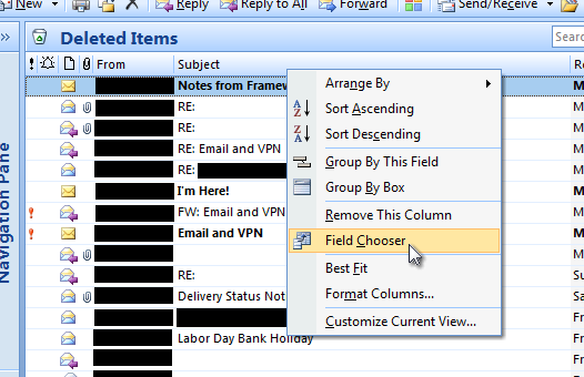
Opening the field chooser

In the Field Chooser, select which fields you'd like to choose from (the combo box therein) and then drag the column header to its desired position in the table:
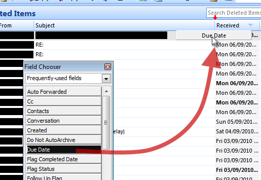
Dragging the new column into the table

Really, it's the dragging-the-column-header-into-the-table bit that I like. That and the way it avoids information overload by categorising its fields. And the red arrows that show you're in a valid area to drop the column header.

Not so much the way you activate the Field Chooser, or the fact that it's a popup - I might prefer an expanding panel above the column headers. It would also be better if the visual representation of the fields (in the Field Chooser) matched their appearance when in the table (it used to in earlier versions of Outlook); add a single line of instructional text to explain the need to drag into the column headers and it might be usable.

Still, once learnt, it's really simple to use.

4
  • Actually, looking back at your question, I really don't think this example helps you at all. If you agree, I'll happily delete my 'answer'. Otherwise, I'll just leave it as an example of what's out there.
    – Mal Ross
    Commented Sep 6, 2010 at 16:58
  • I'm voting to undelete this post, for two reasons: 1) ideas trigger other ideas. For example, someone might see a way to combine EXTJS's current design with part of the Outlook design; and 2) you're not just answering Kyle's question. You're also writing for people who have similar questions, and an answer that doesn't work for Kyle could work for them. Please consider undeleting your answer.
    – JeromeR
    Commented Sep 6, 2010 at 17:47
  • Ah. Didn't realise I was only voting to delete. Oh well. :)
    – Mal Ross
    Commented Sep 7, 2010 at 21:37
  • This drag & drop column approach has worked well for me. The 3rd party grid I use (DevExpress XtraGrid) provides a built in UI to do this - other 3rd party controls probably have something similar. Commented Oct 31, 2011 at 21:53
4

You could add a display that indicates "...and 37 more columns that are not shown right now" in some persistently visible way. Ellipsis, perhaps. This way people have a 'scent' they can follow to get their data back. It's not gone--it's hidden in the drawer/closet/attic/whatever metaphor you choose.

1
  • I approve of this message. Commented Sep 8, 2010 at 19:07
0

Filters can help a lot for data intensive tables - avoids having to show everything in one go. Remember, your users won't read all information at once, they will digest hierarchic chunks of data.

Stacked tables can work: instead of a 30 column table, have 3 tables of max 10 columns and navigate from one to another based on related and contextual information.

So for example, if you click on a row from Table no.1 and that row data is related to table no.2, hide Table no.1 and show Table no.2 and create a breadcrumb system to easily go back.

Your Answer

By clicking “Post Your Answer”, you agree to our terms of service and acknowledge you have read our privacy policy.

Not the answer you're looking for? Browse other questions tagged or ask your own question.