Jakob Nielsen has a good article about how best to visualise links on the web based on his user research, that answers your question directly.
He summarises it thusly:
Textual links should be colored and underlined to achieve the best
perceived affordance of clickability, though there are a few
exceptions to these guidelines
Your instincts are good in that both the existing behaviours you've described as in use by you on your website are considered poor form and are listed in the article.
In the case of text not having any underline, his main guideline (for which he provides two exceptions) is as follows:
There are two main cases in which you can safely eliminate underlines:
navigation menus and other lists of links. However, this is true only
when the page design clearly indicates the area's function. (Remember:
your design might not be as obvious to outside users as it is to your
own team members.) Users typically understand a left-hand navigation
rail with a list of links on a colored background, assuming it
resembles the navigation areas on most other sites
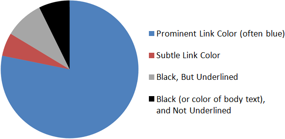
In another article on his site, he includes a chart that demonstrates the prevalence of both of your issues in the intranet sites he's reviewed (it's not obvious that you're talking about intranets, but it may be a reasonable indicator of the wider web):

Chart by Jakob Nielsen (Source).


