2

I need to design a responsive website with many widgets and forms. I want to provide the best UX to mobile users also when they interact with forms, which is often a nightmare on mobile.

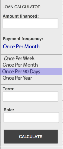
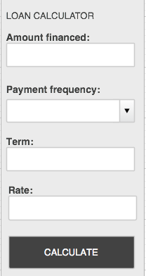
You can find the form I am dealing with attached. With input text I have no problems, but I might want to substitute the select box with something more mobile friendly. Any ideas?

enter image description here

6
  • A responsive example from Norway, with a similar goal. (google translated) translate.google.com/…
    – Velkommen
    Commented Dec 4, 2013 at 13:53
  • they use select box also on mobile
    – Giults
    Commented Dec 4, 2013 at 14:15
  • 1
    it depends on the number of options you provide. if you have few options you could consider using radio buttons. if you have more than ~3 i'd use the dropdown.
    – Lovis
    Commented Dec 4, 2013 at 14:38
  • I want to add: typing on mobile sucks. so use text fields only when necessary and try to use suggestions and default values whenever possible
    – Lovis
    Commented Dec 4, 2013 at 14:40
  • 4
    Why not just use the default controls and let the mobile OS handle how they're displayed?
    – JonW
    Commented Dec 4, 2013 at 15:11

5 Answers 5

4

I highly suggest leaving the OS with it's built in default drop down menu UI.

do not break a standard if there is no reason to

This is important. Why recreate something that isn't needed? If you change the UI that has remained consistent throughout all sites but then suddenly when they land on your application it's something entirely different, confusion will occur.

Stay close to something that has universally remained the same.

1

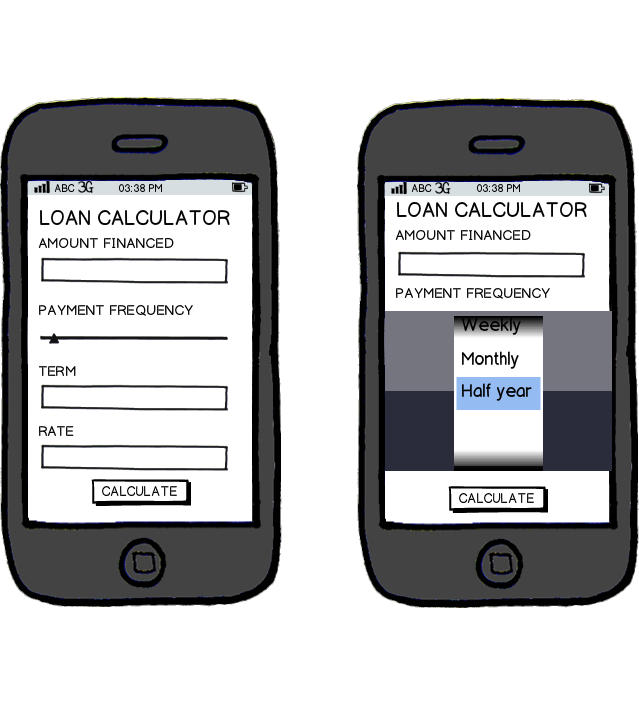
Giults I would propose a solution like this (inspired by the KBC home project app for iPad - I would show you a screenshot, but I don't have my iPad with me :) ).

1. Slider bar

It would be possible to user a slider bar instead, perhaps with fixed points per fixed frequency point. In some app's I know the slider is used to chose the term, but it might be useable for this case aswell.

2. Picker

An alternative is using a "Picker" which is also (in my belief) quite user friendly. This would most likely introduce a scroll bar within your app aswell.

mockup

download bmml source – Wireframes created with Balsamiq Mockups

0

Thomas beat me to it. I would recommend going with the Picker Wheel. It's part of webkit.

select wheel

1
  • 3
    It's not obvious if you're talking about simulating the native interface spinner interface, or simply letting the device handle display itself, but if it's the former it should be known that this interface would feel extremely out of place on some platforms (e.g. Windows Phone).
    – Kit Grose
    Commented Dec 5, 2013 at 1:46
0

Rendering a dropdown for everything is just lazy. I am not saying that dropdowns are bad, but it's a very misused UI element and it certainly doesn't always provide the best UX.

So let me start with "it depends", and it really does. How does your data look like, how many options are there to pick from?

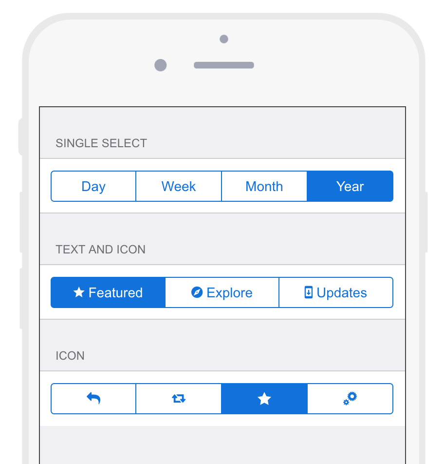
Segmented control

If it's just a couple (up to 4), use a segmented control. It works just like a radio button list but takes up less space.
Segmented Control

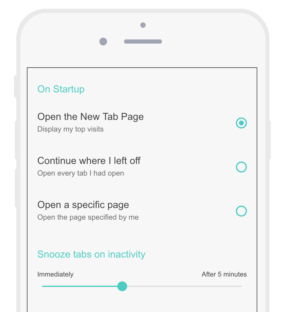
Slider

If there are incremental values, use a slider. You can use labels for values to help explain what the user is dragging.
Slider & Radio button list

Scroller control

If there are several items, use a scroller controls. If the list is too long you can group the options.

Scroller

I also noticed a comment about some things looking strange on certain devices. It is important to stay consistent with the platform, however you should approach it in a platform agnostic way. Then you can make it look good everywhere, maybe handle it with a slightly different look but the core pattern can usually stay the same.

You can try interactive examples and read more about the Single value selection pattern at UIPatterns.io
0

Agree with one of the answers regarding the dropdown list control being overused. For a list with 5 or less options, I'd go with listing all the options alongside radio buttons for selection.

For the cases with more options, I'd use a modal screen dedicated to display all the options, and it will appear when the user clicks on the selection UI. And there will be a cancel button just in case the user decides not to choose anything. Clicking either an option or the cancel button will dismiss the modal screen. Of course this mechanism should only be activated if the screen width is of a certain size.

That is actually how Android treats the HTML selection UI.

The main advantage of this treatment is that it's not funky like other alternatives that might make the user nervous/confused.

Your Answer

By clicking “Post Your Answer”, you agree to our terms of service and acknowledge you have read our privacy policy.

Not the answer you're looking for? Browse other questions tagged or ask your own question.