1

I would like to show a path of the data source of an object (diagram with csv-data) and to give the user the option to copy the path to clipboard. I made different approaches.

One idea was if I could use a tooltip which shows the path. Additionally I would add a Copy/Copy to Clipboard-button. That approach doesn't need more different elements than an outline (shown by rollover and activation) and interactions. It needs a simple rollover plus one click for copy to clipboard, but I am not sure if this is against various interface rules.
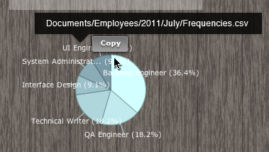
Mock with a additional copy button

Here a button inside the tooltip, but I am not sure, what happens if the user leaves the sensitive canvas (diagram) to use to the button. Tooltip is above the Diagram. I assume, it needs technical feedback and special rules for the tooltip behavior. E.g. when will the tooltip disappear if the user roll out with mouse.
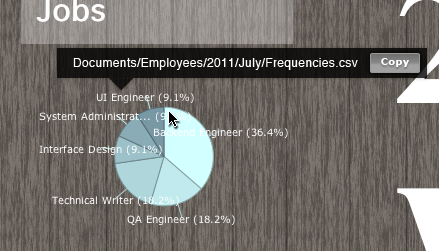
enter image description here

My question is, can I mixup a tooltip with an interaction element like a button? I have never seen such case.

7
  • What is your actual question? There is no question mark in the whole text.
    – Michael
    Commented Jun 19, 2012 at 11:04
  • Are you only asking if this approach is suitable, or are you looking for an alternative option to those you have proposed?
    – JonW
    Commented Jun 19, 2012 at 11:17
  • @JonW: I wanted to know if that approach suitable or not. I couldn´t find such examples in my first researches and could not find that question here at ux.stackexchange. So I wanted to post that question here. Sorry for confusing. Commented Jun 19, 2012 at 12:44
  • 1
    What is the reason why you are showing the source data in a tooltip. Just as every chart should have a title and a legend, you could just show the source data permanently on the screen. If that text would be selectable, users that copy path names ontp their clipboard will be smart enough to select that text, right click it, choose copy. Commented Jul 19, 2012 at 13:00
  • 1
    It depends how often the user is going to want to use that interaction as well. If you have to wait, even if it's like 1/2 of a second for the tooltip to appear, that becomes frustrating after a while, waiting for it so you can click.
    – Ian
    Commented Sep 17, 2012 at 15:21

3 Answers 3

3

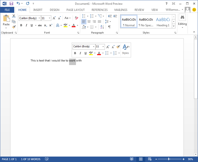
While not technically a tooltip, Microsoft Office has included context buttons on selection and hover for a while. Below is a screen shot of MS Word 2013 with the "pop-up" actions that can be taken on a selection of text. This appears when hovering over the selected text.

enter image description here

If you were to implement the action in a way that the tooltip does not disappear on focus-out, you can keep your "tooltip" active while the user navigates and selects within the tooltip.

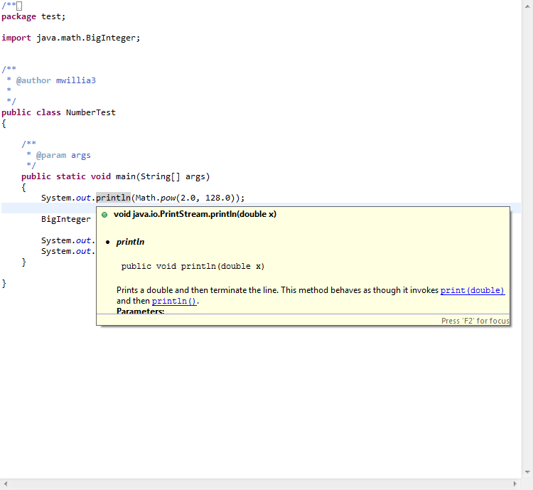
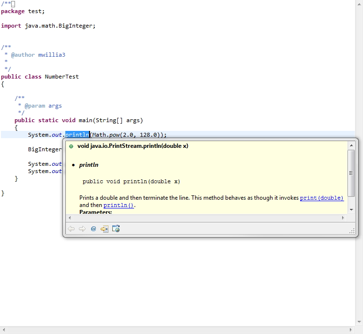
Similarly, Eclipse (the IDE) allows users to focus on a tooltip-like area which converts it to a floating window. This allows the user to interact with the content of the tooltip.

enter image description here

enter image description here

This kind of thing has been done before and actually works well for UX.

2
  • That's the example I was thinking of (Office) +1 for you :)
    – Ian
    Commented Sep 17, 2012 at 15:19
  • Although I "+1'ed" this answer, I generally don't like buttons that appear only on hover because they often disappears when I move my cursor towards the button and this is very annoying. As long as the "tooltip" doesn't disappear when the mouse moves from the mouse hover location to the button, then this UX should work. This would definitely need to be kept in mind with the Copy button because, based on the picture, the button is pretty far from the hover area.
    – mgpugne
    Commented Aug 1, 2013 at 16:58
2

I don't know who your target group is and what your app does exactly so that may make some of the stuff I say below more or less relevant.

My experience is that tooltips can suffer from a lack of discoverability especially when there's no clear visual indication in the design that you are offering the user more information. I think both your suggestions both suffer from a lack of discoverability. Would it be possible to instead have a button triggering the action available in a toolbar or next to the graph name for instance. Depending on how important the feature is and how savvy your users are I would be afraid that people would never figure out how to find the feature.

Additionally all these hover-actions are really only good when your users are using a mouse to interact with your product Touch is getting a lot of traction in all sectors and unless you are maintaining a separate tablet-optimized version of your product you are essentially cutting your touch users off from using the feature (or at least they won't be likely to stumble upon it because they won't have a mouse to move around)

0

Put strictly a "ToolTip" should conventionally contain information about the item you're hovering.

However popup menus and contextual menus that are activated upon hover can definitely contain user controls without breaking convention or expectations. For a working example just hover on your SE user name.

It triggers the same way as a tooltip but should technically be referred to as a contextual menu.

I would go with the latter of your examples since this maps more clearly to the path rather than the chart itself, not misleading the user to think that it's an image of the chart that is being copied. And regarding your concern about keeping the menu open after the user leaves the item with the cursor, this can be quite easily achieved using JavaScript (assuming this is a web application).

3
  • Thanks a lot for you detailed answer. Very helpful. From my understanding the second approach makes more sense as the second one, I totally agree. Now I have some arguments. I am sure my PM will not love that solution ;). Commented Jun 19, 2012 at 12:08
  • @GeorgVinzentHofmann you're very welcome. You should explain to your product manager that contextual menus are part of an user interaction pattern that is becoming more and more popular. It helps keeping a GUI clean whilst still containing more interaction capabilities and it also provides great mapping between the item and the controls with which a user can interact with that item. Commented Jun 19, 2012 at 12:23
  • Clean GUI sounds very obvious in context with containing more interaction capabilities. With that solution the user is freed of to different clicks and ways. Cool and sorry regarding my previous comment (too much misspellings). Commented Jun 19, 2012 at 12:35

Your Answer

By clicking “Post Your Answer”, you agree to our terms of service and acknowledge you have read our privacy policy.

Not the answer you're looking for? Browse other questions tagged or ask your own question.