17

I'm building a photo site that must allow users to manage thousands of photos via paged thumbnails on a big desktop. I also want to offer a touch interface that is both usable and delightful on the iPad.

Is there a best practice for translating right-click context menu options on the desktop to a touchscreen device?

On the desktop I have the following events on the thumbnail:

  • click opens a 640px image in a lightbox
  • hover shows caption using the TITLE attribute, plus avg score & the user's rating on overlay
  • contextmenu shows available navigation/actions for the thumbnail
0

8 Answers 8

6

In most photo apps I know there the tap+hold or longtap event that triggers some sort of contextual menu with further options like export, mail to someone, etc. Look at mobile safari for instance. Tap and hold on a link and an action sheet with some actions appears. This is used widely in apples apps. You can see that in safari on the "+" icon (favorite), in mail when you tap the arrow button (reply, forward, etc.).

2
  • 1
    I would like to note here that you don't want to overload the context menu on iOS. They have a very short list of tap+hold actions.
    – GotDibbs
    Commented May 14, 2012 at 14:16
  • 2
    I must note that I have been using the iPhone for about 5 years now, and I consider myself an advanced iOS user. But this trick in Safari I learned just now! Either I'm not that smart, or this trick has close to zero affordance.
    – Dvir Adler
    Commented Apr 27, 2013 at 10:00
4

Refer to iPhone email app: it allows users to manage a lot of mails. Its UI pattern may help.

First you tap "Edit" button, then you tap each photo you like to manage, lastly you tap one of the options located at the bottom of a screen.

Googled images:

enter image description here enter image description here

This UI solves:

  1. Edit is not a hidden feature (like tap and hold in Safari)
  2. You wont do changes by accident: buttons are located in a way that user can't do unexpected things accidently doubletapped at the same place
  3. Clear open / select distinction

2016 UPD

Apple 3D touch is here https://www.youtube.com/watch?v=cSTEB8cdQwo

1
  • Same idea used in the photos app
    – user28446
    Commented Apr 29, 2013 at 23:23
3

I would recommend two actions:

  • Keep the thumbnails screen clean, minimizing the chrome and buttons. A tap on a thumbnail opens a new screen that contains the photo and an action bar with all the desktop context menu options. You can hide this action bar in a few seconds (or with a user tap) to keep the photo alone. This way you have a safe and visible system to let the users access the contextual options.

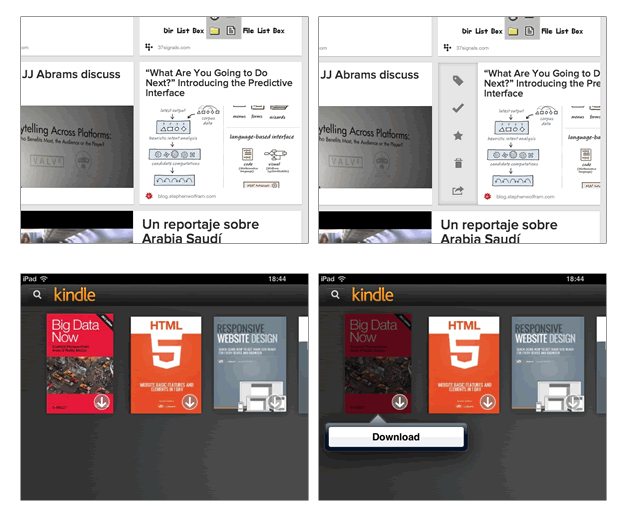
  • For advanced users add a "hidden" but faster option, like a hidden icon menu with a flick in the thumbnail (like Pocket) or a contextual menu with long press (like Kindle).

enter image description here

2
  • I'm not sure I'm following: instead of opening the picture right away, a tap would reveal a menu?
    – Dvir Adler
    Commented Apr 27, 2013 at 9:57
  • No, a tap would reveal a new screen with the photo and an action bar at the top with the options, like iPad "Photos" where the contextual actions are available at the top right in the photo screen. I've updated the answer.
    – PaRaP
    Commented Apr 27, 2013 at 22:28
1

The Facebook app (for Android and I believe iOS as well) has this behavior down pretty well. Tapping on a thumbnail brings up the lightbox, tapping the image again toggles the data overlay (i.e. likes, comments on FB but title, score, ratings in your app.) Tap & hold brings up a context menu. This has been fairly intuitive to learn and seems consistent across other photo/camera apps I've used.

2
  • Where did you get the idea to tap&hold? is that a common and conventional? Clearly there is nothing intuitive about it, as there is no affordance to that possibility.
    – Dvir Adler
    Commented Apr 29, 2013 at 11:41
  • I've found it to be pretty consistent throughout Android. You can press and hold on most homescreens to rearrange items or add widgets to empty spaces. In most Twitter applications, tapping and holding brings up functions for that tweet (e.g. RT, quote, etc...). Commented May 15, 2013 at 15:34
1

What “contextmenu” ? Do you know that the contextual menu is governed by the Web browser, not by the Web page ? I hope that, on your site, your “contextual menu” is not the only way to reach its actions. Otherwise, these actions are not accessible and your site is broken.

At first sight, I thought you were building an iPad app. That may be the best to do.

On the iPad, the contextual menu exists, the user gets it by keeping the finger pressed. It is handy. I use it often.

1
+50

This is how I believe your actions would be best translated to an iPad below. I've put extra emphasis on the context menu as that was your original question, but I believe your other actions deserved mention as well.

'contextmenu' shows available nav/actions for the thumbnail

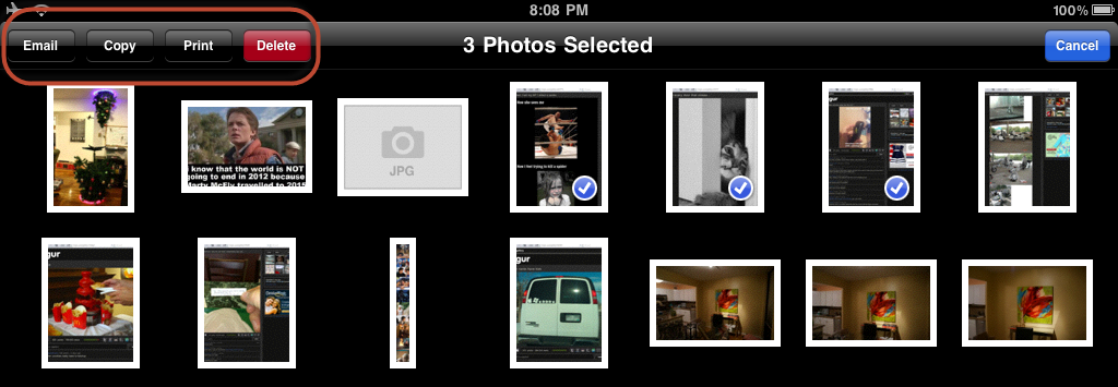
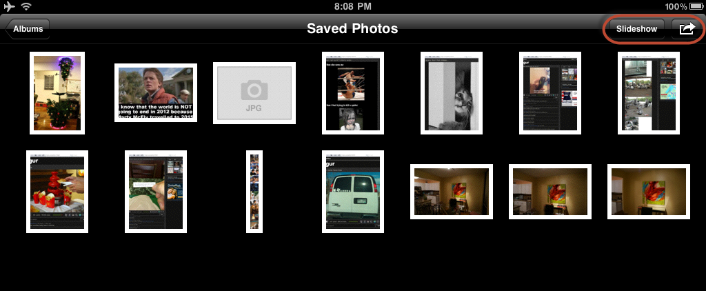
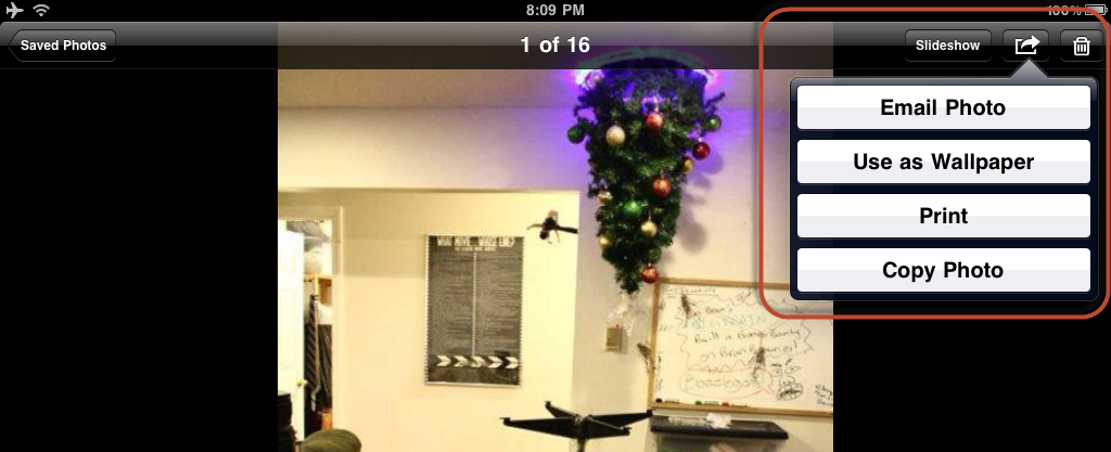
For an iPad specifically I think you should stick to Copy & Save Image (like the iPad's Photo App) only in the context menu (figure 1) -- although you could have some other actions which can only be performed on one photo at a time, you don't want to clutter the context menu. You may notice in the iPad Photo App most of the actions are right (figure 2, figure 3) until you either start selecting items in the grid view, or until you're in the full single image view. I would try to conform to this convention.

So as for navigation, I would move that out to the navigation bar (or just allow for swiping between images), and for the actions I would move most of those to the toolbar (figure 4). Toolbar actions shouldn't change your current view. As a tip I would say the 'export' type actions like sharing to a social network will still belong in navigation as they technically are exporting you/your content from the app which conceptually is like navigation, not to mention the fact that your view will probably have to change.

The actions that can be for multiple photos at a time can stay in the grid and only be active when a user selects a photo, and the actions for a single photo can be moved to the single photo view.

'click' opens a 640px image in a lightbox

For the click, I think your general idea still applies, and you should just show a full size image with contextual actions in the toolbar at the bottom of the application, and navigational options at the top in the navigation bar.

'hover' shows caption using the TITLE attribute, plus avg score & the user's rating on overlay

These options I would think in your application would be merged with the full size image. Depending on how important that information is to your users, you can shrink up the photo a bit on that screen and always display it but allow the users to still show the photo in full screen mode, or have them tap to display the content associated with the photo as an overlay.

Figure 1 Figure 1
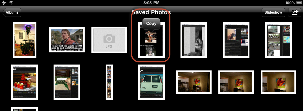
Figure 2 Figure 2

Figure 3 Figure 3

Figure 4 Figure 4

If you would like to read more specifics how to use the navigation bar or other components, I would highly recommend reading Apple's Human Interface Guidelines for iOS.

Note: since you're question is specifically tagged iPad, I've focused on answering within the context of that device and Apple's Human Interface Guidelines.

4
  • can you elaborate on how the context menu in the iPad or Photos app work? can you add a screenshot or link? thanks
    – Dvir Adler
    Commented Apr 29, 2013 at 11:45
  • @DvirAdler Do the new additions help?
    – GotDibbs
    Commented May 1, 2013 at 0:44
  • 1
    They do. How does the "Copy" menu comes up? after a long tap? how do you check multiple pictures?
    – Dvir Adler
    Commented May 1, 2013 at 5:24
  • 1
    Copy comes up after a tap and hold, multi-select is enabled after you click the 'external actions' button in the upper right (shown in Figure 3, open in Figure 4).
    – GotDibbs
    Commented May 1, 2013 at 13:18
1

You can look at references of touch gestures/actions from searching on the forum and see if you want to trigger a menu based on a specific gesture, and Luke Wroblewski's Touch Gesture Reference is pretty comprehensive. I think on apps there might be a standard, but for websites the context menu should be redesigned so that it is not required, especially if you are looking to cater for mobile in the future.

From a usability perspective, I don't see any reason why the context menu cannot be converted into an action button, since the context will be fairly clear when you are clicking or hovering over an image or other parts of the system interface. In fact, somethings the right click context menu suffers from the fact that users don't necessarily know where the focus is when they right click (especially if they have been scrolling or clicking on other parts of the UI). This means that you can make menu options more relevant to the context by triggering it from action icons associated with the image or from a central menu.

1

There are a lot of excellent answers here (makes me wonder if michael intends to vote for an answer at all). I would emphasize one critical point:
This question all but impossible to answer in general terms.

The transition from mouse to touch is a delicate and multifaceted challenge. No one can give you general guidelines that will answer your unique challenges.

The range of options include

  • Tools that expose on gesture
  • Persistent icons/labels
  • Tap and hold
  • A mix of the above options

The factors to consider are

  • Complexity of the page
  • Relative importance of each task in the context of the device
  • Expected frequency of use
  • Target audience's expectations and proficiency

The only way you'll get a real answer for your context: Testing. Iterate until the people you're after enjoy using your service. That's what UX is all about!

Your Answer

By clicking “Post Your Answer”, you agree to our terms of service and acknowledge you have read our privacy policy.

Not the answer you're looking for? Browse other questions tagged or ask your own question.