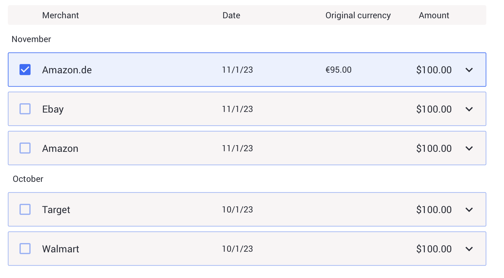
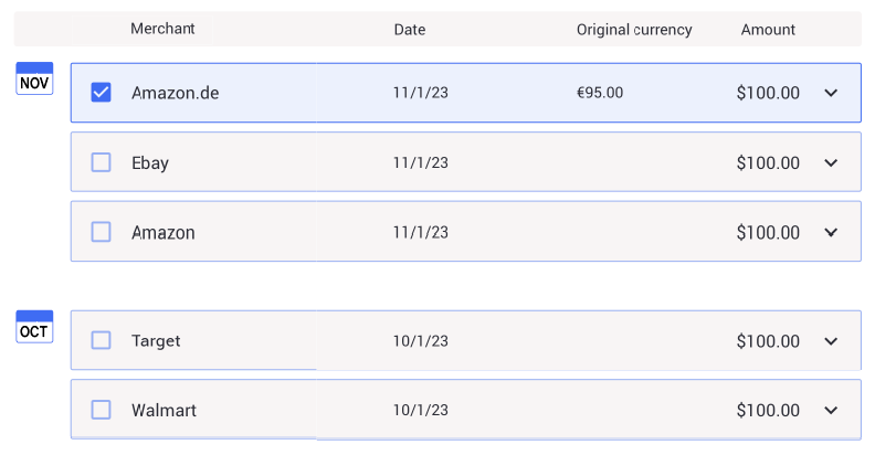
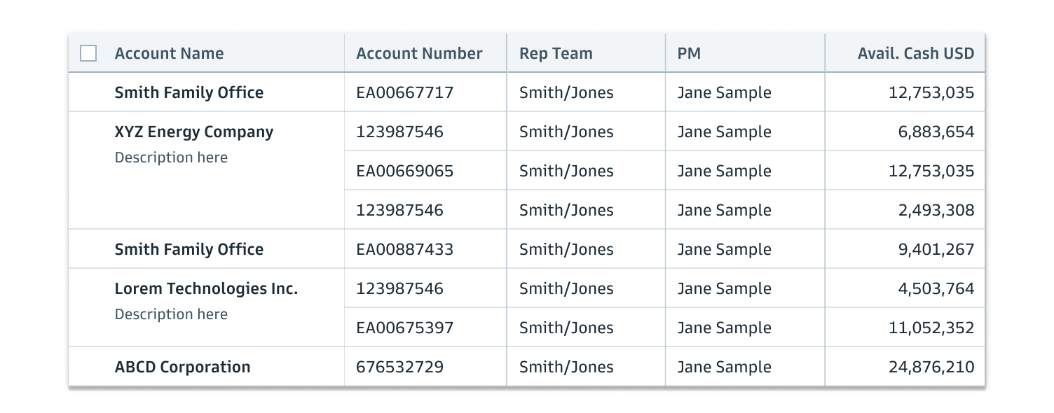
I am currently working on a digital form, and at one stage the user has to select one or more elements from a list of transactions. Each list element has multiple columns with different information.
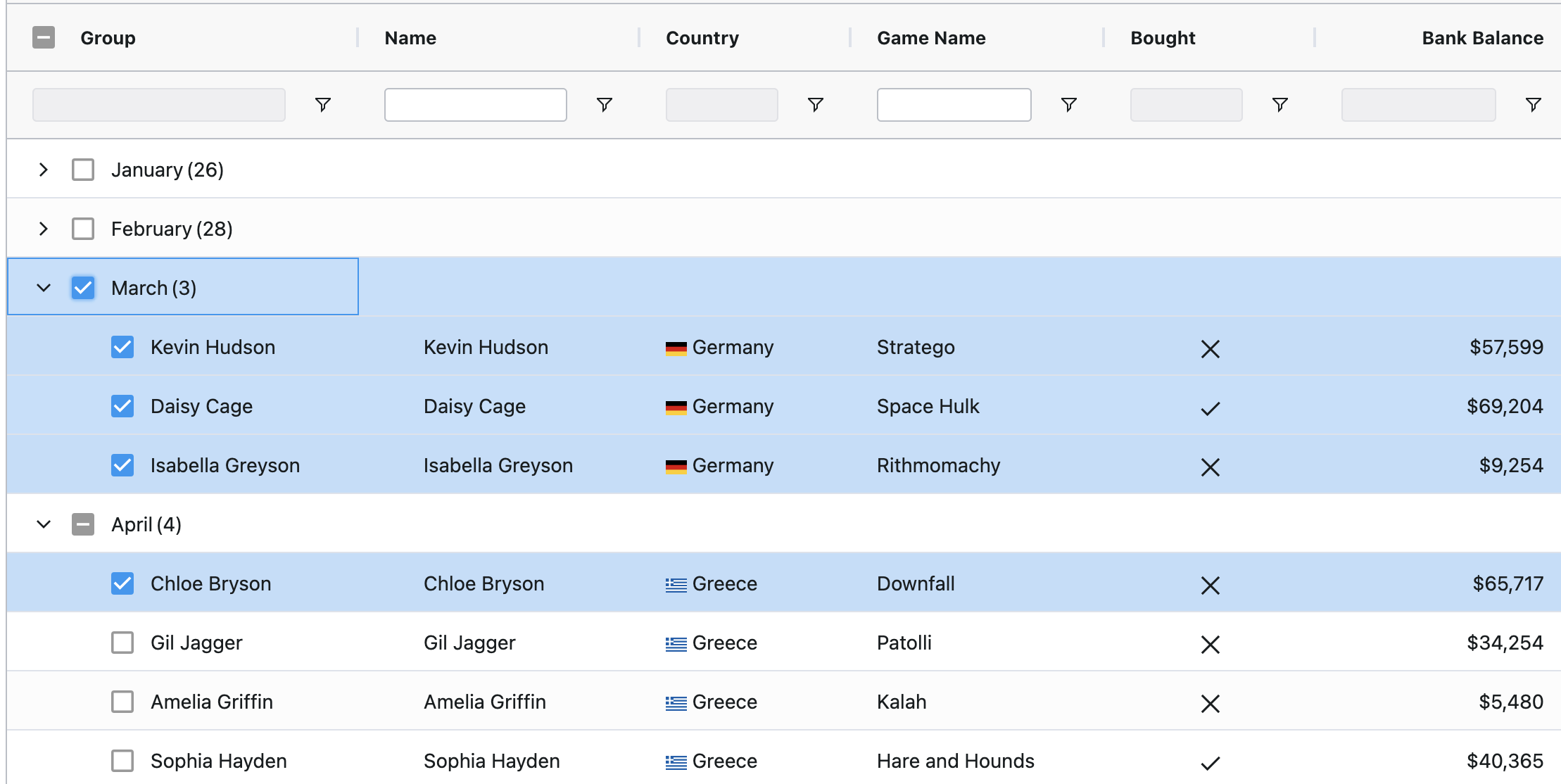
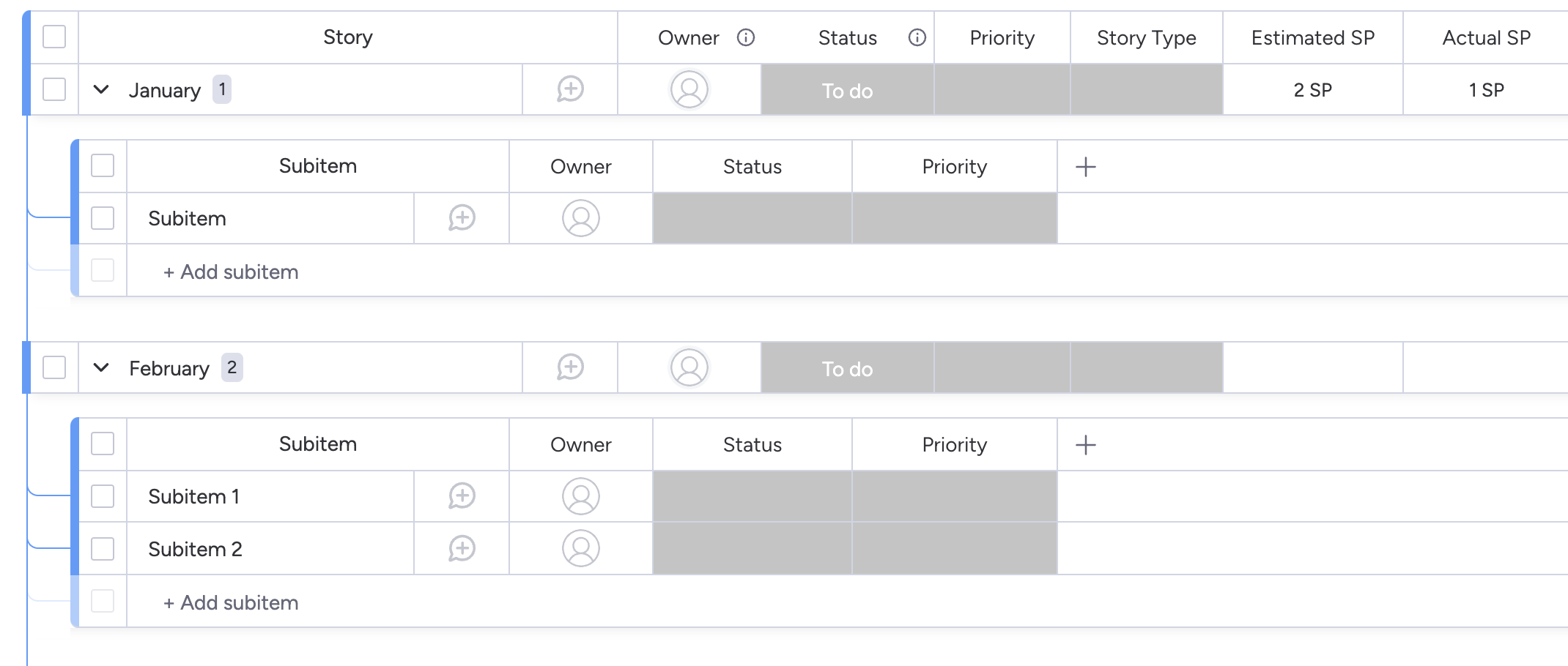
To improve accessibility we want to add column headers to the list. What makes this a little bit awkward is that as a part of the list, we also have month subheaders that serve as separators (so the user can more easily scan/scroll to find what they are looking for.
How would you design/structure this? I find it awkward when the labels are placed above the month subheader, but not sure how to lay this up differently. Also, this way of structuring it might confuse screen readers? Not too familiar with designing this type of component for screen readers.

