2

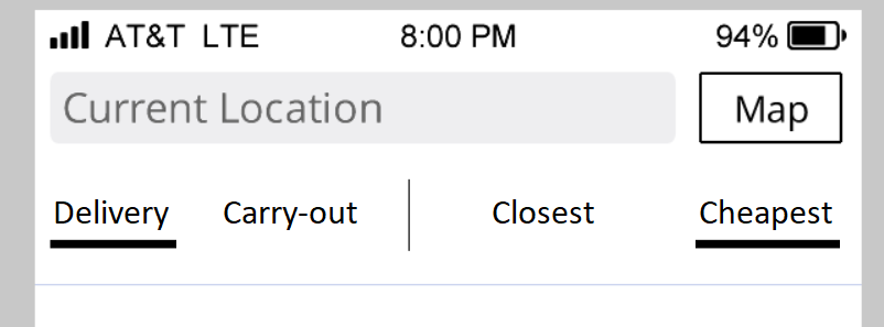
We have a smartphone app for pizza places, and a user can select to see "delivery" or "carry-out" and, separately, the closest or the cheapes.

These are the two options I've found: enter image description here

With the horizontal line under the selection, It's very clear what the user selected. But I really don't like the vertical line, but the user might get confused.

Also, tons of apps are using the horizontal line to display the selection. My app is yet another app with this same boring design that everyone else uses.

I also considered the segmented controls. It'll probably look like this since android doesn't have the ios 13 segmented control: enter image description here

Even though I like it a little more, the biggest issue is that it's not clear which option is selected when only two options are available, which is documented here. I asked a colleague (android user) and he thought that "White wine" was selected. So there's that confusion.

What other options are there?

3 Answers 3

5

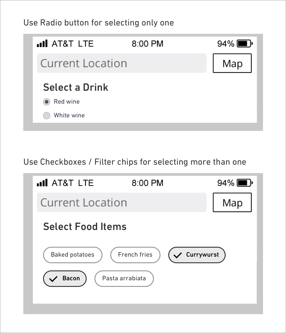
The above two screens are an example of 'Navigation' and they are not used for 'Selection' in general.

Since you have mentioned it's an app that lets you choose food items, What If the user wants to select more than one food/drink item from the category? Or how can you make sure that the default food item is the one user would prefer?

You can use established patterns for selecting items from the list based on the conditions.

enter image description here

Filter Chips by material design: https://material.io/components/chips#filter-chips

1
  • Thanks for your answer. I've edited the items in the pictures because the previous items didn't really make any sense.
    – rbhat
    Commented Sep 4, 2020 at 21:41
0

As presented, I prefer the underline approach in terms of clarity. It's strongly apparent what is selected, what isn't, and which options are paired. That said, I'm sure talented visual designers could improve the performance of the second (making the selected font bold, for example).

I would also encourage you to NOT pick your favorite, my favorite, responders' favorites or averaging the preferences of your colleagues. UX staff commonly waste much time discussing and arguing minor UI variations best left to user tests. Gather all approaches, then let the users decide. I would recommend a '5 second test' for this. Show users each option for just 5 seconds, then ask them what was selected.

Finally, I would add that there is a deeper issue that I believe is more important - scalability. What happens later when you are asked to add "Tater Tots"? Both of your options will break. Always assume the future will add more stuff. Thus I would recommend Sooraj MV's checkbox/filter chip approach. Not only does it scale up nicely, but it also scales down. It would work with just one option (just "Baked potatoes" for example).

Then user test it of course.

2
  • Thanks for the answer. Do you have a link to Sooraj MV's checkbox/filter chip?
    – rbhat
    Commented Aug 31, 2020 at 17:42
  • A link was provided to a material design document at the bottom of her answer.
    – Tom
    Commented Aug 31, 2020 at 23:13
0

This answer is in regards to the edited pictures. Earlier, the pictures displayed selections of products (wine, potato dishes) where the groupings of options weren't too clear.

Now, there is a difference between the choices the user has to make:

  1. What type of service does he want?
  2. Should the service be close or cheap?

There is a difference between the kind of answers that Choice 1 and Choice 2 offer.

For Choice 1, pizza places either offer delivery or they don't. They either offer carry-out or they don't. There are two groups of pizza places (delivery and carry-out), and some pizza places can be found in both.

For Choice 2, a pizza place is closEST only when compared to another pizza place. That means Choice 2 creates a scale from close to far away and a scale from cheap to expensive. Clicking "closest" shows a certain number of pizza places on the "close" end of the scale. When presented to the user, that defined number of close pizza places should also be shown (sorted) in an order of closest to furthest with closest being the first listed.

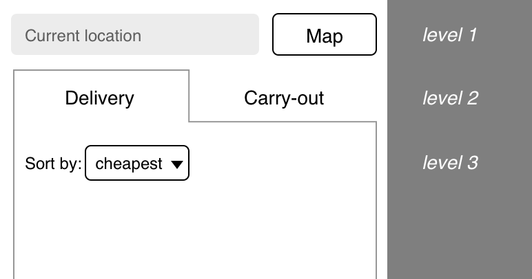
With that in mind, a stronger hierarchy can be established and help the user find what he needs more quickly:

At the first level, is the location. The second level offers a choice between the two main groups of pizza places. The third level, the scale from close to far, is established through a sort function where the user can choose to sort the pizza places be closest first or cheapest first.
enter image description here

We could assume that the user knows if he wants to have a pizza delivered or not before he orders, and that would justify having the user define the pizza place type before the vicinity or price. But that would be an assumption and would be better tested. If the vicinity or price of the pizza place (Choice 2) would end up being more important, Choice 1 would need to be implemented as an optional filter (via checkboxes or dropdown with checkboxes). If vicinity or price (Choice 2) would be discovered to be WAY more important than Choice 1, Choice 2 would need to move to level 2. Choice 1 would then move to level 3 as an optional filter.
Your Answer

By clicking “Post Your Answer”, you agree to our terms of service and acknowledge you have read our privacy policy.

Not the answer you're looking for? Browse other questions tagged or ask your own question.