0

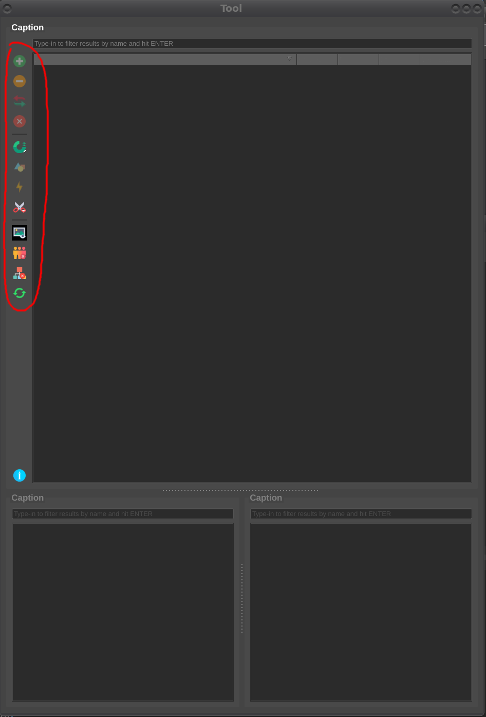
I'm developing a tool for a software specifically for only desktop, and I'm wondering what's the best practice to deal with many icons?

Right now I have them on the side of a treeview as they are all related to what is currently selected. Though I keep hearing that unless your icons are very recognizable it's better to have text beside the icons so it's easier to know what they do at a glance.

I can do that and place them on top of the treeview, but I find it would take up a lot of space and may make the tool suddenly feel very cluttered.

I could leave it as it is and consider adding an instant tooltip as the mouse hovers over the button but that still doesn't solve the original problem of understanding the button at a glance.

What's the best practice to do in this case?

interface

2 Answers 2

3

Yes, icons need text labels.

Icons are often designed around some sort of metaphor. For example, a paper clip to reference adding an attachment. Determining an icon's meaning relies on users understanding of that metaphor.

Complementing icons with texts could increase the clarity of your navigation. Just call it what is going to happen when users click on it. Every icon is a room for misinterpretation and because users may probably have different assumptions, different backgrounds or different experiences in the past, it is a good practice to add a text label to icons.

You probably may not have the budget or resource to conduct usability testing of your icons. But if big brands (that users are supposedly accustomed to and using for years) still benefit from labeling their icons, you should too.

Case studies:

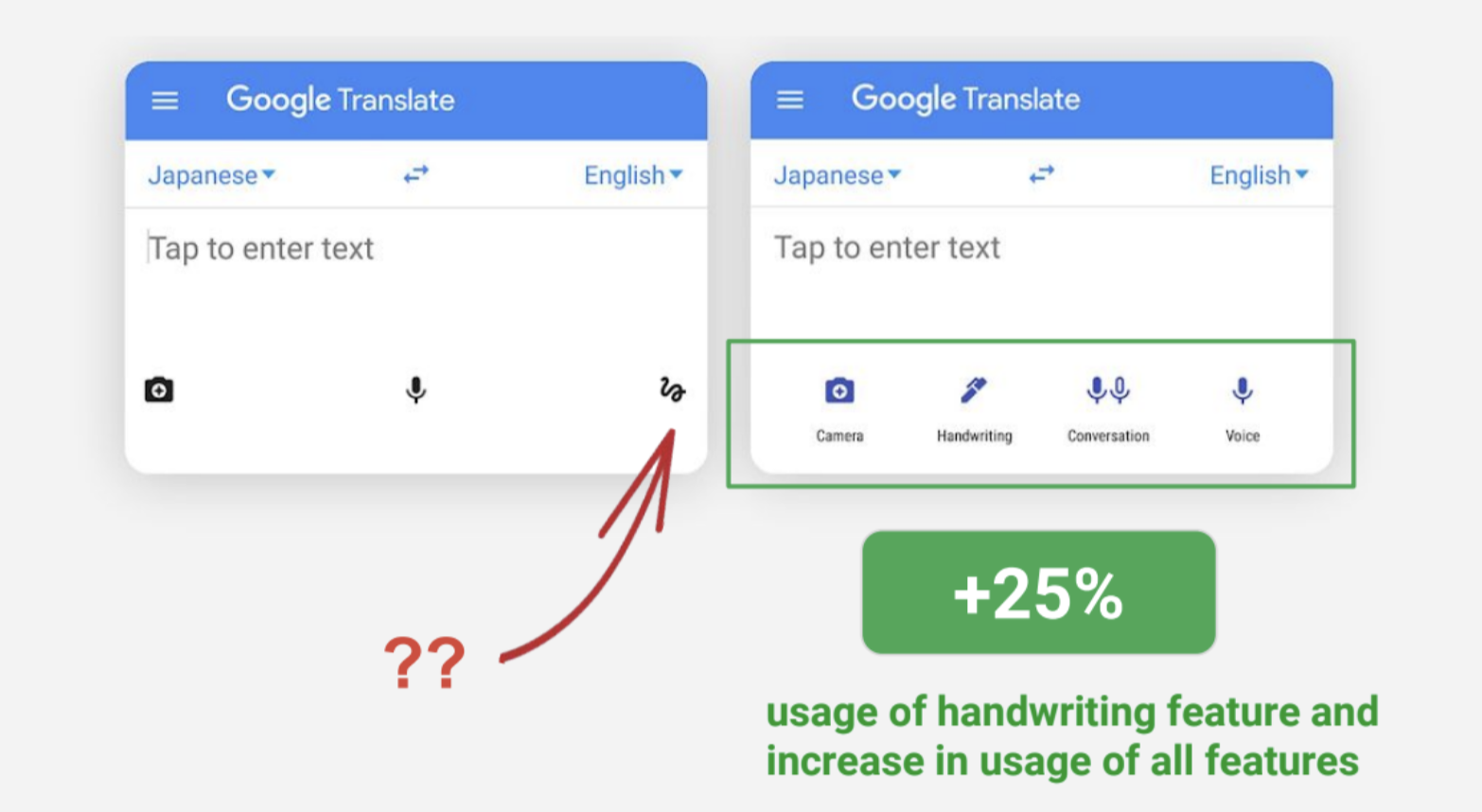
Adding text labels helped Google Translate increase usage of all features increased across the board, with the handwriting being used as much as 25% more than it was before. Read the full case study here.

enter image description here

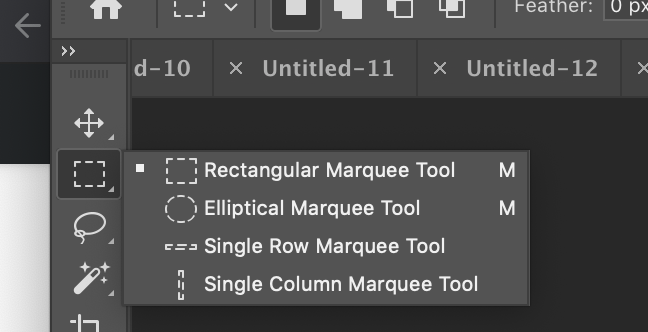
Adobe Photoshop still adds text label even though the software has been in existence for over 25 years.

enter image description here

1
  • "Every icon is a room for misinterpretation" Yeah that hit home for me. I think I just need to be smart about layout them out so that the interface doesn't feel so clunky.
    – Green Cell
    Commented Feb 7, 2020 at 3:50
1

If these are common functions that the user will learn as they use the software then leaving them as icons is fine. Icons are an accepted part of UI design in toolbars and are a great way to condense a lot of features down into a small yet accessible space.

I would simplify the icons as much as possible to ensure the cognitive load to recognize the icon is minimal. Keep them simple, consistent, and use icons which are already in use in other software as they will be more recognisable. Then as you say, definitely add tooltips to the icons to allow the user to discover their meaning without having to click on them. It may also be worth adding options for the user to customize the list of icons to show the features they want in the order they want and hide anything they don't use.

If icons are used outside of a toolbar or on a page that is rarely accessed you should always provide a text label with the icon and just use the icon for improved recognition. The user is unlikely to learn and remember what the icon is for in that case and is unlikely to click on it if there is no expectation of a feature at that point in the app flow. A main toolbar hints at the user that the icons correspond to primary actions and thus encourages the user to learn what they do.

1
  • Some good points here. In this case the features aren't use heavily throughout the software so it might be best to include text.
    – Green Cell
    Commented Feb 7, 2020 at 3:53

Your Answer

By clicking “Post Your Answer”, you agree to our terms of service and acknowledge you have read our privacy policy.

Not the answer you're looking for? Browse other questions tagged or ask your own question.