1

I have a web application in which users have to provide the details for each sub categories and after all the necessary details are provided then it displays all the details on the confirmation screen for reviewing the details entered by the user. I have an option on confirmation page to come back to different sub categories and modify the details if required by the user. After modification done by the user, i want the users to get redirect to the confirmation page as all the necessary details are already provided by the user. I can place the Back to the Confirmation button either below the Next button or at the top of the screen below the progress bar.

For eg,

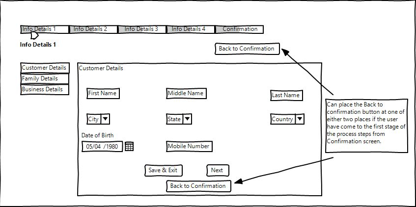
Scenario 1 : User redirected to Info Details 1 page from the confirmation page where i have only 2 buttons (1. Save & Exit button and 2. Next button) and i can place the Back to Confirmation button either below the 2 buttons (1. Save & Exit button and 2. Next button) or at the below the Progress Bar so as to redirect the user to the Confirmation Page directly.

enter image description here

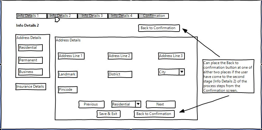
Scenario 2 : User redirected to Info Details 2 page from the confirmation page where i have 3 buttons (1.Previous 2.Next 3. Save & Exit) and 1 drop down displayed at the bottom of the page. Similarly like in scenario 1, i can place the Back to Confirmation button either aside of Save & Exit button or at the below the Progress Bar so as to redirect the user to the Confirmation Page directly.

enter image description here

2 Answers 2

1

I find that this is not a good idea to have two Back buttons. On the 2nd screen you have "Previous" (which is synonym for Back) and "Back to confirmation" (which is also synonym for Back). Users will be confused that there are two Back buttons.

Besides, "Back to confirmation" conflicts with the top menu, which shows, that first there are "Info Details 1" - "Info Details 4", and that the "Confirmation" is the last step. So if the user is on the step "Info Details 3", then "Confirmation" is actually not Back, but Forward.

I would suggest to remove the button "Back to confirmation". If user needs it, he can click on the top most menu.

And of course you should test it with real users. My view is not always what users really like. Only tests can give more insights on what users like more.

0

The best thing to do in this case is to test the location of the button and see which performs better.

For me, I'd put the Back button in the top left of the screen as this is a more natural place to go back (think of the browser back button or navigation back on your phone) but I'd test that assumption.

The key is to test assumptions and learn from them.

Your Answer

By clicking “Post Your Answer”, you agree to our terms of service and acknowledge you have read our privacy policy.

Not the answer you're looking for? Browse other questions tagged or ask your own question.