0

I'm developing a search tool for our web application. The search tool has many different filters and options, such as product category, product price, etc. We have the ability to add zero or more flags to each product. One requirement put to our team is to be able to search for products using this flag. For example:

Find items with flags "big" and "green" and "flat" 
and without flags "fuzzy" and "soft" and "warm".

I have extensive back-end development experience so the SQL queries to find such items are trivial to me, but I'm at a loss on how the front-end for this should appear. At the moment, I'm using a combination of two dxTagBox items from devextreme that allow the user to select all of the flags they wish to include and exclude separately. We've also had prototypes where every flag was listed with a three-way switch (options of "include" "ignore" and "exclude"), but it was incredibly slow and far too large due to the thousands of flags available. Our management team is not liking this layout, but has no idea of how they wish this to look. Any suggestions would be welcome.

Here is the current idea: Current flag idea

Here is the devextreme control when it is open: Current flag idea (open)

4
  • If you could include an image of the option you comment it would be easier to see what you already tried.
    – Alvaro
    Commented Feb 16, 2017 at 19:28
  • @Alvaro - I added images of our current layout, but unfortunately, I do not have any images of the three-way switch layout. Commented Feb 16, 2017 at 19:35
  • The proposal seems clear, Include & Exclude. What is it they are not liking, the design?
    – Alvaro
    Commented Feb 16, 2017 at 20:14
  • Management sees this as clunky, and we've prototyped a couple of different options for them. This was the most well-received, but now they're still not 100% satisfied with this design. Our team has scoured the web for anything similar to this and we're having trouble finding other examples. The biggest problem for us is the sheer number of flags that can be chosen. There are literally tens of thousands of these flags (that is a whole different issue) so showing tens of thousands of options in a selectpicker is not possible. Commented Feb 17, 2017 at 3:03

3 Answers 3

1

I have seen the pattern where an filter uses "field = value" and "field ≠ value". Perhaps that might be a solution?

I think the X being used for anything other than remove or clear might be a very hard pattern for users to learn.

1
  • I agree, I think an X at the right of that tag control could be confusing. We're trying to avoid any mystery-meat functionality where a user has to click something to find out what it does. As for you suggestion, I'll bring it up with management. Thank you Commented Feb 17, 2017 at 3:09
0

I would definitely go for a single line filtering, as "include" and "exclude" may be handled in one. "Ignore", on the other hand, should be a default, as far as I understand. Additionally labels With and Without.. look similar, which adds cognitive strain on the user.

This is a complicated filtering that is easily done in console, however for a regular user it tricky. Clicking the state would be more familiar in this case.

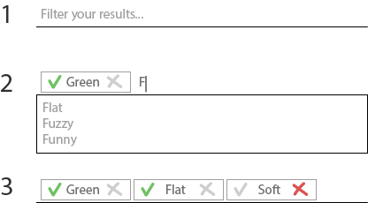
My suggestion wireframed below is a multicombo box like yours but the tokens are completely different.

  • Their default state after pressing Enter is "Include", like on the example 2.
  • Clicking X turns it into "Exclude", and the green checkmark fades to grey
  • Clicking on the label clears it, making it an "Ignore" again
  • Clicking on an already active state button (like X for "Ignore") does nothing

Wireframe

3
  • This may work. I feel like the gray x could easily be mistaken for a method of deleting/removing that flag from line 3. Actually, by what method would you remove "Green" from line 3 in your wireframe? Commented Feb 16, 2017 at 20:16
  • - if you try to click an X, you will see that it actually does something different - clicking on a token's label would remove it, so to remove Flat token, I click on Flat, Green by clicking on Green. So the tokens pop when you press them. Commented Feb 16, 2017 at 20:27
  • I appreciate your work in mocking something up, but I just don't think an "x" being on the right side of that control is a good idea if it doesn't perform the clear/remove/delete function a user may expect. One slight modification could be this: i.imgur.com/S9vIdmR.jpg Clicking the tag could toggle between the two states, with a clear x to remove option to the far right. Commented Feb 17, 2017 at 3:05
0

Have you considered using not ?

I'm looking for socks which are red, striped, not wool, long, etc.

Your Answer

By clicking “Post Your Answer”, you agree to our terms of service and acknowledge you have read our privacy policy.

Not the answer you're looking for? Browse other questions tagged or ask your own question.