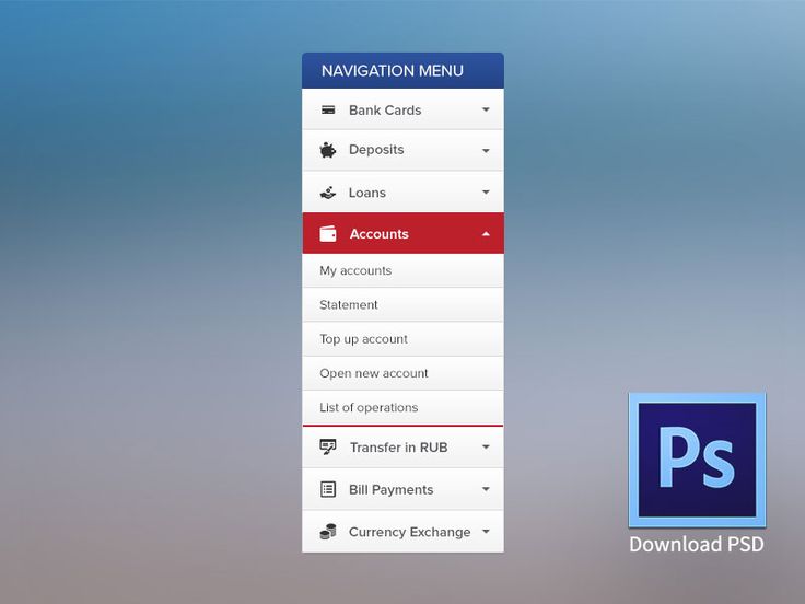
I am redesigning a bad design (IMO) dashboard which shows a list of form fields related to each "Team", such as
Title, First Name, Last Name
and list goes on. It has total of 18 fields which include a remove button at the end of each row, which can take off each row, if clicked.
On larger desktop, it may seem fine, but on mobile or tablet, it would look really bad. Below is a  of the fields.
How can i make it easy for user to navigate and still feel that each row in connected on mobile devices or any other then desktop?

