1

Imagine a web-application that lets student take tests, analyzes the results and presents them to school administrators.

The dashboard shows various stats, score break downs for the school overall, and for each teacher.

I want to create a "Download Reports" area in each section of the download, where a user clicks a link and downloads a PDF and Excel version of the reports. So if the user is looking at Teacher #1451, they should see a link that says "Download Excel" and "Download PDF" that will produce reports specific to this teacher. The area should be styled to look the same everywhere it shows up on the site .

I'm wondering:

  • whether the box be hidden by default, and open when user clicks, or show all the time
  • where it should be placed (floating to the upper right of content, below content?)
  • similar examples, patterns that make the download area visible, without dominating the rest of the page
1
  • Excellent answers across the board. Thanks to everyone for contributing. Commented Aug 1, 2013 at 16:45

3 Answers 3

3

A lot of web-based applications put the interaction links in the "pane" of the content, in the right hand top side. I'd like to think the reasoning behind this is a combination between the F-pattern we read in and the nature of interaction with websites.

The f-pattern stems from the way we skim pages. Since interacting with content is often a secondary action (primary being its digestion) the right hand side makes a lot of sense. It's still near the top of the page (easy to find/easily accessible without scrolling) but it's not important enough to be the first thing they see.

Generally, desktop applications would be all about creating. That's why all intereaction links (including printing) would be anywhere at the top of the page, starting at the very left. The position of the "print" button could on the very left (old versions of MS Word are a good example of this) since printing is (or arguable "used to be") the main way of spreading/digesting the content you've just created.

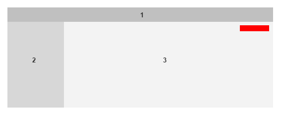
So taking the above into account, and assuming you're building a web-based application built to consume content, and printing is the secondary (though possibly often-used) option, here's an example image.
Interaction placement

Take the image above, and imagine these two cases:

Case 1: A website

1 a main menu, 2 a secondary menu, 3 the content area.

For admins, the red area would be where you'd put links or icons representing "edit", "delete" or any other interaction.

Case 2: A forum post

1 would be the title, 2 a side area with an avatar, post count etc, 3 the actual post.

In this case, it would be where "quote", "edit", "report" and the like would be.

You could see all those gray areas as window panes, where the top and left hand sides hold navigational stuff, and the right hand side holds the slightly "heavier" interaction tools of each pane.


As for icons, depending on how you're serving the printed reports, I'd go with a printer icon, or perhaps a pdf icon.

2
  • I read about the F-pattern of scanning web-pages, and it seemed to refer to content pages of websites. Is it also relevant to web-apps?
    – Dvir Adler
    Commented Jul 28, 2013 at 6:09
  • The f-pattern stems from the way we read; left to right, top to bottom. There are reasons to and methods of pulling people's attention away from that, but that's the default pattern. But in case your application has all the useful stuff on the right hand side, you can train users to look there first.
    – Dirk v B
    Commented Jul 28, 2013 at 22:44
2

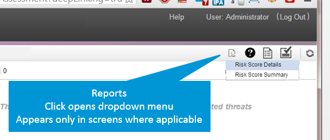
We faced the same problem in our web-app. We needed a fixed place to house all those functions that recur throughout most of the screens, including the generate reports button, but also refresh and help. They are not regular "meta" functions like log-in, since they are made in the context of the current screen (even the help is directed straight to the page relevant to it).

Our solution was to round up all theses in the right corner of the toolbar. Since the toolbar is packed with buttons, and reports is not used very often, we hid the two report options in a drop-down menu.

enter image description here

1

I don't see any value in having the two download buttons hidden unless there is really too much info on the page already.

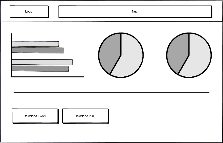
As to where the buttons should be placed, it also depends on how many other buttons you will be having on the page. If it's just the statistics, and the 2 buttons , I would put the buttons either above the graphs, or below the graphs like so:

mockup

download bmml source – Wireframes created with Balsamiq Mockups

Whether you place them above or below just depends on how prominent you want to make the buttons. If the page is really long with the statistics you also have the option of putting the buttons above AND below.

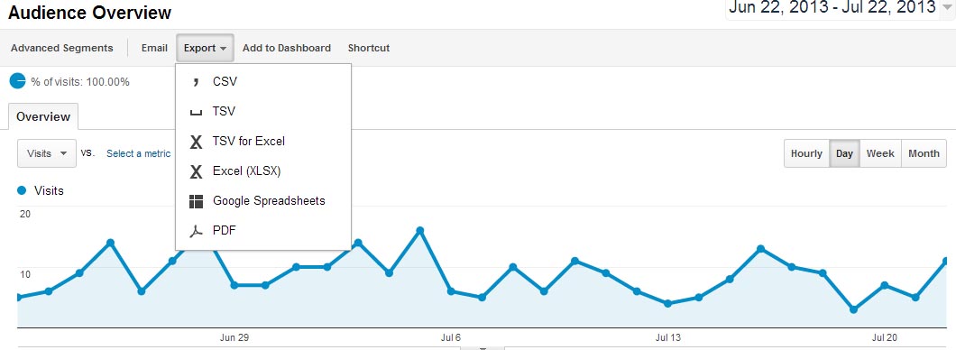
If you have other actions on this page, you could also consider creating a secondary menu bar, and put the download buttons into that. See an example of how google analytics do it below:

enter image description here

Your Answer

By clicking “Post Your Answer”, you agree to our terms of service and acknowledge you have read our privacy policy.

Not the answer you're looking for? Browse other questions tagged or ask your own question.