175

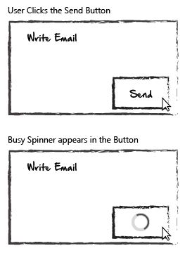
The first scenario is an action that could take roughly 2–5 seconds to execute once the user has pressed a button. A Busy Spinner will be displayed in the button until the process has been completed.

After the action is complete feedback is displayed to the user.

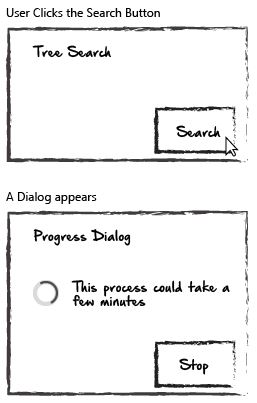
The second scenario is an action that can take a couple of minutes to complete. In this scenario I don't believe it's appropriate to simply display a Busy Spinner in the button. I think that a user would start to question if any progress is being made. So instead, a dialog will be displayed:

By displaying a dialog—along with the text, I believe that the user has more confidence that the action is being carried out.

My question is—how long is too long for a simple Busy Spinner? Around what estimated time frame should I begin to introduce a dialog which mentions how long the action will roughly take?

16
  • 34
    Note that in many cases, a busy spinner means the system is inadequately multitasked/pipelined. Users should never have to wait unless they (not the machine) are specifically waiting for the results of that operation.
    – keshlam
    Commented Sep 12, 2016 at 13:30
  • 31
    If possible add a progress bar either way. Commented Sep 12, 2016 at 18:23
  • 14
    You should put the task in a background task queue and allow the user to do other things or even close the browser. It may be just me but when I wait for long-running tasks in a browser I'm always afraid the connection is going to be interrupted and I'll not only be waiting in vain, but whatever data was processed was discarded and I'll have to redo the task. Commented Sep 12, 2016 at 23:21
  • 6
    @Ralt, which app did you use to create those mockups? Commented Sep 13, 2016 at 10:52
  • 5
    @Jasny-ArnoldDaniels Just Adobe Illustrator. Charcoal stroke, and Hand Of Sean font
    – Ralt
    Commented Sep 13, 2016 at 13:18

8 Answers 8

179

Jakob Nielsen wrote an article called Response times - 3 important limits.

The basic advice regarding response times has been about the same for thirty years [Miller 1968; Card et al. 1991]. He wrote this in 1993:

  • 0.1 second is about the limit for having the user feel that the system is reacting instantaneously, meaning that no special feedback is necessary except to display the result.
  • 1.0 second is about the limit for the user's flow of thought to stay uninterrupted, even though the user will notice the delay. Normally, no special feedback is necessary during delays of more than 0.1 but less than 1.0 second, but the user does lose the feeling of operating directly on the data.
  • 10 seconds is about the limit for keeping the user's attention focused on the dialogue. For longer delays, users will want to perform other tasks while waiting for the computer to finish, so they should be given feedback indicating when the computer expects to be done. Feedback during the delay is especially important if the response time is likely to be highly variable, since users will then not know what to expect.

In 2014 he updated his guidance with this:

  • 0.1 second: Limit for users feeling that they are directly manipulating objects in the UI. For example, this is the limit from the time the user selects a column in a table until that column should highlight or otherwise give feedback that it's selected. Ideally, this would also be the response time for sorting the column — if so, users would feel that they are sorting the table. (As opposed to feeling that they are ordering the computer to do the sorting for them.)
  • 1 second: Limit for users feeling that they are freely navigating the command space without having to unduly wait for the computer. A delay of 0.2–1.0 seconds does mean that users notice the delay and thus feel the computer is "working" on the command, as opposed to having the command be a direct effect of the users'actions. Example: If sorting a table according to the selected column can't be done in 0.1 seconds, it certainly has to be done in 1 second, or users will feel that the UI is sluggish and will lose the sense of "flow" in performing their task. For delays of more than 1 second, indicate to the user that the computer is working on the problem, for example by changing the shape of the cursor.
  • 10 seconds: Limit for users keeping their attention on the task. Anything slower than 10 seconds needs a percent-done indicator as well as a clearly signposted way for the user to interrupt the operation. Assume that users will need to reorient themselves when they return to the UI after a delay of more than 10 seconds. Delays of longer than 10 seconds are only acceptable during natural breaks in the user's work, for example when switching tasks.
17
  • 8
    A spinner just captures the user in a state of doubt whether something crashed or whether something is busy for these 1-10 seconds... Commented Sep 12, 2016 at 12:40
  • 80
    So what is the answer? This is just a copy/paste without elaboration on the current case. Commented Sep 12, 2016 at 13:21
  • 10
    It answers the question "My question is - How long is too long for a simple Busy Spinner?"
    – SteveD
    Commented Sep 12, 2016 at 13:24
  • 13
    @SteveD You may want to highlight that answer (ie 1-10 seconds: spinner, 10+ seconds: percentage). Especially the first quote doesn't mention spinners at all, so the impression at first is that this doesn't really answer the question (I would also just remove the first quote, it doesn't add any value to the second quote).
    – tim
    Commented Sep 12, 2016 at 13:43
  • 6
    But then surely this must be a duplicate question - because this 0.1, 1, 10 seconds must have been used as an answer multiple times on this site
    – icc97
    Commented Sep 12, 2016 at 15:01
77

Imagine you and I are talking to each other in the street. You've asked me if I have the time and with barely any hesitation I look at my watch and tell you. You don't give it a second thought. You then ask my if I can tell you directions to a decent coffee shop. Some options may occur:

  1. I instantly start reeling off a set of instructions

  2. I appear to be contemplating something - it might be that I'm considering the best coffee shop bearing in mind the current location, or I'm trying to work out the best directions for walking.

  3. I say I don't know, but I'm meeting someone next who knows, and I can text you the answer in a few minutes.

  4. I stand there not really doing anything, almost as if I hadn't heard you.

Your expectations might be for option 1 or 2. You realise that if I indicate option 2 that this may take a moment and you're prepared for a small wait, but it definitely helps if I let you know that I'm first considering a few really good coffee shops before picking one and then providing the instructions.

Option 3 lets you get on with your life and get notified soon. You don't get an answer right away, but it's beyond helpful, and you're grateful for not having to wait.

Option 4 though is thoroughly disconcerting. If I continue to stand there not giving any further clue that I'm considering an answer, you're going to prompt me with things like 'any coffee shop will do' or 'if there's no coffee shop near here, that's fine', or 'forget it, I'll just wander round!'.

It's the same with computers - it's still part of a conversation between you and the computer. You may not expect an answer to something complex within a tenth of a second. You do expect some clue that the request is being considered usefully. You expect some indication of the type of response within a second or so, and you get disconcerted if you don't have any of that feedback within a few seconds. And if the total wait is longer than a few seconds, you like to know what's being considered - am I considering a couple of local coffee shops or am I calculating directions from London to a great little indie coffee outlet in Seattle.
5
  • 7
    This is why we don't have John Nash write software.
    – user67695
    Commented Sep 12, 2016 at 13:30
  • 11
    Love the analogy, really well explqined :)
    – Devin
    Commented Sep 12, 2016 at 14:33
  • 3
    I do four. But unlike certain badly written software, I actually respond whilst doing so... ... I am not a bot.
    – wizzwizz4
    Commented Sep 12, 2016 at 16:44
  • 15
    Weird. Plenty of software that I have used behaves this way: "5. I appear to be contemplating something and say that I'm going to answer right away, then keep idling indefinitely. Occasionally, I repeat that I'm just about to respond." Commented Sep 13, 2016 at 9:06
  • 34
    The busy spinner is more like I stand there saying "umm, ..., umm, ..., umm, ..., umm, ..., umm, ..., umm, ..., umm, ..., umm, ..., umm, ..., umm, ..., umm, ..., umm" until you give up and walk away. Commented Sep 14, 2016 at 7:49
38

Scott Klemmer's rule of thumb is:

Answer shorter than a second: No feedback

Answer between 1 and 5 seconds: BusySpinner

Answer longer than 5 seconds: Progress bar

10 seconds is a long time. You should bring feedback to the user before he/she naturally loses interest in what your software is doing and become frustrated that your software wasted his/her time.

5
  • 13
    I'm voting for 5 seconds not 10. Its an empirical test you can do yourself by timing yourself looking at a screen. Check your feelings as the clock ticks. 10 seconds can feel like a long time. The appearance of a progression bar is basically telling the user 'This could take a while, so why not go and do something else for a while' By telling them early you reduce their tendency to build up frustration on the >5second interactions.
    – PhillipW
    Commented Sep 12, 2016 at 16:10
  • 5
    @PhillipW If you're measuring your own feelings while being aware that you're testing this, it's not a good empirical test.
    – Rhymoid
    Commented Sep 13, 2016 at 17:33
  • 3
    I think you have to do a 'reality check' on things. There's a state of mind where you can step back from living 'automatically' and observe yourself and your interactions with the external world. It's what I call 'sample of one', but it gives you hypotheses which you can then test using a bigger sample.
    – PhillipW
    Commented Sep 14, 2016 at 5:37
  • 2
    It's called a Progress bar, not a Progression bar, and as a user I don't trust them at all. They lie. They're just ugly horizontal spinners. Tell me what steps are being performed. Commented Sep 15, 2016 at 7:00
  • @PhillipW I agree with your conclusion, but I disagree that you arrived at it empirically as you suggest. For that you would need to have actually gone out and collected data on this from a statistically significant sample group and analysed it.
    – Nick Coad
    Commented Sep 19, 2016 at 4:36
12

According to this article from NNGroup based on cognitive psychology studies:

  • after 1 second the user might start to lose his flow of thought about the current process.
  • after 10 seconds the user will most probably switch his attention on other task

We don't want to risk the user switching its attention to something else, so we should display the dialog before those 10 seconds. Also, the studies are 25+ years old so the computers have gotten much faster and users expect everything to load faster.

That is why I suggest a threshold around 3 seconds where the dialog with the delay information should be displayed.

Basically, the more information you give the user while loading the higher the chance is she is not going to abandon the process. Try to display:

  • use progress bar
  • explain why it is taking time to load
  • show approximate time of loading
3
  • 1
    +1 - the oddities of Stack Exchange voting. You posted this first which is effectively the same as the top voted answer here and yet somehow you've got about 3% of the votes.
    – icc97
    Commented Sep 16, 2016 at 0:41
  • 2
    Yes, when a question becomes popular people tend to upvote the highest rated answer without even reading it much. Commented Sep 16, 2016 at 7:47
  • 2
    @icc97 That's why I like the stackexchange sites that list answers in a random order instead of ordered by votes. I also like this answer better than the accepted one. About 10 seconds is when users give up, and result should arrive long before users give up, which makes 3 seconds a fair rule of thumb.
    – Peter
    Commented Sep 17, 2016 at 19:47
6

Ten seconds and after that I start thinking "this is not working" and I worry in about my credit card being or not being processed or being processed twice if I have to do this again.

It is good to change the message after 10-15 seconds to "it is still loading, no need to worry" or any other positively reassuring message.

Just an example is sending an email on gmail without letting the attachment to preupload. The message changes from "sending" to "it's still working".

Please note there needs to be some kind off response from the server to confirm that the process is still running or report an error to a user.

9
  • 27
    Please don't change the message after 10 or 15 seconds. If the backend is providing actual update information (stage 1 finished, moving to stage 2) then use that in the UI. If the backend is NOT providing update information, then don't invent some artificial progress in the UI.
    – MSalters
    Commented Sep 12, 2016 at 15:43
  • 23
    @MSalters Oh man, that is the exact thing that pisses me off about Netflix's first 25% of "loading". It counts up from 0% to 25% while nothing is actually loading, to give the impression that progress is being made. If things go well, it never reaches 25% before it actually starts buffering, but if not, then it stops at the 25% lie and you wait for it to fail or to catch up.
    – Marsh
    Commented Sep 12, 2016 at 16:14
  • 14
    @mouseas, actually it's worse than that. I once unplugged the co-axial cable from my cable modem just before going into the other room and clicking on a Netflix show. The loading bar went slowly up to 99% and stayed there for a full minute before finally admitting that something was wrong with the connection.
    – Wildcard
    Commented Sep 13, 2016 at 0:03
  • 7
    @MSalters: To make your concern concrete: Without any feedback from the backend, how does the frontend know that "it's still working"? Commented Sep 13, 2016 at 9:09
  • I don't like this; artificial information is not to be trusted, because the timer for the message change is on the client side, which will operate even if there is no actual job done. Update information is more useful than that.
    – EKons
    Commented Sep 15, 2016 at 18:46
5

Sorry you're all quoting old research. Google has updated this.

125ms the user expects a response of some kind like a loading icon showing up after click.

250ms user starts to notice the action is happening.

500ms the user expects to be updated on response.

1s the user expects the content to be loaded.

10s I give up.

Slide 12: https://docs.google.com/presentation/d/13AJe2Ip4etqA8qylrva7bEgu1_hAvsq_VQiVOAxwdcI/mobilepresent?slide=id.g1e697bbb_0_7

https://developers.google.com/web/tools/chrome-devtools/profile/evaluate-performance/rail?hl=en

1
  • How is that different from what others have said? 0s - 1s, feels snappy. 1s - 10s feels slow. 10s+ feels like it's broken.
    – Nick Coad
    Commented Sep 19, 2016 at 4:39
0

Apart from all the excellent answers submitted here, I want to add that, the expectations of a user on low-bandwidth internet connection (yes, they do exist!) are entirely different than that of a user on high-speed fibre-optic connection.

2
  • ... in a web context. This question can be applied to any context, not just web apps.
    – J. Dimeo
    Commented Sep 15, 2016 at 19:12
  • Yes. Of course. The "waiting" aspect is same.
    – blackpen
    Commented Sep 15, 2016 at 23:28
0

A programming challenge arises when one doesn't know (in advance) the length of time the task is likely to take, either because the task itself varies or because it could be run on different speed processors. Ideally we want to make our code independent of both task size and hardware / OS limitations, and perform consistently in all / nearly all situations.

If we show a progress bar, (or even a spinner) it could just flicker on the screen and disappear immediately, which is disconcerting UX in my opinion.

A less than ideal solution to this (sometimes implemented) is to simply decide that the user will wait some length of time no matter how fast the task is completed... e.g. 1 second + task time, that way the spinner / progress bar does at least remain visible for some time.

I believe a slightly better solution is to add the fixed delay only when the time taken has already exceeded 1 second causing the spinner or progress bar to be shown. That way if the delay gets added, it's proportionately much less compared to the time the user is already required to wait.

Your Answer

By clicking “Post Your Answer”, you agree to our terms of service and acknowledge you have read our privacy policy.

Not the answer you're looking for? Browse other questions tagged or ask your own question.