15

Problem

I have this argument with one of my clients, about the position of like dislike button with the progress in between. Like the screenshot below.

enter image description here

I've always thought that it makes the most sense to have the positive action on the left side, and negative on right side (without any research on my part, just a feeling). This idea is probably based on YouTube, "Did you find this helpful" questions, and other voting services where the positive action was on the left side.

But his feedback was that the people he has asked for feedback found this confusing (we could speculate about the scope of ppl participating in the testing), which still quite surprised me.

It is for a mobile app.

So, which one is more natural way to do voting system like this one?

Option A

enter image description here

Option B

enter image description here


Edit

To answer some comments.

Clients point of view

He basically want's to copy YouTube's voting system. His idea is to have two separate bars pushing each other out (depending on the number of likes/dislikes). And while I agree it might not appear so obvious as it might with different approaches, I don't think its that confusing.

Image how it looks when you vote thumbs down.

enter image description here

My point of view

Since the backend has no feed sorting mechanism, there is very little purpose to vote. If I could decide, I would completely ditch the dislike functionality and make it like (count) only, but it is not up to me. And even though I'm not a fan of this pattern either, I wan't to make it as easy to use and understand as possible.

6
  • 2
    I'm more concerned by the lack of distinction between feedback and calls to action than by the positioning of the like/dislike buttons. Especially since this question will be trivially solved with a bit of A/B testing / usability testing with users and likely has little impact on users' appreciation of the site. Commented Aug 31, 2016 at 17:54
  • 1
    Note that while youtube has the thumb up at the left of the thumb down, both are below the bar and aligned to the right of it.
    – Bakuriu
    Commented Aug 31, 2016 at 18:43
  • 6
    It's weird that as the bar fills up, it moves toward the thumbs down. This is not intuitive to me. Commented Aug 31, 2016 at 20:51
  • 4
    I don't like any of them. It looks like a progress bar, which makes no sense for voting. There are plenty of other options to display votes graphically. Even no graphic would be acceptable, like on this very site. Commented Aug 31, 2016 at 21:27
  • @JaredGoguen It is not about the likes filling up the bar. I should have added a little space between those lines, as it is with the thumbs down image. There is competition going on between the likes and dislikes. When somebody likes an article, the left side takes a little bit of space from the right side. When somebody dislikes an article, it goes the opposite way. The bar never truly fills up, unless the article has only likes and no dislikes.
    – rojcyk
    Commented Sep 1, 2016 at 6:53

8 Answers 8

18

You could create a test to see how easily people upvote / downvote a story and a timed one to give some indication of which stories are 'better' / 'worse' (if that is the value attached to a thumbs up / down) if you need empirical evidence.

I would be very surprised if the left to right, positive to negative option (A) didn't win (assuming a left to right culture), but the very fact that it is raised as a question might be pointing to a different issue. Often the surface questions are not the right problem.

In your case I suspect the confusion may be too much information which tells the brain something is wrong. Your client has vocalised this as the left / right question. I think it might be more that you need to decide on an absolute / relative position and the other problem might disappear.

For me either:

Your absolute one reading three thumbs up, 5 thumbs down (notice how it reads this way - and could also be made accessible with clear markup)

example of absolute thumbs up / down

Or, a good relative one that you may have seen somewhere else :)

example of a relative marking system from stack exchange

4
  • Completely agree with A/B testing everything! But the project is currently in very early development stage so this is not an option. As I mentioned it in my edited answer, there is very little purpose to vote. I would also like to remove the dislike button (to not encourage disliking), but this is not up to me either. I wasn't really able to articulate why this kind of rating is a bad idea, and why it feels so wrong. So even though your answer doesn't answer my question 100%. It gave me some arguments and I managed to change the mind of my client and we will ditch it! :]
    – rojcyk
    Commented Sep 1, 2016 at 6:43
  • 2
    @rojcyk If it's early in development, I think you're solving a minor issue. You know you'll be able to find a solution, so just put anything there and move on. This can be sorted out in alpha testing.
    – yo'
    Commented Sep 1, 2016 at 9:03
  • Glad to be of some help :) I usually try and force to remind myself that the client also has a shared goal of making the best thing for the user. Often the things that seem black and white on the surface can lead to some much more interesting insights. So provoking a productive dialog with your client is a good thing, and there may be an interesting path to explore regarding the purpose of the voting. What outcome does your client think it will produce, how does it help a user achieve their goals, what are the goals, etc, etc. All good stuff.
    – Jonny
    Commented Sep 1, 2016 at 10:07
  • And as yo' says you can always leave them as open design decisions and revisit later if there are bigger value items to concentrate on.
    – Jonny
    Commented Sep 1, 2016 at 10:09
7

Both are weird because there are mixed data: absolute and relative. No matter the thumbs up is to the left or to the right. The thumb icons with the numbers give one information (absolute values), OK, good. But in between them, there is this bar giving another information (relative proportion). There is no immediate relationship between the numbers and the bar. There is an implicit calculation. That's confusing.

The bar has the shape of a progress bar, but it is more a tug of war. In a progress bar, you would see numbers telling the hits and the total (for example: 3 out of 4), not the positive votes against the negative ones.

It is a good idea to make a post with many votes look different from posts with fewer votes (no matter the proportion of positive vs negative votes).

I see some more consistent designs:

  • to show only the thumbs with the numbers and that's it
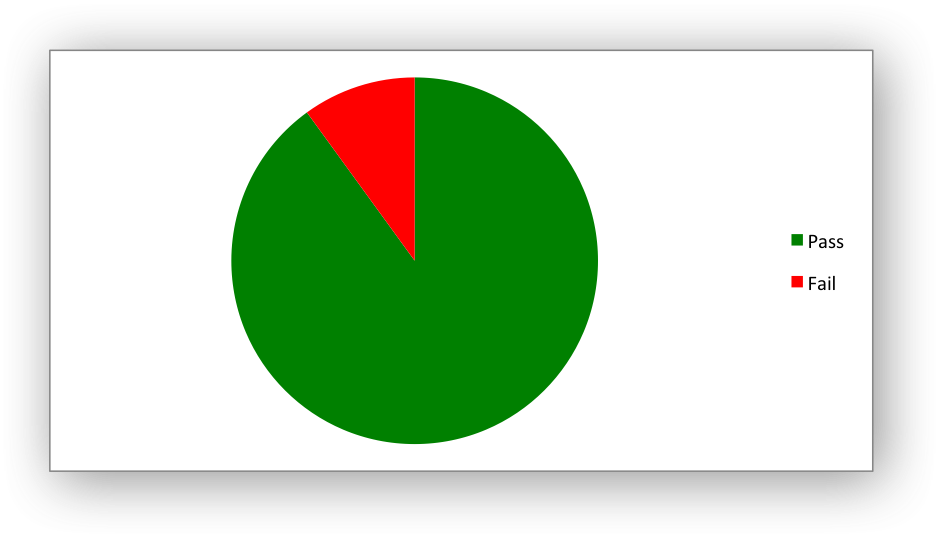
  • to show a pie chart with two colours (green and red) showing also the total of votes simple pie chart example
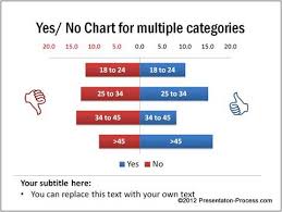
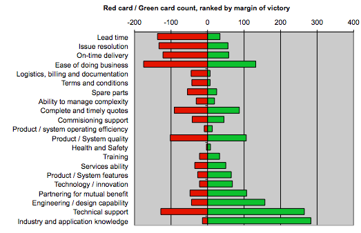
  • to show two horizontal bars, one green and one red, as large as the number of thumbs -- this implies that a post with no votes will show zero-length bars. Also, you will have to set a maximum number of votes two sides bar chart example 1 two sides bar chart example 2
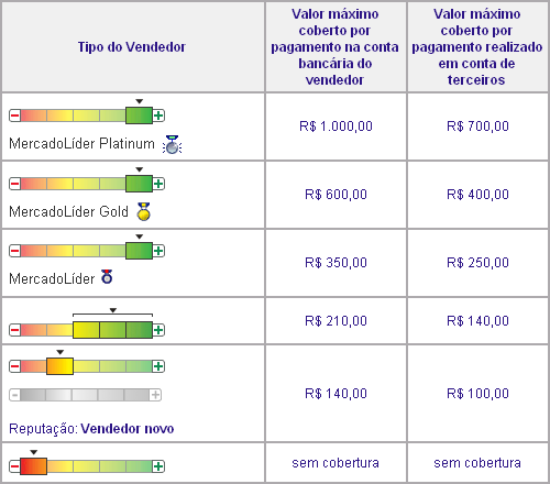
  • to show the thumbs with the numbers and one fixed length horizontal bar which is red to left and becomes gradually green to the right. The proportion of thumbs up and down sets the position of the post in this reputation bar -- this design omits the total number of votes, but at least is clear. termometer-ish chart
4

The bar is extremely confusing, so it's very difficult to get something without A LOT of A/B testing. If it's confusing with 8 votes, just imagine what would happen with 100 or 1000 votes.

Also, consider this situation: you're measuring user reactions, so no votes would equal 0 . Then, votes down would be negative reactions while votes up would be positive reactions, right?

Now think of this as a number line: positive numbers go to the right, while negative numbers goes to the left. This is understandable even by kids since you learn this in primary school.

enter image description here

So, if you present your UI as a number line, then your client is correct. And people probably feels this is confusing because you're trying to present information in a way that goes against what they have learned since childhood.

So, IMHO, you better get rid of the number line, or use it as expected by most people. And if in doubt.... test, test, test!

1
  • I get your point about the number line, but come to the opposite conclusion. With positive feedback on the right, as more people provide positive feedback, the bar progresses to the right (in the number line analogy, a higher number). On the other hand, when people provide negative feedback, the bar moves left, again following the number line analogy.
    – Nateowami
    Commented Sep 1, 2016 at 5:34
2

I absolutely do not mean to be pedantic, but if you are going to use thumbs up and down, you should use icons that can be aligned. Since we're talking about youtube, notice how their icons line up

enter image description here

Whereas your icons stick out.

enter image description here

It's all in the wrist.

4
  • 1
    This is an interesting question I might ask later, but what is the better way to center things? Align it pixel perfectly? Like you proposed? Or center it around its visual center? Its the same problem when you center a triangle in a square. I went with the visual center, which looked more balanced.
    – rojcyk
    Commented Sep 1, 2016 at 6:40
  • I am not completely aligned with you here: Yes, while I think the first rule should be to align things perfectly, but when the visual alignment is different from pixel-alignment, the "Looks better" option should be considered.
    – Jan
    Commented Sep 1, 2016 at 7:06
  • @rojcyk, both examples are technically balanced, as they are symmetrical. What i was proposing was horizontal alignment. You could do this by adjusting margins for your current icons or using a different icon set. Obviously this is a subjective matter, i just wanted to put this out there. Commented Sep 1, 2016 at 22:13
  • Stretch out your hand and do a thumbs up and down. You'll notice that when you rotate your hand, your forearm naturally pivots and moves up and down. It does not stay centered. When you go from thumbs up to thumbs down, your arm usually moves up slightly which moves the mass of your hand up as well. YouTube's got it right. Commented Apr 27, 2020 at 16:20
1

I think that the problem is not the horizontal orientation. Is really useful the horizontal orientation to get metrics, and the sense of competition between like and unlike is very cool!

The problem, on my viewpoint is the gray color, or, the absence of color. When I look for your image I not perceive the unlike, and, when the green color stay on right side, in my case (from Brazil), I have the sense that is a something on wrong way. But, I believe that if you change the gray for another color like purple or orange (complementary colors), you can get a better result.

1
  • Yup, you are right! The color might be the culprit here, making it really hard to distinguish what is going on.
    – rojcyk
    Commented Sep 1, 2016 at 6:54
1

Note that for a mobile app, the full-width nature of this control is likely to skew the results in and of itself.

The majority of people using smartphones are right-handed. The easiest things to tap are those in an arc made by the right thumb when holding the device comfortably in the right hand. Whichever control is on the right end of a full-width control like that is much easier to tap. Depending on vertical scrolling, there will be times when it requires moving the thumb, and others when it is sitting in just the right spot for an easy tab. The control on the left end will almost never be in a location where it is easily tapped and will always require quite deliberate action to tap it.

For secondary controls like a rating system (i.e. not a primary CTA or navigation), you have to overcome a lot of inertia where many people just won't be bothered enough to tap what's on the left.

If you have thumbs up on the right, you are discouraging negative ratings - which you ought not to do.

If you have thumbs down on the right, you are discouraging positive ratings - which you definitely don't want to do.

I would suggest you remove the bar and group both thumbs up and thumbs down together towards the right end of the screen.

1
  • I like this answer. I thought this too. Also I tend to think from "bad" to "good". I think YouTube goes "positive" to "negative" because they want the 'positive' rating closes to the view count. It's the first things you see when reading left to right. Commented Apr 27, 2020 at 16:27
0

I would not choose option B because it seems negative. The green color stands out the most and is now drawing attention to the dislikes. Give attention to the likes. Option A in your example seems positive, even though there are less likes than dislikes.

What is the rating asked for?

1
  • Just updated the question. I personally agree. It is almost the same pattern as on YouTube.
    – rojcyk
    Commented Aug 31, 2016 at 15:38
0

As far as I'm concerned, personally, negative first then positive is far more intuitive. However this has been tilted by Youtube, Facebook and the like, which have to use positive first, because positive is the primary action, sometimes even the only action.

It follows that for people who grew up with Facebook and YouTube like and dislike buttons, positive first is more familiar and thus more intuitive. Therefore I'd assume there is actually a difference depending on the age of the target group.

Instead of choosing between two horizontal layouts where each of the layout choices is unintuitive to some users, use a vertical layout. On a vertical layout a vast majority agrees positive is on top, negative is below.

Your Answer

By clicking “Post Your Answer”, you agree to our terms of service and acknowledge you have read our privacy policy.

Not the answer you're looking for? Browse other questions tagged or ask your own question.