FIXED DIALOG
Use for mandatory actions as it emphasizes the necessity to take that action. But, it should not hide necessary information
MOVABLE DIALOG
You can use movable dialog boxes unless they don't hide the information. Most websites don't use movable dialog boxes these days, as it just hinders the flow and visibility
But these are just guidelines
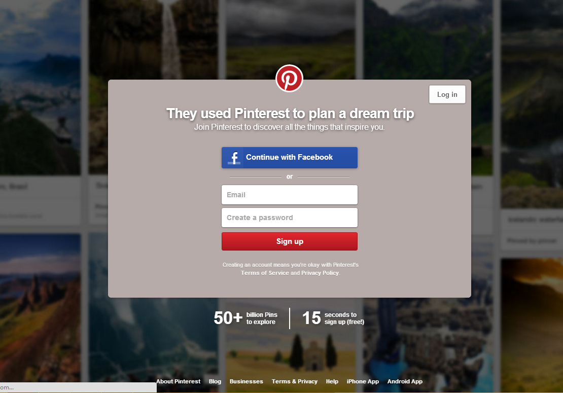
Pinterest displays a fixed login dialog box if you are a new user. Unless you sign in/sign up, you can't go in. It stands there like a bouncer outside a club (No password? You ain't goin' nowhere inside pal!)
But, if you observe, the background is blurred and keeps scrolling, giving the users a sneak peek of what they can expect from Pinterest. This increases curiosity. This is an awesome UX. The dialog is fixed but it still gives you a hint of information.

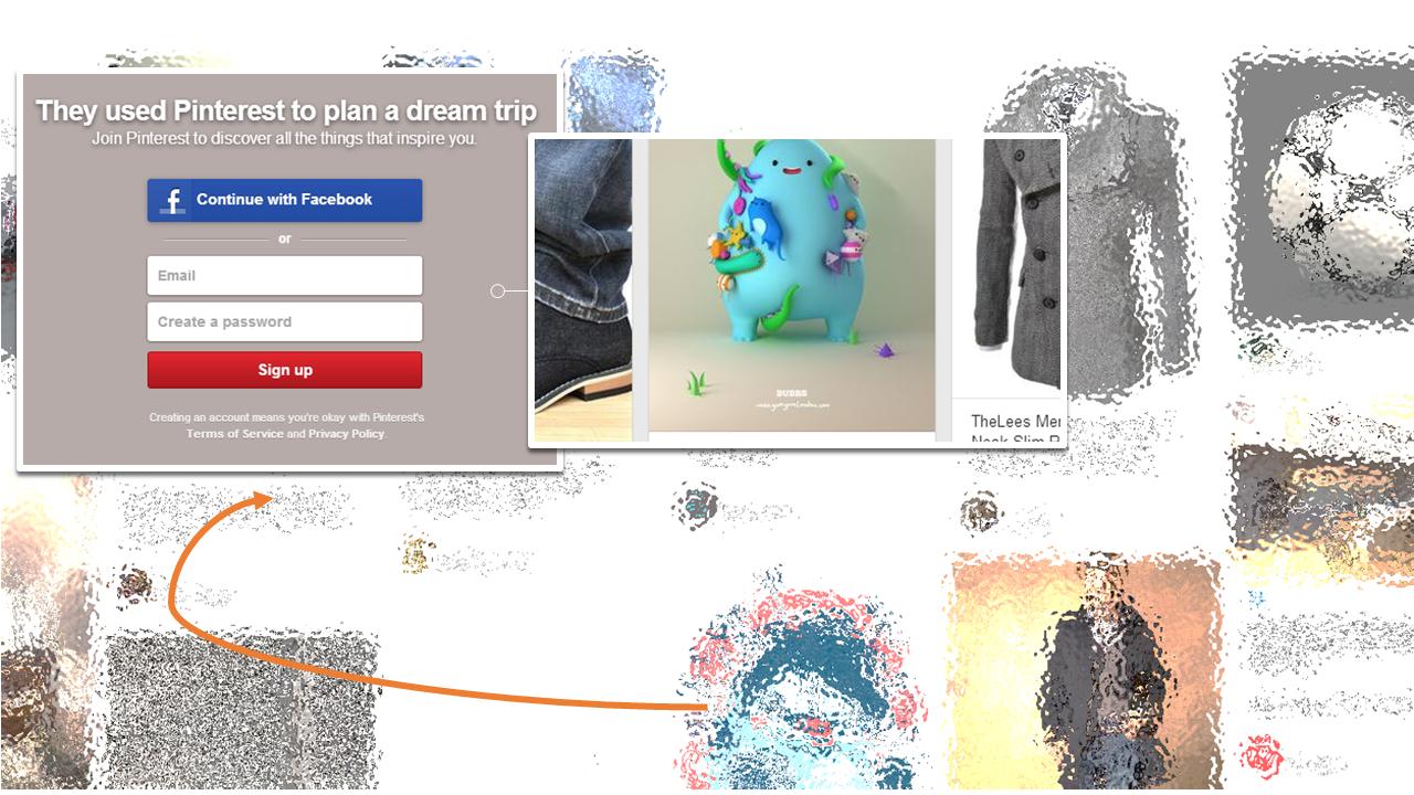
You can imagine a more engaging movable dialog box for the same scenario.
Example: Pinterest can have the same login as a movable dialog, with another box on its right. This box de-blurs and reveals the background, wherever the login dialog is moved. This can end up being an awesome micro interaction. A rough concept image attached.

In the end, it's about how you are using these elements, both effectively and creatively, to engage the users.


