Question Protected by Benny Skogberg
edited tags
Link
JohnGB
  • 68.6k
  • 26
  • 185
  • 297
Added the Windows logo to the list, even though it's a Microsoft example
Source Link
Kit Grose
  • 15.7k
  • 2
  • 37
  • 74

I've noticed an interesting phenomenon in the user interfaces of many famous applications, they're moving away from the glossy complex to a more dull and bare minimum design.

Why the sudden change? It also appears that most of these companies have adopted this design around the same time, was that linked to some new study?

Examples:

Examples of icons that have changed from a glossy look to a flatter one, including Lync, Skype, Photoshop, Last.fm, Chrome and othersExamples of icons that have changed from a glossy look to a flatter one, including Lync, Skype, Photoshop, Last.fm, Chrome and others

I've noticed an interesting phenomenon in the user interfaces of many famous applications, they're moving away from the glossy complex to a more dull and bare minimum design.

Why the sudden change? It also appears that most of these companies have adopted this design around the same time, was that linked to some new study?

Examples:
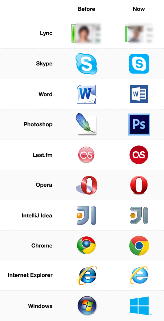
Examples of icons that have changed from a glossy look to a flatter one, including Lync, Skype, Photoshop, Last.fm, Chrome and others

I've noticed an interesting phenomenon in the user interfaces of many famous applications, they're moving away from the glossy complex to a more dull and bare minimum design.

Why the sudden change? It also appears that most of these companies have adopted this design around the same time, was that linked to some new study?

Examples:

Examples of icons that have changed from a glossy look to a flatter one, including Lync, Skype, Photoshop, Last.fm, Chrome and others

Added new, single table of icons that looks better on the UX.SE style.
Source Link
Kit Grose
  • 15.7k
  • 2
  • 37
  • 74

I've noticed an interesting phenomenon in the user interfaces of many famous applications, they're moving away from the glossy complex to a more dull and bare minimum design.

Why the sudden change? It also appears that most of these companies have adopted this design around the same time, was that linked to some new study?

Examples: (sorry for the bad table)

Examples Examples2Examples of icons that have changed from a glossy look to a flatter one, including Lync, Skype, Photoshop, Last.fm, Chrome and others

I've noticed an interesting phenomenon in the user interfaces of many famous applications, they're moving away from the glossy complex to a more dull and bare minimum design.

Why the sudden change? It also appears that most of these companies have adopted this design around the same time, was that linked to some new study?

Examples: (sorry for the bad table)

Examples Examples2

I've noticed an interesting phenomenon in the user interfaces of many famous applications, they're moving away from the glossy complex to a more dull and bare minimum design.

Why the sudden change? It also appears that most of these companies have adopted this design around the same time, was that linked to some new study?

Examples:

Examples of icons that have changed from a glossy look to a flatter one, including Lync, Skype, Photoshop, Last.fm, Chrome and others

People in comments reasonably argue that 3 out of 4 products in the list belong to Microsoft. This adds icons of several other programs that are not made by MS.
Source Link
Loading
edited tags
Link
Zelda
  • 41k
  • 10
  • 114
  • 183
Loading
Clarified question title to refer to the style being referred to. Deleted skeumorph tag as it's really about a particular style than emulating physical interfaces.
Link
DA01
  • 41.9k
  • 6
  • 82
  • 142
Loading
added tags
Link
JohnGB
  • 68.6k
  • 26
  • 185
  • 297
Loading
edited tags
Link
Michael Brown
  • 7.7k
  • 5
  • 21
  • 15
Loading
Tweeted twitter.com/#!/StackUX/status/307165669642883072
Source Link
Adi
  • 3.5k
  • 3
  • 15
  • 11
Loading