Tweeted twitter.com/StackUX/status/1197303666551775232
Improved grammar
Source Link
Mayo
  • 6.6k
  • 9
  • 31
  • 37

Why are these two structure are separated?

Why not one search only that opens the profile page when you click on a user, and one that opens the company page when you click on the company?

Or one company profile like a SPA, where you can select which user you need information of?

Are these CRMs designed in this way because of user experience or software engineering (to avoid things getting messy)?

Hubspot for example:

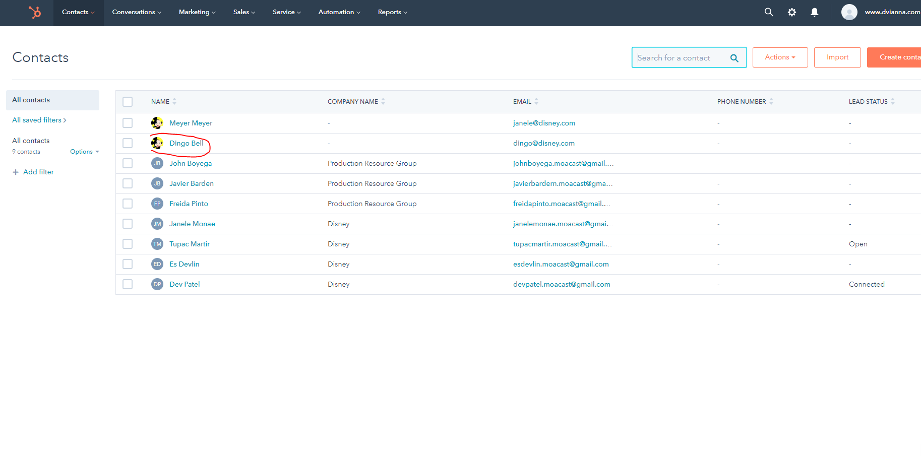
1- Contact Search

enter image description here

2- User profile screen Shown after clicking on user contact search results

enter image description here

3- Company Search

enter image description here

4- The company profile screen is shown after clicking on a company from the results page Shown after clicking on company contact search results

enter image description here

Why these two structure are separated?

Why not one search only that opens the profile page when you click on a user, and one that opens the company page when you click on the company?

Or one company profile like a SPA, where you can select which user you need information of?

Are these CRMs designed in this way because of user experience or software engineering (to avoid things getting messy)?

Hubspot for example:

1- Contact Search

enter image description here

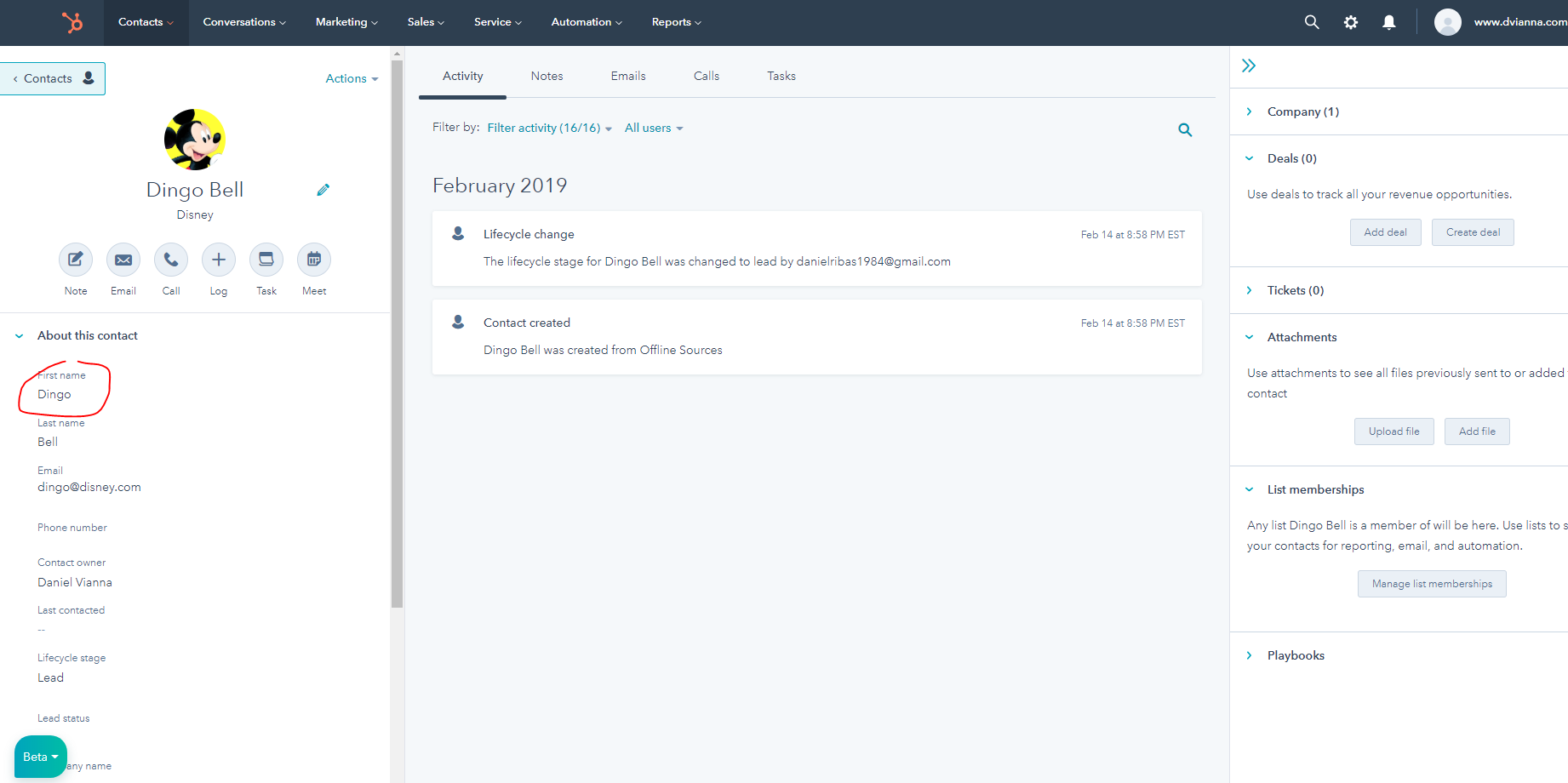
2- User profile screen Shown after clicking on user contact search results

enter image description here

3- Company Search

enter image description here

4- The company profile screen is shown after clicking on a company from the results page Shown after clicking on company contact search results
enter image description here

Why are these two structure are separated?

Why not one search only that opens the profile page when you click on a user, and one that opens the company page when you click on the company?

Or one company profile like a SPA, where you can select which user you need information of?

Are these CRMs designed in this way because of user experience or software engineering (to avoid things getting messy)?

Hubspot for example:

1- Contact Search

enter image description here

2- User profile screen Shown after clicking on user contact search results

enter image description here

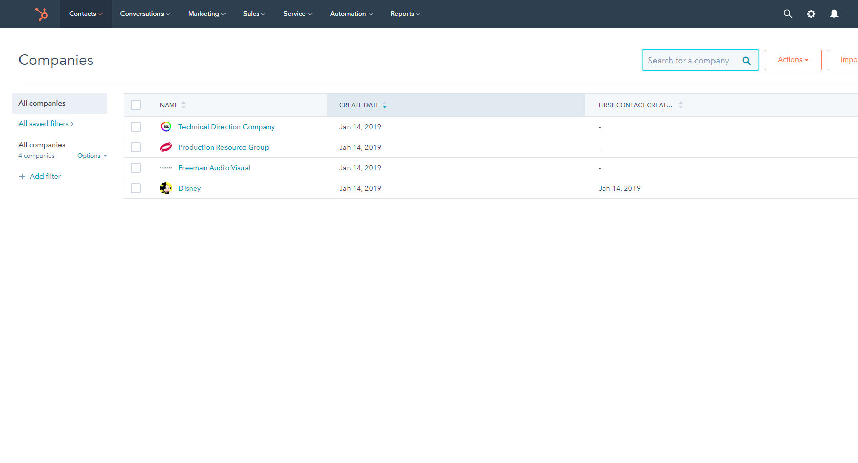
3- Company Search

enter image description here

4- The company profile screen is shown after clicking on a company from the results page Shown after clicking on company contact search results
enter image description here

Why these thetwo structure isare separated?

Why not one search only that opens the profile page when you click on a user it goes to profile page, and one that opens the company page when you click on the company you go to the company page?

orOr one company profile like a SPA which, where you can select which user you need information of?

Are these CRMSCRMs designed in this way because of user experience or software engineering (to avoid things getting messy)?

Hubspot for example:

1- Contact Search

enter image description here

2- User profile screen HappensShown after clicking on user contact search results

enter image description here

3- Company Search

enter image description here

4- CompanyThe company profile screen is shown after clicking on a company searchfrom the results page HappensShown after clicking on company contact search results

enter image description here

Why these the structure is separated?

Why not one search only that when you click on a user it goes to profile page and when you click on the company you go to the company page?

or one company profile like a SPA which you can select which user you need information?

Are these CRMS designed in this way because of user experience or software engineering (to avoid things getting messy)?

Hubspot for example:

1- Contact Search

enter image description here

2- User profile screen Happens after clicking on user contact search results

enter image description here

3- Company Search

enter image description here

4- Company profile screen after clicking on company search results Happens after clicking on company contact search results

enter image description here

Why these two structure are separated?

Why not one search only that opens the profile page when you click on a user, and one that opens the company page when you click on the company?

Or one company profile like a SPA, where you can select which user you need information of?

Are these CRMs designed in this way because of user experience or software engineering (to avoid things getting messy)?

Hubspot for example:

1- Contact Search

enter image description here

2- User profile screen Shown after clicking on user contact search results

enter image description here

3- Company Search

enter image description here

4- The company profile screen is shown after clicking on a company from the results page Shown after clicking on company contact search results
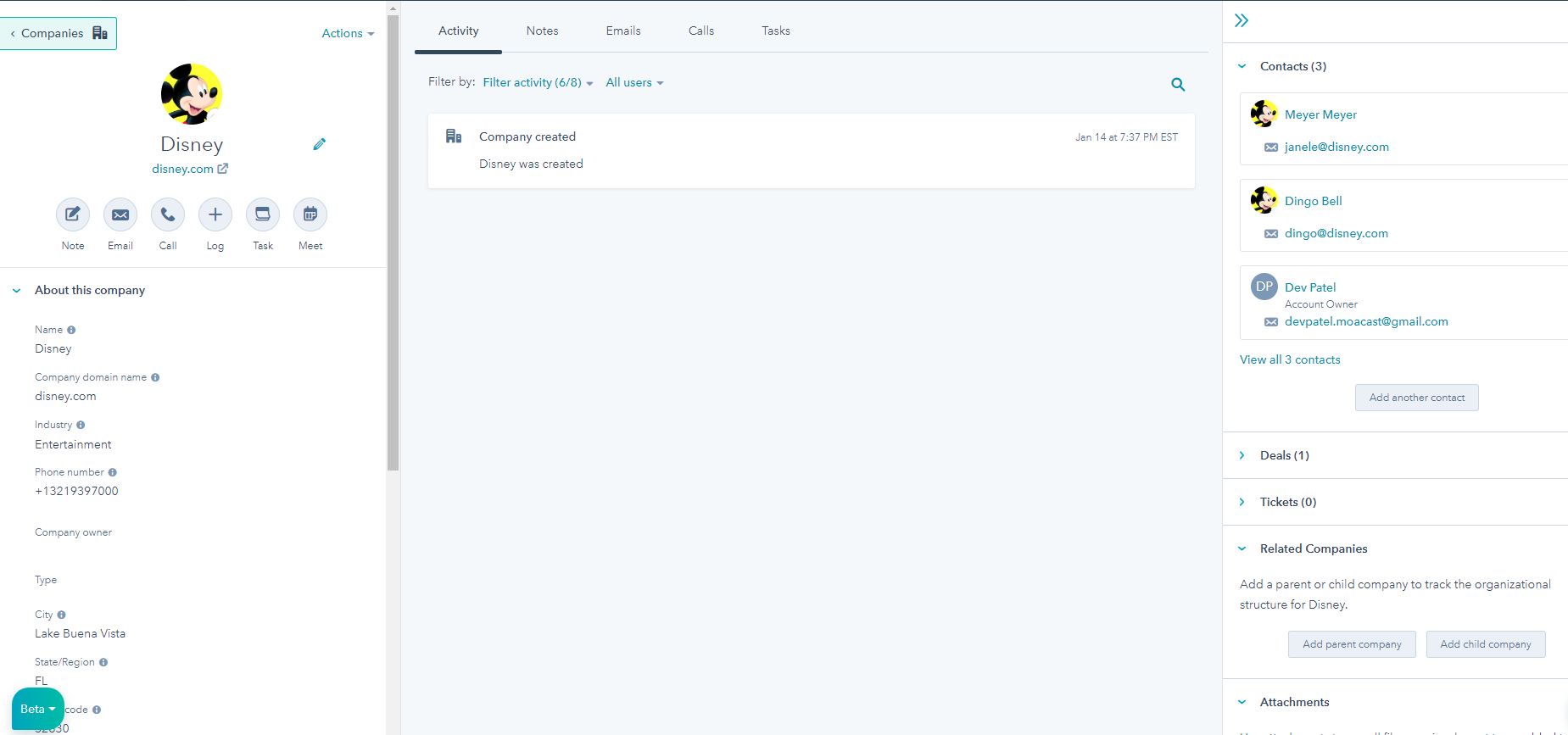
enter image description here

Bumped by Community user
Source Link

Why CRMs have two views - one for companies and one for contacts?

Why these the structure is separated?

Why not one search only that when you click on a user it goes to profile page and when you click on the company you go to the company page?

or one company profile like a SPA which you can select which user you need information?

Are these CRMS designed in this way because of user experience or software engineering (to avoid things getting messy)?

Hubspot for example:

1- Contact Search

enter image description here

2- User profile screen Happens after clicking on user contact search results

enter image description here

3- Company Search

enter image description here

4- Company profile screen after clicking on company search results Happens after clicking on company contact search results

enter image description here