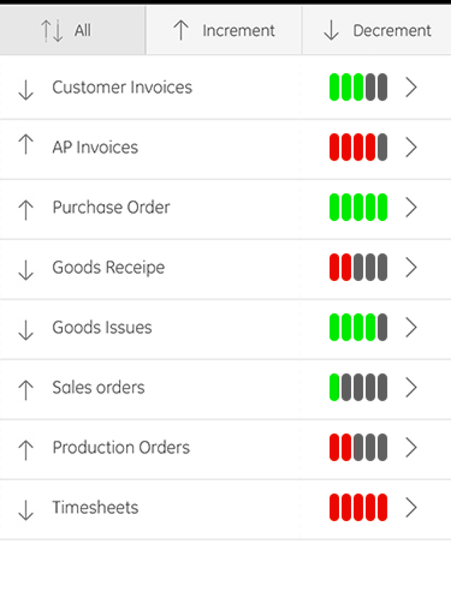
Perhaps you could use only black for the arrows so that the user knows of the increase or decrease, place them on the left, and then on the right use a "health-bar" style status report which would look professional and could indicate the positive/negative aspect and even severity. (Use colors other than Red/Green if you are worried about color blind issues)
(*NOTE: My colors may not correlate to arrow orientation as I just did it randomly without trying to uncover which arrows are good (green) and which are bad (red))
(Also, the arrows may not even be necessary anymore if you are adding these visual ads, sorting can be changed to performance based (i.e. 'good' v 'bad') instead of directional based (i.e. 'increment' v 'decrement')

Albert Renshaw
- 347
- 1
- 7
