The first idea failed field testing and variants failed usability testing
It sounds like we had the same idea as your option 1, and we implemented it. We were looking for a way to force users to search first **without users realizing** that we were forcing the search to occur. A variant of our first design actually tested OK with a small sample in usability-test sessions.Post-release, it was bad news.
Let me first tell you the details of our earlier design, and then tell you why it failed and what we're planning to do to make it more usable.
Our first attempt
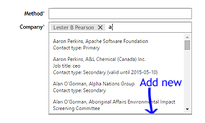
As users type in the box, matching names appear in a drop-down list. The drop-down list scrolls if there are more than four matching. Clicking an item in the list adds a lozenge to the box. To multi-select, users can click in the box again, beside the lozenge, type some more, and select another match from the drop-down list.
The more characters the user types in the box, the more exact the matches become in the drop-down list. As you can imagine, this shortens the list of items. The very last item in the list is always an icon with its Add new command link. But if there are still more than four items in the list, users can't see this command link unless they scroll down.
In this detail the design failed. Users didn't scroll. They didn't discover that the Add new command was at the bottom of the list. It increased support calls. The majority of users of this system are occasional users, so not daily users. They are data-entry clerks. Some of them are unwilling users who enter garbage data so they can "finish" their task and get on with other work. The garbage data must later be cleaned. The users quickly learned—and remember—that they can enter a few character in the box, and see a list of matches. They stop typing as soon as the list of matches appears, so the list is never short enough to reveal the Add new command link. #FAIL
We also considered putting the Add new command at the top, but this path was too easy and caused over-use in usability testing. The desired user behaviour is to select an existing item whenever possible. The Add-new function needs to be the user's last resort, in this context.
Another thing we considered was a non-scrolling block below the scrolling drop-down list, for the Add new command. Our developer couldn't manage it in the available time.
Our second attempt
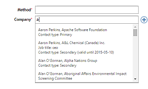
We relocated the command. It's no longer at the bottom of the drop-down list. It's now to the right of the box, but with a few differences.
- The command is now a button with only the icon. The command link's text has moved into the tool tip, which appears on hover. The icon is a circle with a + inside, common on the Windows platform. This icon is appropriate for these users.
- The command never appears unless the box has focus and the user has typed at least one character.
- The command doesn't appear in one abrupt snap. It fades in, so it won't trigger an involuntary looming-stimulus response. This is because we don't want the user's brain to flush its short-term memory or to release stress-inducing adrenaline.
- The command fades out when the box loses focus.
We're about to start testing this Saturday.
We really want the user to click in the box and start typing, so we can look for existing matches before they create a new entry.


