I've simple password change form. I'm wondering how to place call to action buttons.
1 option:

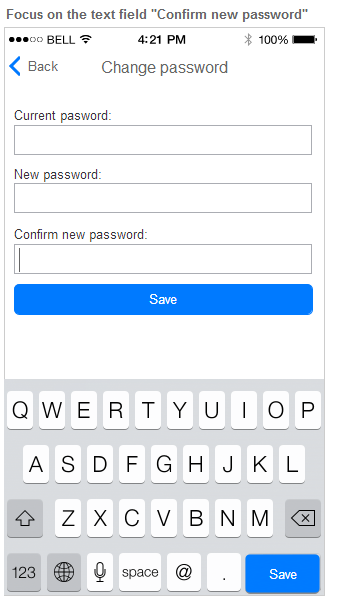
- big blue call to action is placed under the text fields
- focus on the first text field - we display "next" button on the keyboard bringing user to the next text field
- focus on the third text field - we display "save" button on the keyboard
2 option:

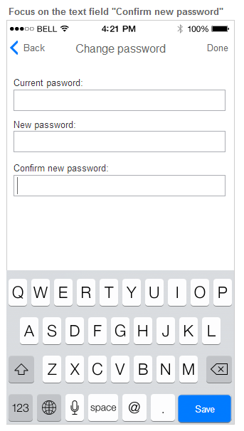
- link save is placed on the right side of the header
- focus on the first text field - we display "next" button on the keyboard bringing user to the next text field
- focus on the third text field - we display "save" button on the keyboard
3 option:

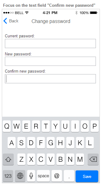
- there aren't any other call to action, excluding call to actions on the keyboard
- focus on the first text field - we display "next" button on the keyboard bringing user to the next text field
- focus on the third text field - we display "save" button on the keyboard
Best solution:
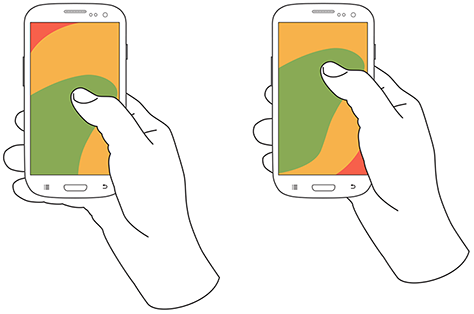
I think that the best solution is the the first one, because it would be easier for the user reaching call to action button "Save". If call to action is on the keyboard or on the right side of header it's harder to reach CTA according to this:

