My suggestion would be to break the survey into meaningful chunks and present them on different pages so that users dont get overwhelmed by the amount of content and quickly click through. To quote this article
With a single-page questionnaire, the respondent scrolls down to see the next question. At the foot of the page, there is a button to submit the answers to the server. There are several drawbacks to single-page surveys, including:
- Problems with download delays due to the amount of information on the page.
- A higher percentage of respondents who decide not to complete the survey.
- Can force respondents to answer questions that do not apply to them.
- Less flexibility/functionality, particularly with respect to asking follow-up questions or skipping subsequent questions based on responses to previous questions.
- Increased risk of data loss because the respondent has to complete the entire questionnaire before submitting the data.
- Inability to require responses to certain questions.
- Increased perception among respondents that the survey sponsor is unprofessional or unsophisticated.
Because of these drawbacks, single-page surveys often produce lower response rates and less useful results than multi-page surveys. Consequently, most online questionnaires developed by market research professionals use a multi-page approach. A typical page will load rapidly and fit neatly on the respondent’s screen regardless of resolution. The respondent answers one or more questions on each page then clicks an arrow or button to proceed to the next page.
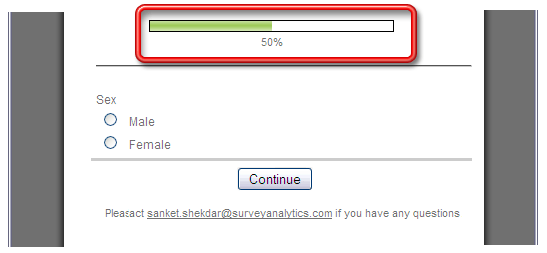
That said I would recommend providing some kind of visual indicator which informs users how many questions have been completed and how many are still left.

