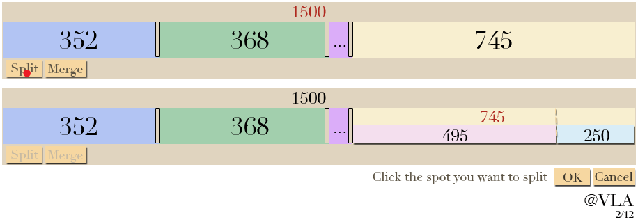
I created two mockups for you. Have you considered something like this:

and here's a version with Split and Merge buttons to allow users to add or delete without a right-click menu (so it can work on mobile devices.) Clicking Merge would allow the user to select two or more blocks and then combine them (not shown.)

Another benefit of heading in this direction is that zoom + and - buttons on the top right corner will allow the user to split or delete thin slices effectively, even on a mobile device. It will also allow them to see small labels that would normally require a tooltip hover on a device with a mouse. While zoomed in, a preview of the overall picture will need to appear below.
I believe that a secondary, permanent visualization should contain a swatch with the value and color for each space. This way, a mobile or desktop user could easily see that the overall design contains 352, 368, 35, and 745 without needing to zoom in or hover their mouse. The ordering should always match the primary visualization.
Depending on your application, the ordering might not matter. If so, you could have a button to rearrange the bars in the order that's best, such as decreasing or increasing. A subtle hint to the user to click the Reorder button should be provided after manipulating the bars. It would not be a good idea to auto-reorder whenever a user releases the mouse because it would be very confusing.
