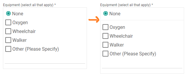
- Option A is a relatively uncommon metaphor for representing these input constraints and will increase cognitive load of users trying to parse meaning
- Option B is probably more easily parsed, but takes more clicks to physically accomplish
In weighting them, I would distinguish between Usability vs. Learnability
If you have repeated users, the new input format can be learned and quickly processed in the future by returning users
If you have a kiosk like environment, then I would aim for the highest degree of discoverability between the two options, even at the expense of additional clicks.
Also, to iterate over Option A, as IronBasset pointed out, adding a visual separator between the radio selection and checkboxes should add clarity and separation between those two distinct option sets.
No matter the case, additional interaction logic should be added so that the appropriate state is synchronized and enforced programmatically, without users having to regress and undo a particular action. If the top radio button is ever selected, it should deselect any checkboxes as those option sets are mutually exclusive.
Further Reading:

