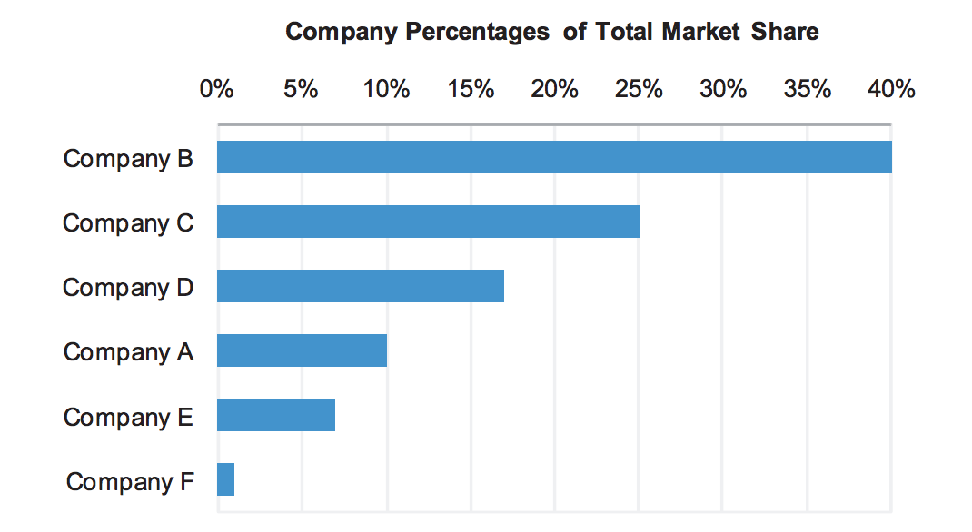
#Try using a horizontal bar chart.
But first, a word on pie charts:
A lot of people's first attempt would be a pie chart, which shows parts of a whole relationship. However, there's some strong opposition to pie charts.
Stephen Few advises against pie charts, but he does acknowledge one strength:
From Save the pies for dessert, by Stephen Few of Perceptual Edge:
Pie charts are not without their strengths. The primary strength of a pie chart is the fact that the message “part-to-whole relationship” is built right into it in an obvious way. Children learn fractions by looking at pies sliced in various ways and decoding the ratio (quarter, half, three quarters, etc.) of each slice. A bar graph doesn’t have this obvious purpose built into its design.
The con, from Show me the Numbers (pg 94):
Our visual perception is not designed to accurately assess quantitative values to 2-D areas, and we have an even harder time when a third dimension of depth is added.
##Why a horizontal bar chart works.
Now the values can be compared with relative ease and precision, relying solely on the graph, without labeling the values. What value does this bar graph offer, compared to a table? In little more than a glance it paints a picture of the relationships between six companies regarding market share. Not only is their relative rank apparent, but the differences in value from one company to the next is readily available to our eyes.
Visual perception is highly tuned for seeing differences among the lengths of objects that share a common baseline but not well attuned for discerning differences among 2-D areas.

