68

I'm designing a website, and I need to allow the user to change the color of some elements. I will have to implement a color picker. What kind of color picker is the most user friendly, and looks best?

I've got four different kinds so far, but if you have another better one, please let me know.

I'm fully flexible with how the design looks.

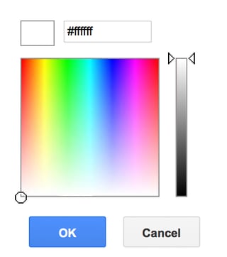
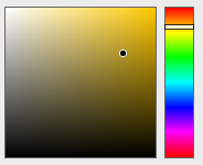
#1: Square Color Picker
enter image description here

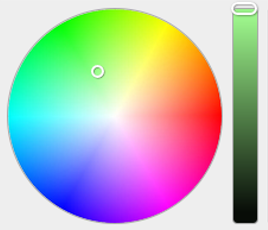
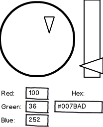
#2: Color Wheel Color Picker
enter image description here

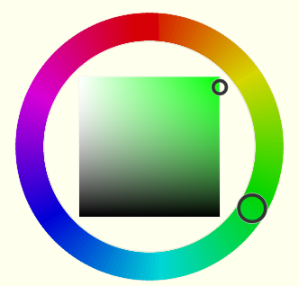
#3: Color Wheel - Square Color Picker
enter image description here

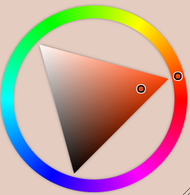
#4: Color Wheel - Triangle Color Picker
enter image description here

10
  • 1
    If your users are largely familiar with a picker, you should have a design that matches that picker. For example, if most are Photoshop users, use a picker similar to Photoshop, and if most are web devs using Chrome's dev tools picker, use that.
    – Jonathan
    Commented Dec 16, 2015 at 15:13
  • 15
    Are you sure you need the full range of colors? I'm not sure what your use case is, but I think that most use cases can live with a much smaller subset of colors, and that would allow for a much simpler UI. Commented Dec 16, 2015 at 15:55
  • 6
    I would argue that users don't want or need that many choices to begin with. They'll be happy to choose between 12 colors, not 16 million. Commented Dec 16, 2015 at 16:30
  • 3
    Don't forget the mspaint-style one, with a rectangle with hue and saturation(?), and a separate lightness control. Commented Dec 17, 2015 at 3:51
  • 1
    Fwiw, personally I always find option 2 to suit me best. Pick the hue at a glance then adjust the intensity. Usually I'm looking for a color and the brightness is just a secondary tweak. I'd definitely add RGB or HSV text fields though so if a user already knows what color they are looking for they don't have to hunt for it. Options 3 and 4 have always confused me.
    – Jason C
    Commented Dec 17, 2015 at 15:19

8 Answers 8

88

Basic users first

I assume this isn't a color theory app. If this is intended to support quick color selection with a sub-set of power users, a hybrid palette chooser / builder will work well.

Make ‘easy’ easy

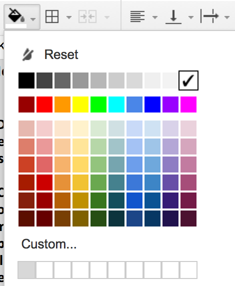
Start with a palette-based chooser with reasonably sized swatches that simplifies the user's job of making a fast selection. Google has done a good job with this in Docs.

Simple color swatch chooser

This design benefits from three key features:

  1. A reasonably broad but not overwhelming selection.

  2. Thoughtful organization of options.

    1. Greyscale
    2. Bright colors
    3. Value range of the bright colors
  3. A customizable section for advanced users.

That last point accommodates more particular users who are ready to put in effort with your controls to get the palette they want.

One point of contention ...

For the record, I think Google's base colors (the second swatch row) are useless. How many of these would you actually want in your documents without modification? Here's a quick stab at how I'd change the base color selections. It's subtle, but I think the difference is meaningful in use.

A new set of base color swatches

Make ‘hard’ possible

You can't possibly anticipate every possible color a user may want, but you're on the right track with trying to support them. The familiar pattern (a clickable region to one side and a slider to the other) can take different forms, for better or worse.

Google gets this wrong.

The advanced picker model they chose lacks precision without improving usability. By using the main "stage" for hue and saturation, color selections are constrained into narrow vertical columns. Value on it's own requires very little precision but claims total ownership of the fine-grained slider control.
Highly scientific conclusion: I don't like it.

Google's advanced color picker

A better way

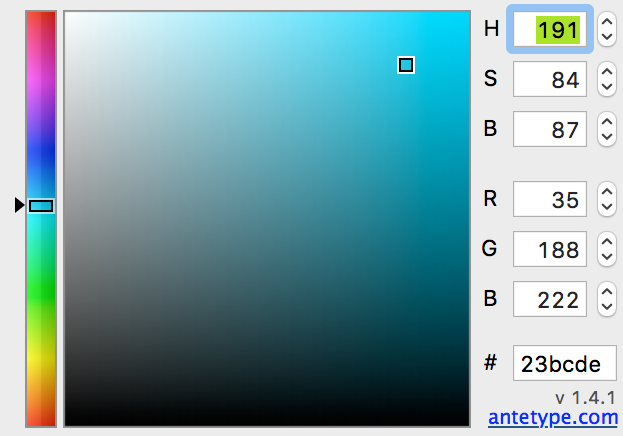
Dedicating the slider to hue, users can easily get to the general color they're after. The main stage is then available to fine tune saturation and value, easily creating subtle variation. This example comes from an OSX color picker plug-in I have installed on my Macs (with some modification).
Highly scientific conclusion: Mo betta.

Modified Antetype color picker for Mac OSX

Credit to @dberm22 for the insightful observation that this model should have the hue selector first to the left of the main stage. This creates a logical progression from the broad task (find the color), to the detailed (manipulate value and saturation), to the advanced (tweak or copy the numbers).

Also consider where your color values start when entering the creation state. Some pickers start with value and saturation at 0 (black) which results in a hue slider that appears to have no impact on the swatch. Starting with value and saturation somewhere in the upper right quadrant is likely to be closer to what the user wants.

Remember the user’s hard work

However you format the control, make sure you store custom colors for users that take the time to generate them. Then they'll have a swatch library of their own over time and love your product even more!

Credit for the "easy is easy, hard is possible" philosophy goes to Larry Wall, creator of the Perl programming language.

18
  • 2
    The Mac/antetype (Mo betta) chooser fixes the above issue, but I would argue that the hue slider should be on the left since it would generally be the first thing the user adjusts.
    – dberm22
    Commented Dec 17, 2015 at 13:27
  • 1
    Personally, as an advanced user, I strongly dislike the "custom color" -> "color picker" two-step approach. It always annoys me that I have to click a color switch, define the color, then select the swatch again when picking a color. But a color picker with a "recently selected color" selection, on the other hand, nice and smooth.
    – Jason C
    Commented Dec 17, 2015 at 15:21
  • 1
    @dberm22 That's a great point about the hue slider! It really is the logical (if not typical) order of things. I'll have to update the screen shot in the hope that our discussion may impact the state of color pickers for all! Commented Dec 17, 2015 at 17:19
  • 1
    @plainclothes Thanks for the answer! Am I aloud to copy, is it legal to copy the colors from the color palette and use it for my website?
    – Steve
    Commented Feb 2, 2016 at 1:34
  • 1
    @plainclothes I only want the colors. So you're saying google would allow me to do that?
    – Steve
    Commented Feb 2, 2016 at 3:20
29

I'm not sure there's any objective answer to this one, because it'll depend too much on the demographics of your clients. I'll give my subjective two cents though!

If they're not graphic designers or extremely tech-savvy, I'd want to go for the most intuitive solution, which to me is the second one. In my mind, the thoughts of a user would probably go "I want a red, maybe dark" , not "I want a dark colour, maybe red", so Colour > Shade works better for me than Shade > Colour or any of the circular ones in 3 or 4. Note that this relies on a left-to-right reading style to make sense to the user and may not work in right-to-left layouts like you'd find in Hebrew, for instance.

This reasoning may not be true, however - especially if you're picking text on a white background and you must choose a dark colour. If so, maybe horizontally flip the first one?

Additionally, I'd recommend having a bar for entering in hex codes. If you do know exactly what colour you want, it can be frustrating having to slide a selector around a large area when you could just type it in. Something like this:

mockup

download bmml source – Wireframes created with Balsamiq Mockups

Updating the graphical element updates the text immediately, and vice versa. This also is more accessible to people who can't click and drag easily, or have troubles with vision.

13
  • 4
    While I agree that most users would likely want to pick a hue (e.g. green) first, and then maybe tint or shade it down, I don't see how that makes the second color picker better than the others. On the contrary, the second design mixes the hue and tint into the same color wheel, so that if the user decides, say, that they want this green, but a little lighter, they'll have to guesstimate where on the wheel that will be and try aim their mouse carefully to avoid changing the hue too. The last two designs seem a lot more usable to me in that respect. (They're also direction-neutral.) Commented Dec 16, 2015 at 4:21
  • 3
    Yeah, but the slider in the second color picker only goes darker; you can't use it to lighten a color, or tone it with gray. Commented Dec 16, 2015 at 5:24
  • 1
    @Toothbrush A lot of people don't know what hexadecimal notation means, and transforming between hex and RBG is difficult even if you are used to it.
    – Darkhogg
    Commented Dec 16, 2015 at 12:16
  • 1
    @Darkhogg True. That's why I suggested providing HSL/V values instead of RGB, and everyone is happy: those who know RGB HEX can use that, and everyone else uses HSL/V. If you know RGB in decimal, then it would be safe to assume you know it in hexadecimal (in most cases; the Windows colour picker does not give the RGB colour in hexadecimal, but it does give it in HSL).
    – Toothbrush
    Commented Dec 16, 2015 at 20:16
  • 1
    #007BAD? What do you have against James Bond?!
    – corsiKa
    Commented Dec 19, 2015 at 16:57
20

All the color pickers you list are based on variations of the HSL / HSV (hue, saturation, lightness / value) color representations. Thus, their main differences are not in color theory, but simply in the placement and shape of the controls.

That said, the second color picker in your list has one major disadvantage compared to the others: it doesn't have the hue axis separate from the others. Whereas all the other interfaces allow you to first choose a specific hue and then pick different tints and shades of that hue without affecting the base hue, the second color picker combines the saturation and the hue axes in the same color wheel, so that clicking the wheel will alter both the saturation and the hue.

Thus, trying to tint a color while maintaining the hue becomes a tricky exercise in visual acuity and hand-eye-mouse coordination. Since tinting and shading is a very common thing to do when working with colors and graphics, this could easily get very frustrating.

The first color picker in your list does have a separate hue axis, but it's compressed into a fairly small space, making it hard to accurately pick a specific desired hue just by clicking the range. It also fails to visually represent the circular nature of the hue axis, introducing an arbitrary discontinuity in the red part of the spectrum. Thus, I'd rate it as the second worst of the lot.

The last two color pickers are very similar in appearance and usability. I'd personally consider the last one a bit more natural and elegant, since the tint/shade space is fundamentally triangular in nature (consisting of combinations of three "pure" shades: black, white, and the pure saturated hue). That said, I don't see a practical usability difference between them.

Thus, I'd personally rate your color pickers in the following order: #4 (best), #3 (almost equal to #4), #1, #2 (worst).


Finally, I'd like to note that all the color pickers you've shown share a common flaw: since the HSL / HSV color models they're based on are simple reparametrizations of the RGB color space, which is not perceptually uniform, changing the hue affects the perceived lightness of the color. (You can easily see this by looking at the color wheels: the blue parts look a lot darker than the green and yellow parts.) Thus, while most of them make it easy to pick different tints and shades of the same hue, the converse — changing the hue of a color while maintaining the same perceived lightness and saturation — is quite difficult.

Alas, I'm not aware of any commonly used color picker designs that would avoid this issue, and there are some fundamental difficulties involved: if you e.g. start by picking a bright green color, and then try to change the hue to, say, blue, you'll find that it's not possible without either tinting or shading the color — a normal RGB monitor just can't produce a saturated blue with the same brightness as a saturated green, nor can standard RGB color spaces represent one. Thus, some kind of a compromise would have to be made in such cases.

3
  • Thanks for the answer! I think @A. Sim is pretty accurate about what he said in the second paragraph. What do you think about that? Also, with whichever design I go with, I do plan on having a slider for rgb, hsv etc.
    – Steve
    Commented Dec 16, 2015 at 4:16
  • Replied below A. Sim's answer, since I feel it belongs there. Commented Dec 16, 2015 at 4:23
  • My personal opinion: I shudder when I see #4 as it doesn't map to my mindset; I don't know if I should/could rotate the triangle. Option #1 makes it pretty obvious that I pick a color from the "rainbow" on the right, then fine-tune lightness/darkness from the middle. And I also like the ability of text box inputs at the bottom mentioned by @plainclothes for folks who know what RGB or HSV values to use if they have a design standard to match. Commented Dec 17, 2015 at 18:28
14

@DavidGrinberg has a good point about most users not caring about having more than a small number of colors to choose from. However you can cater to both that group and people who want more choices with an interface supporting progressive enhancement.

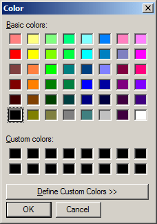
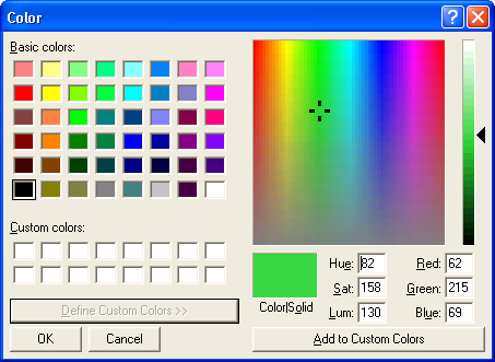
Microsoft's provided one with Windows for many years. I had trouble finding newer screenshots in English; but the look and feel is the same at least through W7. For a greenfield design I'd probably reduce the total number or standard colors and hide the custom colors section on the small version unless the user had already defined at least one custom color.

http://www.functionx.com/dlgboxes/color1.gif

enter image description here

2
  • 5
    How I miss those color pickers.
    – Insane
    Commented Dec 18, 2015 at 5:55
  • The only improvement I'd make is the ability to enter HEX and HSM colors as a single string instead of separate values but this was a pretty solid effort by the Microsoft team! Commented Dec 20, 2015 at 19:21
6

If the user can select different colours for different elements, consider giving them a list of pre-defined palettes to choose from instead - reduces fiddly user interaction and the possibility of migraine inducing yellow and purple colour schemes

http://colorbrewer2.org/# ColorBrewer has such a list of palettes, in this case specifically for data visualisation, but there'll be others out there if these aren't suitable

1
  • 2
    I agree themes / palettes is a good option, but this is only the 80% solution (well, closer to 95% percent, but 'the 95% solution' is not a saying). There are always those users, like myself, that are not completely satisfied with the default themes and feel the need to customize it to perfection. For these users, you still should have a color chooser. However, this changes your demographic, and the style of chooser would also change.
    – dberm22
    Commented Dec 17, 2015 at 13:48
5

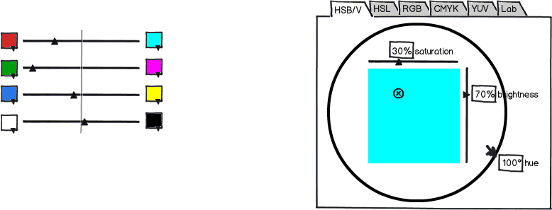
Here are two ideas that are not complete proposals, just very rough sketches.

mockup

download bmml source – Wireframes created with Balsamiq Mockups

Left mockup

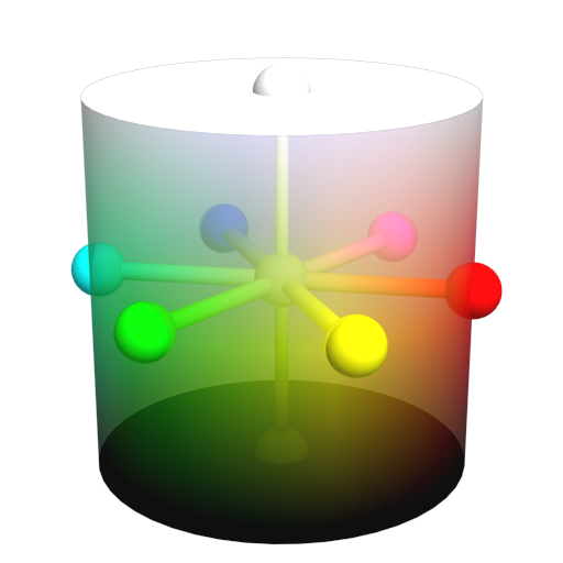
A hue-saturation-lightness/brightness/value/intensity/… representation of an RGB color space cube results in either (typically) a cylinder, a “hexalinder” (prism/cylinder with hexagon base), a hexagonal bipyramid or a sphere. For both kinds of bases, a disc or a hexagon, the plain coordinates can be specified by a combination of the red–cyan, green–magenta and blue–yellow axes. (It’s a flattened cube.) This combines angular hue and the radial saturation. The brightness, lightness or value, i.e. the height, is specified by the white–black axis.

HSL cylinder

Right mockup

Many HSB/HSL/HSV/HSI pickers don’t make the connection between visual selection and numeric values obvious. This sketch tries to show a way how this could be achieved.

Remember that this is an input widget so the output/export values are of secondary concern. Still, some people will want to start with a color that they know some numeric representation of: That’s what the tabs and numeric inputs are for and pasting would also work, of course.

2
  • This is a great solution for color theory aware users (like a pro-level design application). It's a very similar approach to the palette creation tools I've used over the years. But that's a complicated presentation for anyone else. Commented Dec 22, 2015 at 17:44
  • Nice cylinder solution. I suspect it would be hard as hell to choose the right color there, but nonetheless upvoting for creativity.
    – Zoe K
    Commented Dec 22, 2015 at 17:59
5

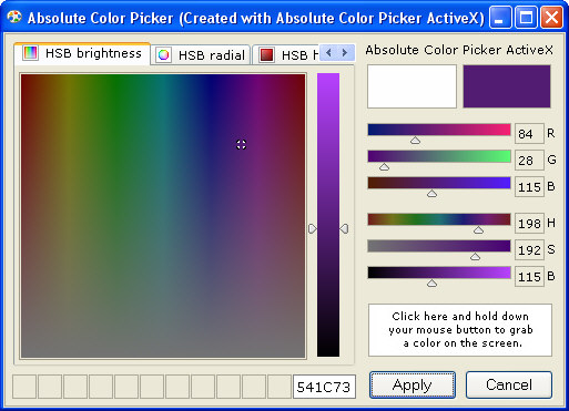
Several answers here propose pickers with separate numeric controls for RGB/HSL. These controls are good to have, but not very visual and require some trial-and-error to operate. Below is a picture with dual-mode visual+numeric controls for RGB/HSL depicted on the right.

When you operate one of the sliders, the gradient on the others should change. This gives six dimensions of visual support for changing the color, as opposed to one or two in other pickers (the pickers generally have three dimensions, but only one or two of them are painted with the color being operated).

You can include them with any other picker type, space permitting, but it might work best with some sort of palette and a list of recently picked colors.

Absolute Color Picker example
(source: eltima.com)

3
  • I like this approach for a power user's palette builder, but that's a lot to take in for an average user who just wants to pick a nice color. Commented Dec 18, 2015 at 17:39
  • The brightness slider B appears twice, though, once horizontal and once vertical.
    – Crissov
    Commented Dec 22, 2015 at 15:02
  • @Crissov Yep. As you can see on screenshots, sometimes there is no vertical bar and sometimes there are one or two. Not sure why they are there, probably they belong to "any color picker" part of "any color picker + extra controls". Commented Dec 22, 2015 at 18:10
3

enter image description hereenter image description here

Not complete as it is lacking the ability to use hex, enter the channels separately and also to remember colors.

It has :

  • Large stripes for better selection
  • One for hues
  • One for a gradient towards gray, varying saturation
  • One for a gradient between white and black, varying value
  • A large field to preview
  • The option to vary the stroke color toward the background color
  • A reset to black&white button

It is rather slim, so not really a Color Dialog but a Color Picker Tool.

3
  • Why is the hue spectrum split at the yellows instead of the reds? That looks so weird.
    – Keavon
    Commented Dec 19, 2015 at 8:12
  • 1
    It is unusual but I felt that the split between yellow-green and yellow-orange is the most important one. I guess I could make the spectrum moveable..and obviously making it zoomable would be nice as well, as long as it is simple to recognize..
    – TaW
    Commented Dec 19, 2015 at 8:54
  • 1
    That's an interesting idea, maybe the spectrum could be dragged up/down and the center is the selected part. But that's probably pretty counter-intuitive. But I do like the zoom idea for increased accuracy! That would also be useful on a standard hue and square saturation/brightness picker, perhaps with the scroll wheel.
    – Keavon
    Commented Dec 19, 2015 at 9:27

Your Answer

By clicking “Post Your Answer”, you agree to our terms of service and acknowledge you have read our privacy policy.

Not the answer you're looking for? Browse other questions tagged or ask your own question.