Well, if you don't feel the need, than you could simply not do it.
Pros
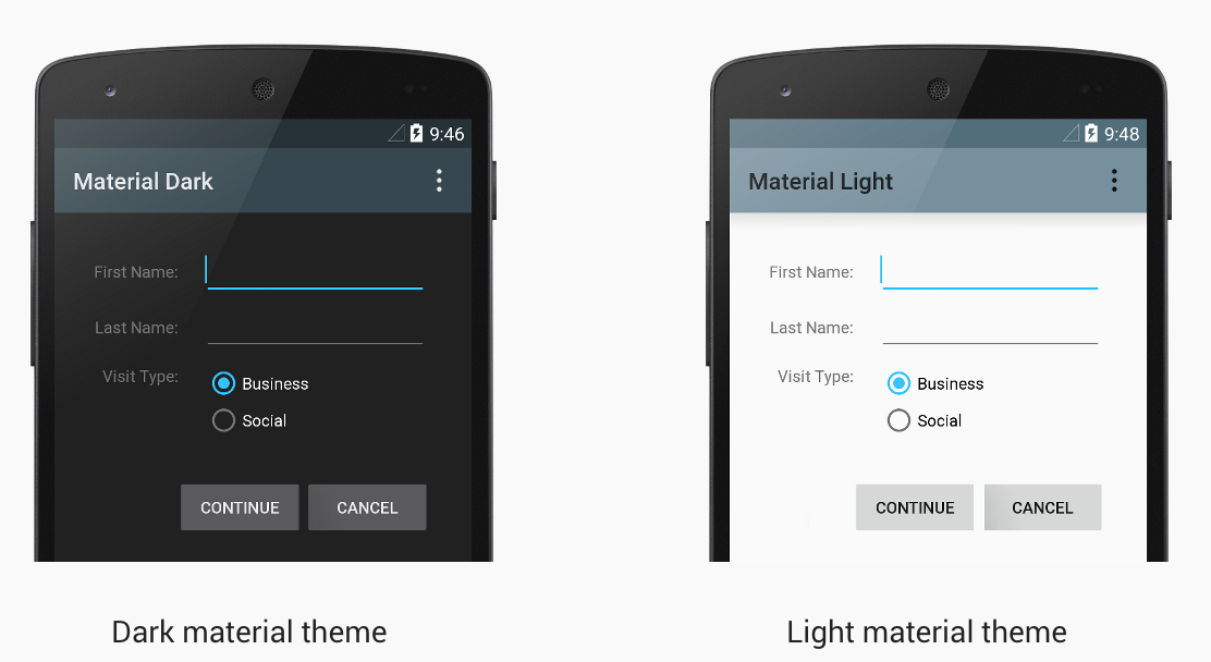
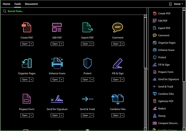
Functional usages are to make it darker, this is especially interesting in dark rooms where a "white" interface will blind you. We do this, for instance, in control rooms for cinema projectors.

Another usage could also be to get unification and branding, in which you'll follow your own design guidelines, e.g. Google's material design
It could also be to improve accesibility, like providing bigger icons and text, better contrasts, ...

It could also be used to "hide the flaws" of an application, as beautiful themes can eleviate the pain of bad usability. The opposite is probably more true: Ugly apps with bad usability will be bashed upon more than apps that have just a good usability; thus try and provide both.
Cons
Reasons not do do it include the simple fact that most users are accustomed to a certain way things look and behave on their favorite devices, changing that could lead to confusion and should thus only be done if you know what you're doing. More often than not, you'll find some "styled" app that is actually hard to use because of this.
Just as you can increase accesibility, you could decrease it (which could be potentially dangerous) as some styles will be hard to read for people with certain disablities (e.g. colorblind people). Most OSes have improved accesibility modes, but if you start overriding these, those will not be applied (unless you inherit these colours).

Conclusion
There is no one answer to help figure that out, as it depends on multiple factors, some of which I've discussed here. Like I said, if you don't see a very need to break an OS convention, I'd reconsider leaving it alone.
sources:

