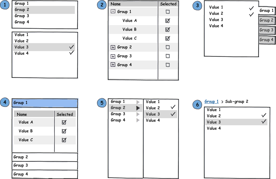
In theory, using an accordion to minimize screen height of search filters is a good idea, but it seems that our target users completely overlook it.
So, we end up with users that are unaware of the content because they don't recognize the pattern (users are between 30-50 teachers, not tech-savvy at all). It means they would have to go through alot of results to find what they really want (very poor experience).
Any idea?
This could be an alternative (no accordion), but once it hits mobile width, we hit a wall with the disciplines because width is now problematic (original version was radio buttons instead of dropdown list).

This is with a sub list element selected. As you can see, once it would resize to mobile with, it would be way too large. By staking the two, we loose the relation between the two lists (the second being a sort of 'child' element).


