8

Does anyone have any advice or examples of what to do with a progress bar that exceeds 100%.

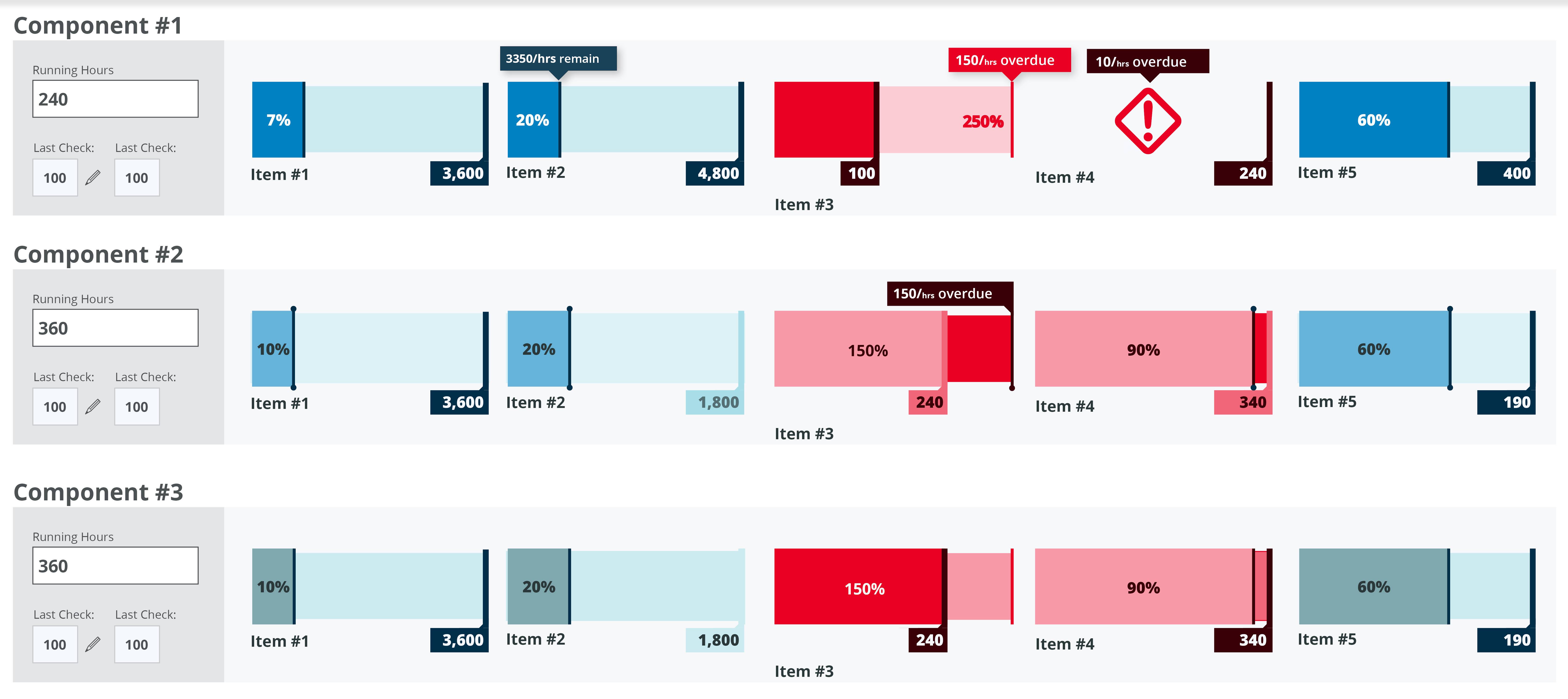
I am working on a progress bar to indicate the status of an item. At 100% a deficiency is created for someone to take action with the item. Because the items are time sensitive we must show how far over 100% the item has gone.

What would be the best way to display this information?

enter image description here

This mockup maybe confusing because I was exploring styling options.

5
  • The situation you describe is not very clear, if you can explain it in more detail, may be use an example, it would help to give you an answer.
    – PatomaS
    Commented Apr 3, 2014 at 0:46
  • Yeah, its hard to explain. I'll upload an image hopefully that will help. Commented Apr 3, 2014 at 6:02
  • Yes, I'd definitely would go for a change after the 100% mark, that would break the stability of the design and call for the user attention. I added a few more options and comments on my answer based on your screenshot.
    – PatomaS
    Commented Apr 3, 2014 at 6:18
  • It's worth noting that if by default your UI accommodates out-of-range values, your Users might be (however subconsciously) encouraged to wait until an item has entered the most prominent visual area (ie. out-of-range) before dealing with it. Unless this is intended behavior it would be advisable to "punish" the User, or otherwise reflect that something has "gone wrong" rather than create a UI such that these incidents are "baked-in" to the system.
    – Richard D
    Commented Apr 3, 2014 at 13:10
  • 1
    Most video games simply start filling the bar over again from the left with a new color, though this is generally the case when "100%" is basically "one level" of an item and multiple "levels" are supposed to happen
    – Zelda
    Commented Apr 3, 2014 at 13:14

8 Answers 8

8

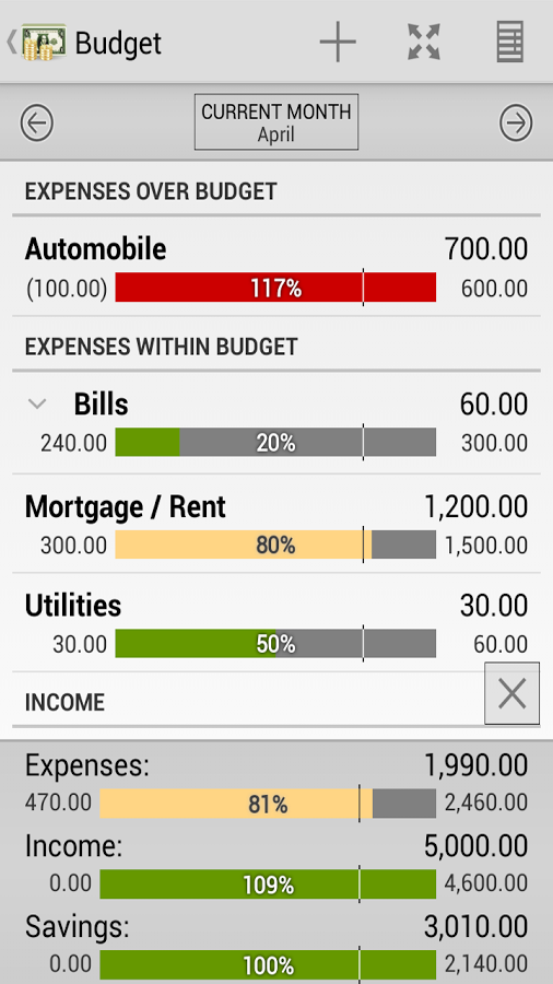
The same situation is when you display values off the scale. In most cases the most important thing is to show the user that the values are exceeded. Usually exceeded values aren't represented proportionally to the columns lenght. You could see how the problem is handle by personal finance apps, which have budgets functions - in these apps we need to communiacte user that the budget is exceeded.

enter image description here

3

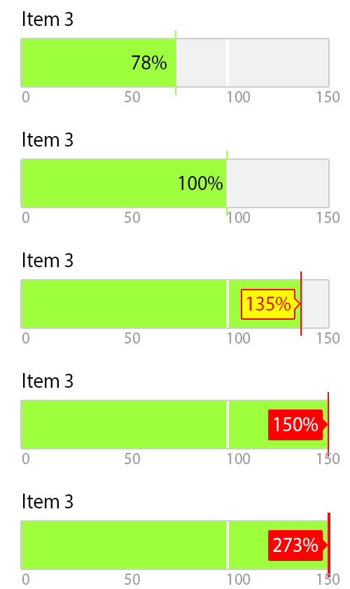
This is what was inside my mind right now, maybe it isn't up to marks:

enter image description here

  1. Set a Bar Chart range to 0% to 150% (you can change the max number as you wish)
  2. Anything <=100% will be display in normal way.
  3. Anything >100% to <=150%, the data label background will be display in yellow color.
  4. Anything >150%, the data label background will be display in red color.

The reason behind this proposed 150% max value is because the data can be any number of percentage, even 1270%. Without the limit, there is a risk of that bar chart being render as one long bar, and make it not uniform with others bar chart around it.

Since generally the purposes of dashboard is to able the user to understand the information at one glance, we will set the max value up to 150% (...and it's up to you how far you want to put the limit) to make all bar chart in uniform size. Anything beyond 150% we consider as abnormal.

So if the user seeing any figure in solid red background, they know this bar need some extra attention to it.

1
  • Nicely done! The 100% limit mark should be differently aligned like that. Commented Apr 19, 2018 at 8:46
1

The situation is not very clear, but still, since there is not more than 100% because after that what happens is a change of status, you should change the design.

Use the progress bar up to a 100%, and after that, replace the bar with an icon or a text, something that is relevant and understandable for your users and that transmits the idea that you want to show.

If anybody can interact with the item before 100% but not after, add a text indicating that.

The icon or text that would be after the 100% mark can also have a standard progression of colours, like green, yellow, orange and red to indicate relevance or urgency; although that is something that you have to judge.

After using colours, if still necessary, you can add a blinking effect, but I'd say that if a process passes thought than many changes unattended then it's not very important, there is nobody to take action or the measurement system is flawed.

Another option, is to reduce intensity of the other progress bars, reduce the saturation or add an alpha effect that reduces visibility, but still allows the data to be read, that way, you intensify the relevance of the one that has passed the 100% but the others are still visible.
1

One suggestion would be to have 2 designs: in-range (0-100) (eg. green) and out-of-range (100-200) (eg. red)

When the item is in-range, display one style meter.

Once the item reaches 100% replace the in-range meter with the out-of-range one.

Ensure your out-of-range meter is significantly different from your in-range meter and you will be able to communicate this information in an efficient use of space.

1

In "real life", pressure gauges, temperature gauges and "rpm meters" often have a indicator for a limit which should not be exceeded. Often, the unit of measurement will be the "native unit" (degrees temperature, psi, pascals, revs per minute), but sometimes they are also carry percentages (I have encountered one voltmeter which has markings of 80%, 100% and 120% - anything below 80% and above 120% was apparently so far out of the question that no markings exist).

Typically, anything above the rated 100% figure has a red sector or arc, so the user can easily see when the needle gets past the red line.

The concept of "redlining" (or, rather, avoiding redlining) should be familiar to most car drivers.

A round gauge (like the rpm meter in a car) will have a hard stop at some point; the needle won't go over, let's say 130% or so. A temperature gauge in a car will often be designed that 100% is in the center, so it could go (visually) up to 200%. An analog/digital combination can be used to give the quick visual reading of below/above 100%, with the increased accuracy and range of a digital readout.

1

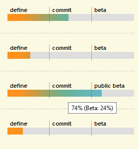
The Area51 for staging new Stack Exchange sites has some progress bars that may be relevant.

enter image description here

A site in staging goes through three phases - definition, commitment and beta. Each phases has it's own progress - a set of metrics and goals to be met. So each phase has a progress between 0 and 100%. After 100% in a phase is reached, the site moves into the next phase - so progress continues. The overall state is combined into a single progress bar which looks like a single bar where 'complete' means progress reached 100% in all three phases.

It seems that the question also talks of different phases. All you need to do is define the metrics for each phase, and how many phases you require.

For example (imaginary):

  • Phase 1: a numerical goal based (% of quota)
  • Phase 2: a numeric or log based percentage over-reach before it becomes critical / escalated to phase 3
  • Phase 3: a time based percentage (% of how long an item is allowed to be critical for)
1

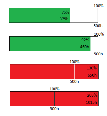
My suggestion...enter image description here

If it needs explaining, it's not good enough :)

0

Is a progress bar the best way to represent this data? How far past 100% can the values go? Is it infite or fixed.

If the potential post-100% value is not infinite then I would suggest extending the progress bar tick-marks or indicator outside of the original bar and change the color to indicate that it has surpassed the allowed time.

Here is a quick mock-up:

progress bar moc-up

1
  • How far the progress has gone past 100% can vary depending on the threshold set for an item. We don't have any actual data yet but it could go higher than 200% in some cases. The progress bar must live inside a fixed container(we want to have about 5 on each row). The problem with this approach is that it either: a)Condenses the information and creates a lot of wasted space or b)As it exceeds 100% thresholds shift which making it confusing for the user to judge what 100% actually means. Commented Apr 3, 2014 at 5:35

Your Answer

By clicking “Post Your Answer”, you agree to our terms of service and acknowledge you have read our privacy policy.

Not the answer you're looking for? Browse other questions tagged or ask your own question.