Should we add red asterisk before or after the label of required fields, i.e., to the left or the right of the field name? My boss prefers to add the asterisk before the labels, but I like to add them at the end. Which is more user-friendly?
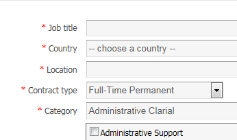
Should we add red asterisk before or after the label of required fields, i.e., to the left or the right of the field name? My boss prefers to add the asterisk before the labels, but I like to add them at the end. Which is more user-friendly?

I've never actually conducted any research, but I don't imagine it will matter so long as it's consistent, and the opposite side to that you dock your labels to. If you align field labels to the right and right-align your asterisks, you'll create an odd-looking ragged effect.
Apart from that, I'm not convinced it matters. Some might suggest otherwise by claiming it's better to read the asterisk first, but I'm not convinced that users' eyes will read text in order, rather than locking to points of interest (which seems a more accurate representation of how human reading actually works).
It depends a bit on which side you align your labels to. Reading into the eye-tracking research, I would suggest placing the markers along the line of fixation ... which for right-aligned labels would put them after the labels.
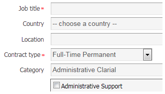
However, you don't want the field required markers to bump the labels such that you get a ragged edge, like this:
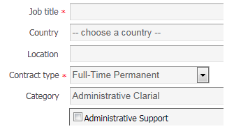
That said, you could instead do the following, which is neater:
For left aligned labels I would place them to the right of the labels .. but aligned to the fields themselves. This way the user can easily scan through the form looking for any required fields they haven't completed yet:
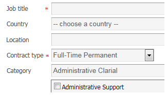
<img> elements (with @title="required" for accessibility bonus), or a CSS background (and just the padding for optional fields), or go old school with <table> (please don't).
I believe the most visible and easy-to-scan position for an asterisk or other indicator of a required field is to the right of the field, rather than the label.
Using red or just an asterisk is not as effective as bolding required fields.
Better practice for 508 compliance (not relying on color), and an asterisk alone is hard to see on a screen.