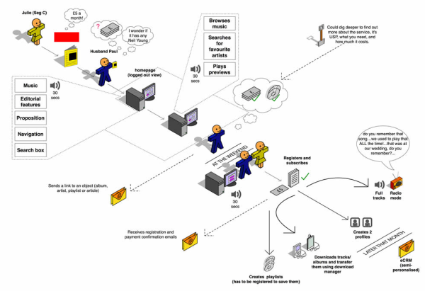
Where appropriate - I've often liked the infographic 3D style user journeys as they really key into the visuals and real world perception - see example on Wireframes Magazine and also linked article An introduction to user journeys on Boxes and Arrows.

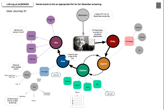
I also love this snapshot on flikr by user tgod from the LUX redesign project (not sure if I should really be including the image here) - it's clean, simple, but presents (and therefore identifies visually with) the persona, illustrates the flow nicely, uses colour themed stages, utilizes intensity of colour for an added dimension, and with thought bubbles where relevant - a really nice example!

Both these examples are good alternatives to the more common rather dull and boxy flow chart style presentations that clients especially have a hard time digesting (and the rest of the team for that matter). These examples are both useful, engaging and, more importantly, likely to be read.
Both these were created with omnigraffle, but you could use Inkscape (free), Illustrator or similar for equally scalable quality output.

