7

I've built this BBC feed which people find nicely styled (please ignore the animation glitch - I'm working on it!). However, people have been telling me (and I've felt it also) that the colors hurt their eyes.

Do you think it's the colors that are the problem? How can I make the feed more "gentle" on the eyes?

7
  • The colors of the black background where the default content is? Other than that it looks fine. Commented Oct 31, 2011 at 17:37
  • 1
    The red is a bit harsh, always use red sparingly and try to avoid super saturated reds.
    – Zelda
    Commented Oct 31, 2011 at 18:21
  • The only red I am seeing is in the code and used for strings. The red used for these purposes is a subdued red. Is there something I am not seeing? Commented Oct 31, 2011 at 18:39
  • @MattRockwell It's in the Javascript not the CSS unfortunately
    – Zelda
    Commented Oct 31, 2011 at 18:47
  • Then I guess it doesn't show up at all for me, in Firefox and IE9. That might be worth looking into. The "black" area is just black with white text that reads "BBC" Commented Oct 31, 2011 at 19:08

7 Answers 7

36

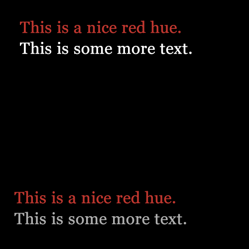
In and of themselves the colors are fine; I think it's the particular combination of colors that you are using. The red rgb(192, 55, 47) is at 46% luminance, and your eyes will adjust to that accordingly; but the white text is 100% luminance, which requires your eyes to adjust slightly. On bright enough monitors, it can actually be kind of jarring, although I wouldn't say it's all that bad. If you want to stick with a black background, I would probably just dial down the white a bit, somewhere between 46% and 78% luminance, depending on your audience.

enter image description here
This is 68% luminance. Note that the red text used is all the same color.

1
  • 2
    interesting - that second option is noticably easier to read. nice example.
    – Jon White
    Commented Nov 27, 2011 at 6:35
10

If there's one problem with the design, it's that it's Loud. I don't just mean the colors. The fonts, the transitions and the gradients are all very bold and cross into flashy.

I took the liberty of forking your JS Fiddle, here's my fiddle. enter image description here
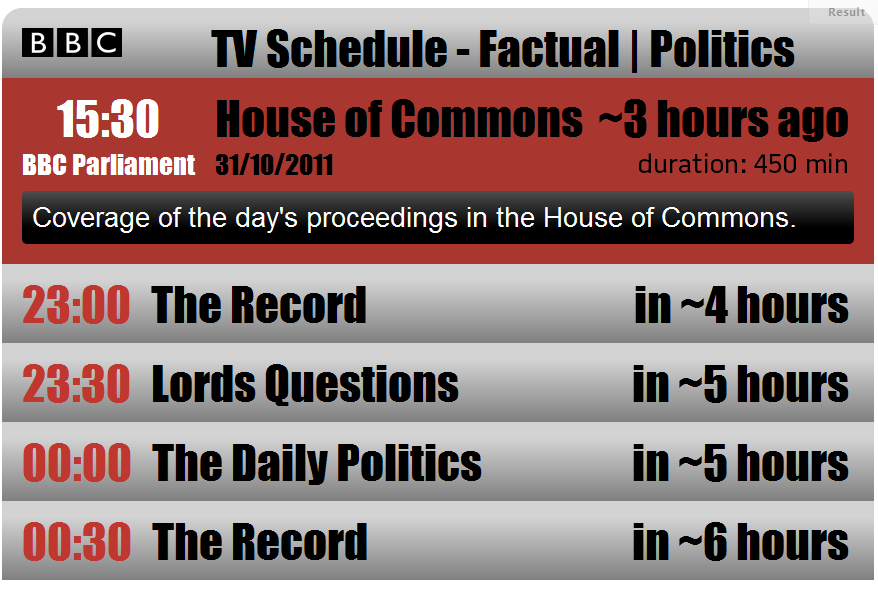
In addition I noticed your font didn't anti-alias well on chrome so I replaced it with Impact in my fiddle; Impact is certainly loud but it displays a bit more smoothly and I think it's quite a bit easier on the eyes. I changed the synopsis font to Helvetica, anything more than a headline should be a simple, non-bold easy to read font, IMO Battersea doesn't cut it even for a relatively short chunk, but part of that may just be because of how it looks in Chrome.

I made the red less saturated; it's not quite BBC red and I'm not 100% happy with it but I think it shows that red can be used in the same place without being so hard on the eyes. I killed the gradient on that background; not everything needs a gradient, just consider that.

I personally found the transition effect very bothersome but there was no easy way to tinker with it. The shrink AND slide is just a bit much IMO.

1
3

Change the background color to a dark gray ... maybe something like: #595855 and see if that helps.

3

I think it is clearly a problem with the combinations. White on black is harsh on the eyes. Red is often harsh, especially against black or white. I think if you were to make the background less black and the white less white - that is, take the intensity down in both cases - you would be fine.

Overall, as per @stoicfury, I think the red is probably OK, but you need to adjust some of the other colours around this to ease the contrasts. It is one of those oddities that both low and high contrast between text and background are hard to read. The need is to get it somewhere in the middle.

3

It's not the particular colors in this case, but the contrast. A dark background on screen with 100% white type is the hardest on the eyes of nearly any combination in terms of contrast. That's why back in the day we had amber and green type on black screens.

In your case, the solution is to decrease the contrast. The simplest option is likely to knock the white back a bit to perhaps 60-80% white (ie, light gray).

You could also consider using a sans-serif face. Serif faces on dark backgrounds don't always work as the little details of a serif face tend to become highlighted more than they need to be.

EDIT: Somehow I completely missed stoicfury's answer. That's the answer to go with!

0

I would say the red timestamp on the greybackground combined with a serif font causes the kind of sharp feeling of it. Since the font is light/thin the grey bleeds into it making it hard to focus on, thats whats causing stress on my eyes.

0

Red has high wavelength which can sharply penetrate our eyes. Even tone downed red font face in black color hurts our eyes. Along with that the white font on the complete black background is also doing their own hurts.

I would suggest you to tone down the black background into grey color as 'asuciu' mentioned and try to do the same for white font color. Leave red color as it is.

Your Answer

By clicking “Post Your Answer”, you agree to our terms of service and acknowledge you have read our privacy policy.

Not the answer you're looking for? Browse other questions tagged or ask your own question.