32

Today I started implementing a design that had some copy text with font size 17px. My fellow web developer told me that we should round that to 18px and more in general that we should not use odd font sizes. He thought this is because the text may look better.

So my question is: do text with even font size look better than odd? Or what is the reason to round odd font sizes as given by design to even in the css?

4
  • 15
    It isn't necessarily about even or odd numbers. It is about choosing a common font size that is likely to exist, and size 18 meets that criteria (as do several other even numbers, like 10 and 12). This mattered back in the days before vector fonts, when fonts were defined as bitmaps and only existed at certain sizes that had been provided. Sizes in between had to be simulated from those bitmaps by scaling, which looked ugly.
    – Cody Gray
    Commented Nov 8, 2019 at 0:15
  • 41
    I'm mildly amused by the fact that we are discussing this on a site (ux.SE) that uses 13px and 15px font sizes.
    – Bob
    Commented Nov 8, 2019 at 5:36
  • 2
    The standard font on the Microsoft Windows platform is Segoe UI, 9 pt. Commented Nov 8, 2019 at 8:00
  • Seeing how point size doesn't even strictly correlate in a systematic way to character size, or line height, or anything in particular, and that 11pt was the default text size for decades in LaTeX (even when it wasn't trivial to render glyphws at any size, with sub-point scaling and sub-pixel precision), it's in my opinion a stron indicator of obsessive -compulsive disorder.
    – Damon
    Commented Nov 9, 2019 at 11:41

4 Answers 4

23

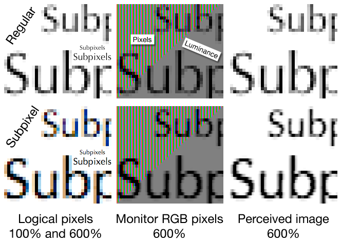
I think your fellow developer is somehow correct. To be honest, as far as I know there's no "set in stone" rule for this, so nobody is right or wrong as an absolute. However, depending on implementation, you may end with browsers rendering your font as integer numbers. Which isn't a big deal on modern screens, but some older screens will start to add subpixel rendering and therefore results might look inconsistent. See how subpixel rendering works in the image below
enter image description here

This being said, at this point we're talking of edge cases, nowadays most screens won't have any issues dealing with subpixel rendering and display will be consistent in most cases.

The convenience case

However, there's an scenario where even sizes are really useful: developing. If you define an even number , it's easier to develop based on rem or em sizes. This way, you can define a base size and then use sizes such as 2rem, 1rem, .25 rem, .5em . For example, if you use 16px as base size it's really easy to scale using rem or em knowing that they will become soemthing like 16px: 1rem ; 8px: 0.5rem ; 4px: 0.25rem and so on.

Please note that I chose 16px because its' the default and because we use 8pt vertical rhythm system as default on all our projects, but you could use any size, of course

5
  • 24
    Most monitors (be they new or old) do not themselves implement subpixel rendering; this is something that is almost always done in software, by whatever font rendering library is used by your operating system.
    – Psychonaut
    Commented Nov 8, 2019 at 9:37
  • 2
    "However, depending on implementation, you may end with browsers rendering your font as integer numbers." (emphasis mine) I'm confused by this. Don't all font sizes get rendered as integers (if you're referring to pixels sizes)?
    – paulvs
    Commented Nov 8, 2019 at 17:04
  • 1
    @Psychonaut, you are correct, but not all monitors understand the instructions sent by the software. Just try checking fonts in the same browser, same page and different screens such as VGA, LCD, Retina 2x, Retina 3x, whatever. You'll clearly see the differences. And the difference is the hardware, not the software
    – Devin
    Commented Nov 8, 2019 at 17:43
  • 4
    The first part of the answer does not answer the question - subpixel rendering will be used both for even and odd font sizes
    – Sergey
    Commented Nov 8, 2019 at 20:09
  • 11
    @Devin That's incorrect. Monitors are dumb, they only display image that source sends. A monitor is just a grid of pixels. It's only software that renders stuff. Of course Retina and regular displays look differently, but that's due to differences in physical size of pixels and their density + software deciding how to render for hardware with such parameters. Difference in rendering depends solely on software.
    – gronostaj
    Commented Nov 8, 2019 at 21:04
16

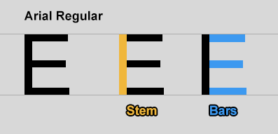
Sans fonts, which are commonly used on screens, are mostly designed to have the same thickness of stems and bars.
enter image description here

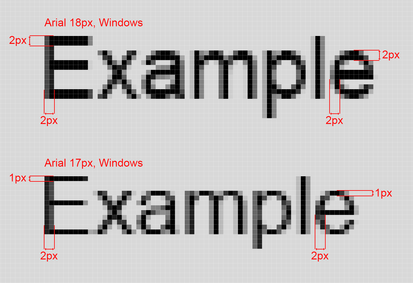
When the font size is quite small and is odd, like 17px, the font renders in a way that the bars are about 2 times thinner than stems. enter image description here

Such rendering badly represents the actual look of the font, and that's why there are recommended font sizes:

6, 8, 9, 10, 11, 12, 14, 16, 18, 24, 30, 36, 48, 60, 72 px

5
  • 1
    This is shocking! Why isn't that solved nowadays? Or maybe this font is too old to use?
    – user131683
    Commented Nov 10, 2019 at 16:54
  • This is relevant to all fonts. Professionals who work with UI know that and use recommended fonts sizes. Modern advanced AA is there to help with the other font sizes, but it doesn't always succeed. Commented Nov 10, 2019 at 22:15
  • 1
    @user131683 “Why isn't that solved nowadays?” — with higher resolution displays, it effectively is. When you're down at the level of rendering complex shapes like letters in a few pixels, the problem is always there, but we have lots more pixels now, so you'd struggle to actually see the problem when it's there. Commented Nov 11, 2019 at 9:02
  • When the font sizes get small, due to lack of enough pixels the stems and bars can be rendered in different dimensions. But it has nothing to do with even and odd. @user131683 In a well crafted type system this is solved by hinting. In the old days hinting was done manually and was resource intensive. Nowadays the fonts are auto hinted vertically (to save time) since a lot of displays have more pixels. Commented Feb 20, 2020 at 9:23
  • Why don't sizes 9 and 11 have this problem?
    – rococo
    Commented Jul 24, 2021 at 5:54
7

This is based more on a very psychological perspective (number psychology to be precise) than it has to do with designs or programming or any other thing.

Even numbers sort of has the calmness and the 'I'm not doing something awkward or out of place' feeling and has over time been been employed as the standard font sizes across various devices and platforms (even MS word has its predefined fonts in even numbers).

Odd numbers in a way have this attention seeking and 'chaotic' feeling to it and if you were designing and your font is odd, a lot of designers would round up to the nearest even number.

You could read more from a UX designer's research on the disparity here.

4
  • If you allow odd numbers in your code, sooner or later someone will add a 13. Commented Nov 8, 2019 at 8:45
  • But if even numbers are more commonly used, many font creators will probably use more time optimizing their font hinting for even sizes.
    – jpa
    Commented Nov 8, 2019 at 10:11
  • 3
    even MS word has its predefined fonts in even numbers - I'm pretty sure that my own personal aversion to odd-numbered font sizes is primarily learned from the evenness of the predefined options offered in MS products.
    – Will
    Commented Nov 8, 2019 at 11:52
  • Note that Word is displaying point sizes, not pixel sizes. Big difference.
    – Cody Gray
    Commented Nov 9, 2019 at 0:32
5

There is utterly no (general) reason why even-number sizes will look "better" than odd-number sizes. How these numbers correspond to the degree to which stroke widths and positions line up naturally on a pixel grid (vs needing ugly hinting or subpixel positioning) is completely font-dependent, and in a modern web context where px sizes are not even necessarily physical pixels, just a logical unit corresponding to historical display resolutions, also device-dependent. On high-resolution/"retina" devices, the correspondence is largely irrelevant anyway except at extreme small sizes.

However, there may be good reason to work in even increments, and even larger ones past a certain point. 13px and 14px, or even moreso 17px and 18px, are going to be difficult to distinguish visually, and using both in the same context creates a disconcerting feeling that something is "off" (likely, that someone copied and pasted text with mismatched formatting and didn't clear/fix the formatting) rather than that distinct sizes are being used intentionally.

Your Answer

By clicking “Post Your Answer”, you agree to our terms of service and acknowledge you have read our privacy policy.

Not the answer you're looking for? Browse other questions tagged or ask your own question.