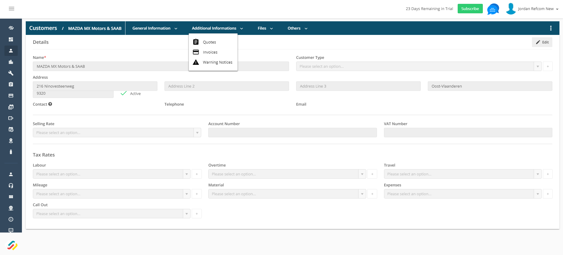
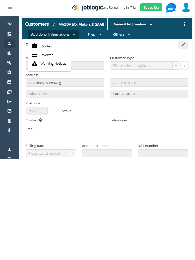
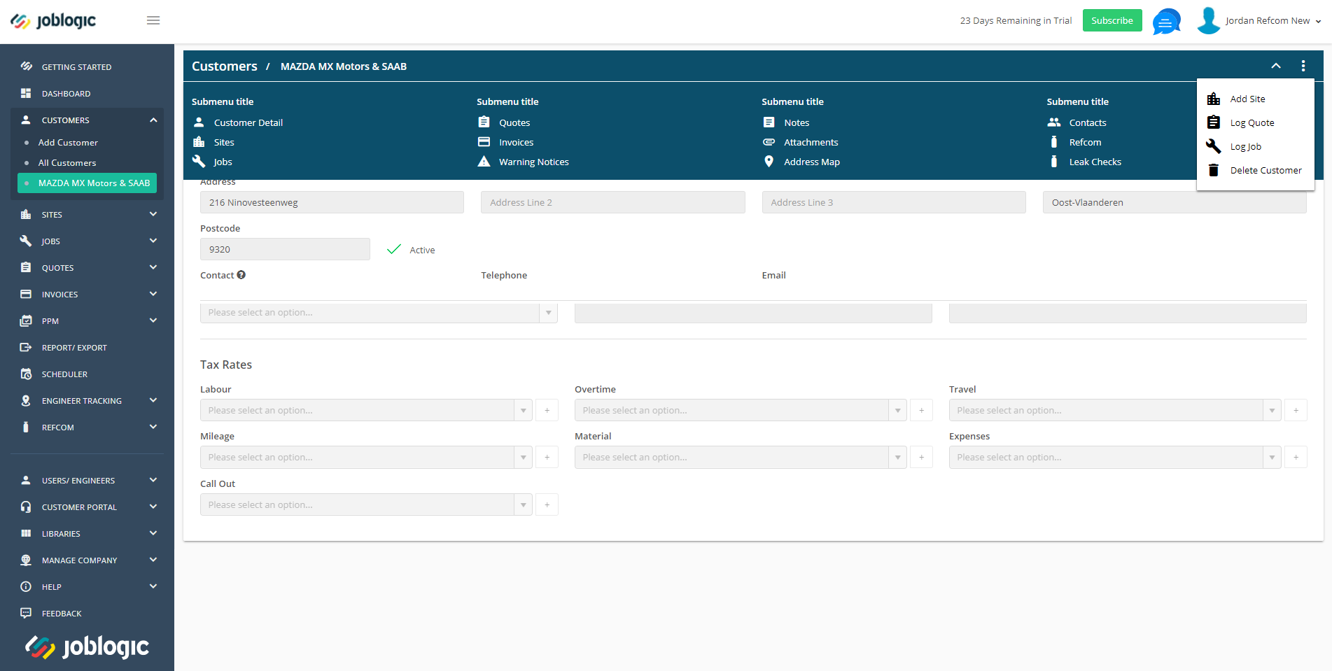
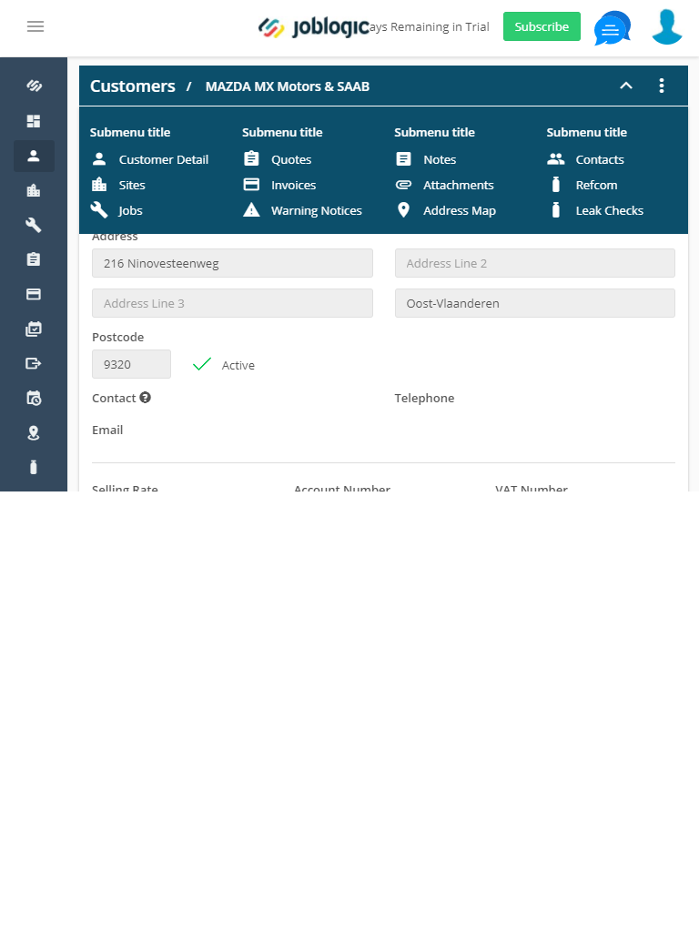
Have you considered testing it with your users? By a task-based research (e.g. checking your invoices) you could clearly determine here if there is a significant preference towards one of these.
However, a basic review would suggest option nr 1 over nr 2. Correct me if I'm wrong, but in v2 with collapsed menu, users would see initially only a blue horizontal bar with a dropdown icon. This could lead to confusion - some of the users could interpret the blue background only as a decorative element and not as a second navigation.
If our goal is to make their life easier and find their invoices quickly, option nr 1 gives them much more accurate "scent of information". It's clearly visible that there are some menu options to explore there and it will guide users to look there for what they need.


