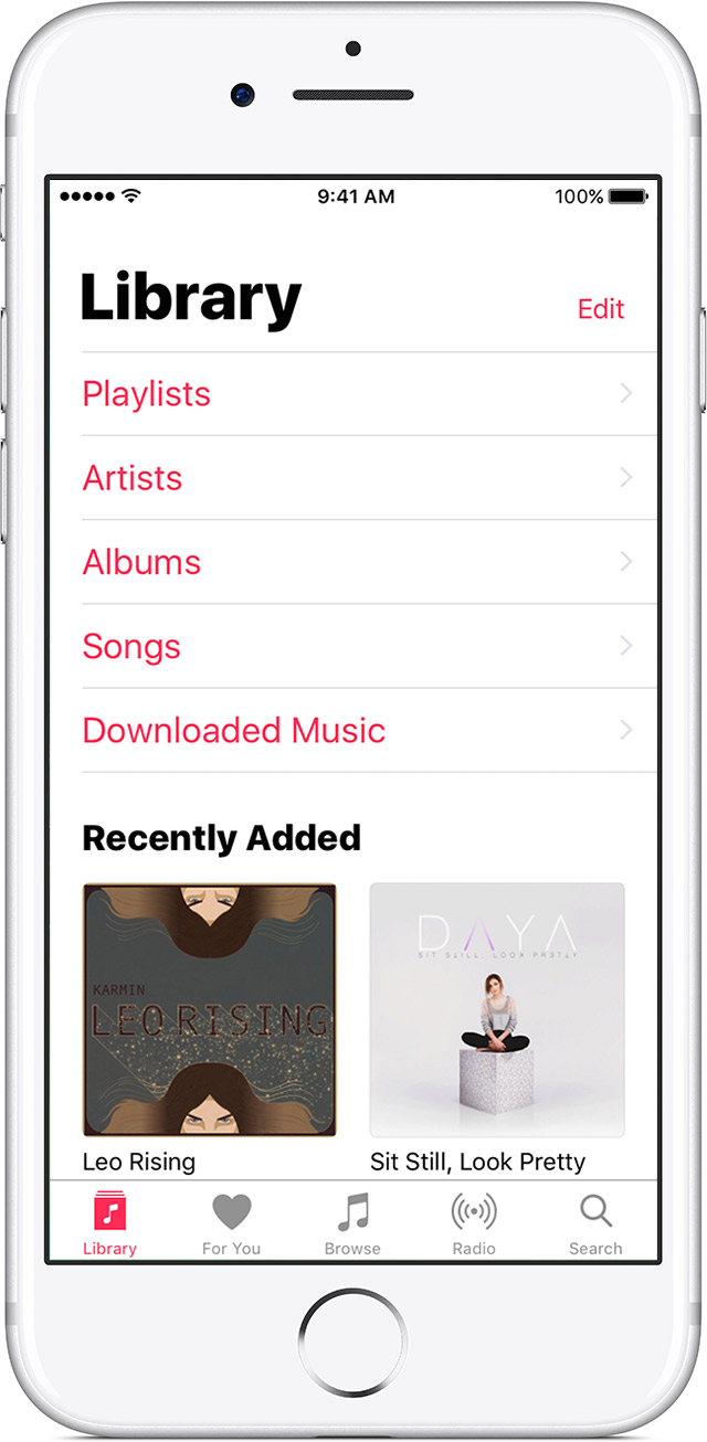
I have been testing the new Apple Music app for quite some time now. At first, I liked the design but I am slowly getting fed up with the big fonts. I like big fonts but Apple seems to have gone a bit far with the size. However, before I pass judgment on the design, I want to hear from the experts in the community to see if the big fonts are good from a design perspective.
-
4They're probably just trying to get you to buy a new iPhone with a bigger screen so the fonts look smaller again ;-)– Roux MartinCommented May 23, 2017 at 14:43
-
@AndrewMartin as funny as that might sound, it is also too close to the realm of possibility for comfort. The very large and bold font style seems to reduce its legibility...– Michael Lai ♦Commented Jul 24, 2017 at 1:34
-
@MichaelLai I wouldn't be surprised if that was Apple's strategy– Roux MartinCommented Jul 24, 2017 at 6:58
2 Answers
Let's not overthink this.
Larger fonts do increase usability but larger fonts don't always mean, "look at me!"
You notice the bottom navigation bar? The icons in it are pretty small and the text is readable only because of the superior pixel density of the screens today. The human eye always scans a page from top to bottom and hence it makes sense to keep the Hero of the page there. I emphasize on that word hero is because a larger text on top keeps my mind on it sub-consciously.
The human brain also tends to leave out or skip larger, yet constant visual items. The word Library will be seen once or twice and then it would be ignored by the brain. However, it would be induced in our minds
Well, it dominates the space and is eye catching, plus I think is "on trend" at this time, even though it means lower information density in that region.
From a purely logical point of view, this choice means now that users are highly unlikely to miss the headings on categories, and also means that users that are hard-of-sight are catered to when differentiating categories (whether this is a priority is not for me to decide). So on one level, it ticks a box, although testing with smaller and lighter text may reveal that comfort is retained for those demographics (which is something I personally suspect) as I personally feel that the font is bordering on impractically large (aesthetics notwithstanding). That said, arguably, those who are hard-of-sight may not really benefit from this at all, as iOS has a system-level font size setting (modifier?) (which hopefully this is tied to), which they will have likely increased already to better see the small text in Apple Music (song titles, etc), so I'd consider catering to them to be a pretty weak argument for unusually large text.
Moving beyond accessibility, it's not much of a stretch to say that for long time users who develop muscle memory for common tasks and have good knowledge of the features of Apple Music, a overly large heading only represents dead space for them to move past to access content if scrolling or moving the finger to reach a control. In this way, this represents an actual nuisance for users as it seems to have done for yourself.
On a counterpoint, iPhones are tall, and, if always situated at the top, the large heading is a convenient yet stealthy way to push content down from the top of the application, where users' thumbs are unlikely to reach when using the application one-handed. Users can scroll lower options up to meet their thumb's radius of access, but if at the top of the page, cannot scroll options down to do so, and if a user has to change their grasp on the phone or involve a second hand, I can see how that may get tiresome in a hurry as extra mental load is required.
I can't find the article at this time, but some time ago I read about interfaces that collapse in size and verbosity as the time spent using them increased, which makes me wonder how people may react if you slowly decreased the size of the header over time. Obviously this would have to be done slowly and in small increments so as not to compromise muscle memory, but it might be interesting.
For a bottom line, I'd say they can be, and it depends on your use case. On the desktop, as eye-catching titles for users who are on the move, or to really stick out when users are scrolling fast through a large amount of content, they can be useful, however they can also easily be an annoyance when used in the wrong way. As I have not used the new Apple Music app, I cannot say in greater detail whether this is a good use of large fonts or not for sure, but I can agree that it seems a little large, but this may be helpful when factoring in the size of the iPhone.

