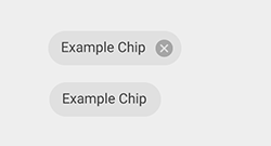
Since all the below components looks similar, what is the difference between Pills, Chips and Tags/Tokens. Since, am confused where/when to use these components.
3 Answers
That's a really good question. I searched for clear definitions, but it seems there's not one...
Atlassian calls it Lozenge while Material calls it Chips. These terms are used interchangeably and are mostly based on the design system naming flavors - I think.
However, I found two pages that may help us define & stick to one naming system, at least from now on!:
- https://www.w3.org/2021/03/04-openui-minutes.html#r01
- https://blog.prototypr.io/design-guide-classifying-items-db5b121985d
I can conclude that:
- Tag: It isn't a UI component; it is a general concept about organizing data. It can be a Pill, a # (like Instagram), a color (like iOS files)...
- Token: The term is used many times in the backend for security keys (tokens). We also have "Design Tokens" which point to colors, typography, iconography and so on. Don't bring it into play, please :-]
- Badge: It's referred to the Notification counter above App icons (& another icons as well). In most cases, badge is a simple red dot with a number inside, placed on the upper-right of the icon.
- Label: It's mostly used in forms to show what should be entered in the corresponding input. Calling another component "Label" causes a huge confusion. Also,
htmlhas alabeltag which is for labeling inputs and checkboxes. - Pill: A rectangle (with any
border-radiusfrom 0px to 100%) that visualizes a Tag. It may have an "x" button to delete the Pill. It may have an icon or an image (like buttons do) - Lozenge: - Same as Pill -
- Chips: - Same as Pill -
Final Decision
Since I couldn't find a single source of truth, I will use this - my own naming convention - for my projects.
I encourage you to give your opinions, and we will find a standard together!
- Tag: Not a component
- Label: Label text for inputs and checkboxes
- Badge: Notification Counter above an icon
- Token: Not a component
- Pill: The rectangular - rounded or not-rounded - component. Can have an icon or an image. Can have a "x" button to delete itself. Can act like a button to filter items or open a new page.
Chips & Lozenge are the same as the Pill, but I chose the term "Pill" because it is...
- easier to type/read
- visually related to the medicine!
How is Pill different from the Button if it can execute functions or open a new page?
Well, the Pill keeps its tagging hypostasis even if it acts like a button, but a button has nothing to do with organization and filtering.
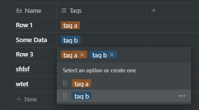
See the above screenshot from Notion; pills are used in a table to "tag" rows. Imagine clicking/tapping the "tag b" badge on a row will open a new page containing info about this tag. (a similar example is clicking a hashtag on Instagram which opens a new page, showing posts tagged with the same name)
Again, I encourage you to share your thoughts and help reach a standard.
-
Might I also suggest that clicking a button should never navigate you away from the current page?– Hugo CoxCommented Oct 20, 2022 at 10:26
-
+1 for "hypostasis." At first, I was at odds with your dismissal of "token," but agree that the term is so highly overloaded already in computer science, there's no need to further muddy the waters. "Chips" doesn't do it for me: chips are not containers, but fragments. "Lozenges" or "Pills" are more descriptive and capture the "container" aspect. Commented Feb 22 at 20:05
The short answer: they have different shapes.
The (only slightly) longer answer: The tags in your question are not the UI device shown but the data they contain - in other words they could be described as 'Pills' or 'Chips' representing tags used to label data.
-
I'd add that "tags" can also represent the UI device as well as the data - as a metaphor representing a luggage tag or label attached to the object. This is often carried through in the visual representation of the concept. In the examples included in the question, the second and fourth examples are mimicking physical luggage tags. Commented Aug 16, 2016 at 11:01
-
1All these are names used by various design systems to identify the components they designed. you can categorize them based on the functionality of these components rather than just the names. tags are used to identify data sets and pills are labels that provide additional status of an element/feature. Chip is a material design term. similar answer can be found here: ux.stackexchange.com/questions/103820/… Commented Sep 6, 2019 at 8:18
Chips are used to represent complex entities in small blocks such as contact details. This may contain entities such as photo, text, icon etc

There is only a difference in representation between pills or chips otherwise both can be used for same purpose and yes, The "tags" are data which is contained by chips or pills not the UI.
-
1In more recent Material Design documentation it sounds like Chips are used for actions and for filtering, not just for displaying information.– user35782Commented Dec 8, 2019 at 2:08


