Over at Stack Exchange we (fairly) recently rolled out a mobile design for all of our sites. This was definitely a 1.0 attempt, and while I think it's a huge improvement over what we had (which was basically nothing) there's a lot that can still be improved.
The subject of today's question: tag auto-completion.
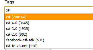
On the desktop version of the site we've got a standard drop down.

This approach fails on mobile for space reasons: vertical space is at a huge premium on many phone (especially with a software keyboard displayed) so the drop down is a bad fit, and we really can't afford the horizontal space for tag counts either. This is compounded by many phones habit of centering the text field when it's focused, causing about 1/2 the available real estate to be wasted (whatever is above the text field after focus).
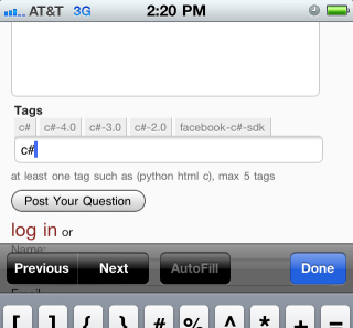
What I came up with as a stop-gap solution.

The logic is basically, chose the top 5 likely tag auto-completions and display them above the text field. Clicking them will replace the text in the tag field as expected.
This runs into problems with hit boxes (especially on Android phones), as it requires a great deal of precision to click some of the smaller tags.
Since I'm going to be redoing this anyway, I thought it best to solicit some feedback on the various designs I'm considering.
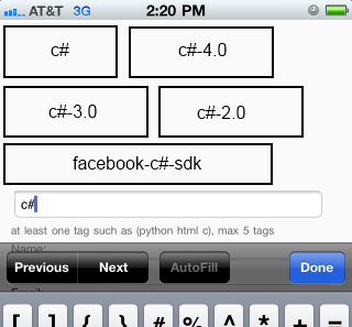
Mockup #1

The idea here is that I'd make the tags huge (with really exaggerated hit-boxes in comparison to the text), and try and force the input field to the bottom of the "screen". The scroll would only occur on initial focus, the user would be able to scroll back up to the question or down to "Post your Question".
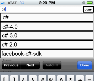
Mockup #2

The idea here is to still present something that resembles a drop down, but to steal the whole screen for the auto-complete controls. Effectively, this would be a modal dialog (with a little "done" button and everything). Unfortunately, we can't capture the "Done" button on any of the phone keyboards... so, that's a wrinkle to consider.
In Super Constrained Screens
On a number of phones, if you're in "landscape mode" then there's really not a lot of screen real estate to play with at all. Literally 2 lines of text in some cases. When this happens, I intend to fall back to the existing auto-complete controls (flawed though they are, they're better than nothing) with the added constraint of not allowing more than 1 line worth of tags to display (the exact count would thus vary depending on the suggested tags' name lengths).
The Actual Question
I say all of that to basically ask: Which of these approaches would actually present a better user experience?
The sort of "multiple entries in a single field" auto-complete is a tad rare, at least in my searching, and I'm unaware of a canonical mobile equivalent. Are there any I should be considering?
I'm personally leaning towards Mockup #1, out of a dislike of modal dialogs. It'll also be a tad harder to implement, due to having to cope with orientation changes.
In terms of platform, we're constraining ourselves to recent iPhone and Android phones (not tablets), and the upcoming Windows Phone 7 Mango release.
