8

I'm designing a mobile interface for a website. Somewhere on it, I want to put a link to the full desktop site, as some users may prefer this (I know my Nexus 7 usually gets sent mobile sites, but I prefer the desktop versions most of the time).

The question then is where to put the link. Both locations seem to be used frequently. I can have it at the top:
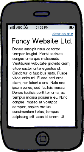
mockup

download bmml source – Wireframes created with Balsamiq Mockups

  • Easy to see
  • User wastes no time finding link
  • Takes up space - less content will fit on

Or at the bottom:
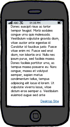
mockup

download bmml source

  • Out of the way - doesn't disrupt content on first page
  • Not immediately visible
  • User might have to scroll through a long page to get to it

Is there any research into which is better, or any data?

2
  • 1
    +1 for calling it "Desktop Site" instead of "Full Site", implying the mobile version has limited functionality (which is a bad practice, IMO) Commented Jul 30, 2012 at 21:10
  • 2
    @jeroen cough stackexchange cough. They're mostly good, which makes the omissions in the the mobile ui all the more annoying.
    – fredley
    Commented Jul 30, 2012 at 23:06

3 Answers 3

5

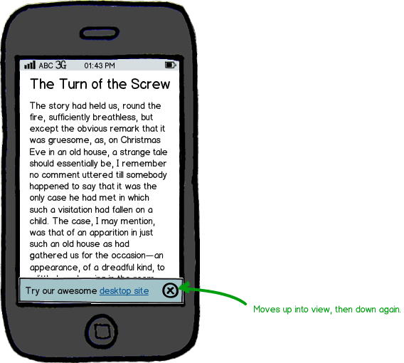
What about doing both in the form of a toast notification?

mockup

download bmml source – Wireframes created with Balsamiq Mockups

After the element falls back down or is dismissed, it can be found in the site footer (putting this link in the footer is a very common pattern). You get the advantage of discoverability but without the difficulties of aligning and designing a non-obtrusive top-page link.

6
  • 5
    Why invest money in a mobile version if you are encouraging the users not to use it? I think this type of pop-up distracts from the current page the user is on. To me this communicates a disbelief in the mobile so much that I am assuming the mobile version is bad. Most users are used to going to the bottom, if they want it let em scroll ;) Commented Jul 30, 2012 at 20:55
  • @JeroenEijkhof - you raise a good point; I suppose it is a bit strange to invite users to move away from the mobile service. The only real use case I can think of is when there's content on the desktop version that doesn't exist on mobile, in which case, it's best discovered at the end of navigation or the bottom of the page. Still, this sort of toast notification could work well on the desktop site for inviting mobile users to try out a specialized app. Commented Jul 30, 2012 at 21:05
  • Yea in the desktop version it would work nicely. I posted a comprise answer just now where the top level "Desktop version" link is actually inside a menu dropdown (which often exists). It also points out the fact that we design sites that 90-95% of the time have limited functionality. I have been trying to move away from that actually. Commented Jul 30, 2012 at 21:08
  • 1
    In addition to @JeroenEijkhof's excellent point, I would argue that those toasts would get annoying pretty quickly. I also think it's a non-trivial problem to develop the smarts that would correctly pick when/how often to display that toast while preserving both its usefulness and the discoverability of the feature. In the end, developing a good, feature-complete mobile site would be a far more effective use of time, in my opinion.
    – user8697
    Commented Aug 1, 2012 at 18:15
  • @Phong - yeah, you'd probably only show the toast once every thirty days / store a cookie saying 'never show it me again'. Commented Aug 1, 2012 at 18:32
2

In a similar project, we put a link at the top and at the bottom, combining both of your examples. Obviously the top link was clicked most. About 70/30, but that's not surprising. No matter what method you choose, ensure to repeat this strategy on the desktop site. Put an easy to find link to the mobile site -- so people who prefer the mobile site can get there easily.

3
  • Why did you put the link at the top? Commented Jul 30, 2012 at 20:56
  • We had a stakeholder that was unconvinced that users were getting everything they needed from the mobile site. This same person pushed for the link at the top of the page. So of course it got more clicks, but those clicks likely lead to a less than ideal browsing experience. I agree with your point that investing in mobile, just to further invest effort in a strategy to get them back to the desktop site, is counter-productive.
    – drawtheweb
    Commented Jul 30, 2012 at 21:07
  • Stakeholder, don't you just love em'? Commented Jul 31, 2012 at 17:57
0

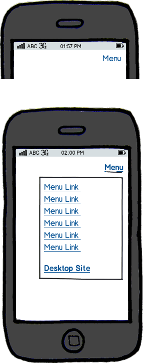
If you want to, it could be accessible from the top. As long as it also exists at the bottom. Just don't encourage people to leave your mobile site, if you do then there is no reason to invest in a mobile site.

mockup

download bmml source – Wireframes created with Balsamiq Mockups

3
  • Can you provide some reasons for including the message at both the top and bottom? Commented Jul 30, 2012 at 21:07
  • No, this was just a comprise since the OP seemed to want one there. I guess it was a reaction from me as if the OP was a client "Ok you can have it at the top, but not visible at first glance. Because your paying us money for a mobile version" Commented Jul 30, 2012 at 21:12
  • Rephrased my answer to reflect better Commented Jul 30, 2012 at 21:13

Your Answer

By clicking “Post Your Answer”, you agree to our terms of service and acknowledge you have read our privacy policy.

Not the answer you're looking for? Browse other questions tagged or ask your own question.