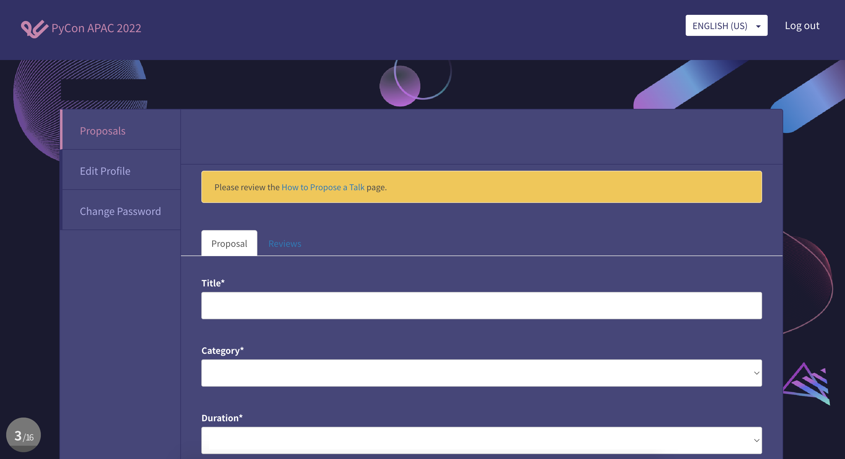
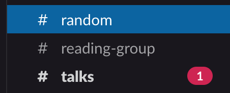
First, the contrast on the dark on dark text needs to be improved either way, for unimportant or important tabs.
Second, you may not need to highlight it at all. Often, as long as users are well-informed and can find the thing in an obvious location, they will quickly learn what to do. That is, you've contextualized them in the email; they know they're looking for reviews and it's in the middle of their screen so they're likely to find it.
Third, because of that, you could consider just having the email take them directly to the reviews tab. If that's the action you want them to take, then eliminate a click. There is definitely much to be desired in an experience where two tabs are highlighted in different ways for different reasons. That is to say, it's very hard to expect the user to say, "Oh, that colour means it's highlighted because I'm on it, while that colour means it's highlighted because I'm supposed to be on it." These visual cues are too broad to differentiate that way (to unskilled users) and will remain ambiguous.
But supposing you really need to highlight it and can't do #2 or #3 above. What are your options?
Do a lighter highlight, such as a thin white border with no colour fill or a lower-contrast colour fill than the other one
Add an icon to the tab text, such as an exclamation mark or asterisk or a floating arrow pointing at it
Establish and follow a consistent design for such cases, e.g. the text for an action you're supposed to take is always lime green
Include a modal popup directing the user's attention


