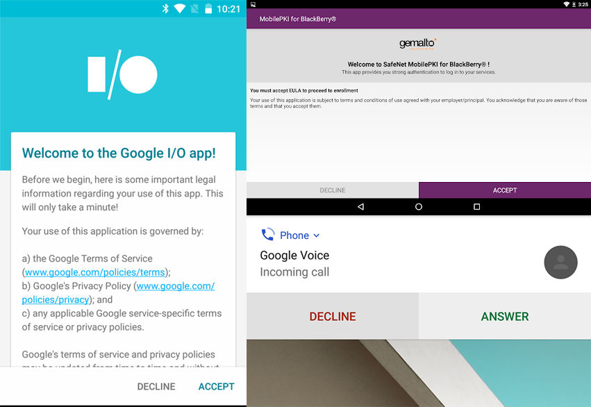
The Material Design guidelines for fullscreen dialogs state, that the action (like SAVE in the screenshot) should be shown on the top right. Cancel always is shown as an X on the top left.
EDIT
Now I have a case, where a user enters data into a fullscreen dialog - here SAVE on top is okay.
Afterwards a different user can ACCEPT or DECLINE the data. For this, I am showing the same dialog, just with read only data, but at top right is no place for both actions. So I'm thinking of showing them on the bottom, although this does not follow the guidelines.
Any other ideas or suggestions?

