0

I don't know which text I should add on top of my social box (where there are icons to follow official page). I fear that the user might not know the text and the function of those icons....

Which should I use ?

Follow me

Connect with us

Official page

Other option ?

Thanks a lot

5
  • Could you add some screenshots of the icons you proposed to use? What type of app is this? More context would be helpful. Commented Feb 15, 2016 at 15:19
  • 1
    i don't have screenshot but are "facebook, tiwtter, gooogle+ and pinterest" icons (ksloan.net/css-color-definitions-for-font-awesome-social-icons) square Commented Feb 15, 2016 at 15:20
  • 1
    What does your app/website/business do? Do you sell through social or is it just updates/news? That should help indicate what copy is appropriate.
    – Midas
    Commented Feb 15, 2016 at 15:23
  • Depending on how formal the tone of voice of your website is, "Follow us on Facebook", "Follow us on Twitter", "Follow us on Linked In" (and if you have RSS, "Subscribe to our RSS feed") ought to be OK. Commented Feb 15, 2016 at 15:27
  • is a science website (volcanoes, earthquakes ecc), in the sidebar i will have a box with those icons... the tone of voice is formal for all pages of website (eccept for the blog area) Commented Feb 15, 2016 at 15:42

3 Answers 3

1

I have an very completely diffrent attitude than hsawires! In my opinion you dont "should", you MUST set a title for this elements. As a user I was already several times in the situation that I just didnt know whether the Twitter icon bring me to the twitter profile of the organisation or share the content! The task of the title is to tell the user is the icon a link to the profile, or the icon has a different task (for example sharing).

In my opinion are follow us and connect with us both learned formulations.

1
  • I also think like you.... Commented Feb 17, 2016 at 11:49
1

I would have been able to help better if I had like a screenshot to understand the exact placing of the content, but here is my opinion from the insights I gathered here.

  1. If you want the user to share the content present on the website, put them up in a box titled "Share" right after the content and use flat icons(no text) or do not title the box and use icons like shown here: https://pbs.twimg.com/media/Au9OG-SCEAAHU7n.png

  2. If you want the users to follow you on your social media accounts, create a separate area and use either "Follow me/us" or "Find me/us" or "For more Updates" and put just the icons with no text,as text will clutter up the area. This gives the clarity that you are guiding them to the respective media platform.

  3. Try and place these two boxes away from each other to avoid confusion. Place them such that the user does not have to search for it when browsing through, it should just be there for them.

Hope this helps.

2
  • the problem is that i don't have a space to have icon with text "share" :/ however the most important thing is don't have two box very close no ? i was thinking if is right to put the box "follow us" under the menu and the other box (share) under views box (that it will be under "follow us" box.... so a sidebar where are menu, follow us, views box and share box). What do you think ? Commented Feb 17, 2016 at 11:48
  • If space is a constraint, then avoid text and put text on hover over the icons(if need be). I would suggest to place the "share" icons closer to the parts of the site which are shareable and place the "follow us" icons either as a tab on the main menu(like with a contact us header maybe) or at the very end of the web page or as a fixed nav bar on the right/left side of the page. Just place then away from each other and near their designated usage areas.
    – rnaikzz
    Commented Feb 18, 2016 at 0:03
1

In my opinion. you shouldn't put any text titling your social media icons, because of the wide spreading of using social media website it is so obvious to the user right now that those icons are your presence on social media.

For sure you are not putting facebook google+ and twitter icons in your page as a bookmark to those social media websites redirecting the users to it!!. It will be so obvious they are your pages on those social media!

Titling your elements in the page is for weak designs and I am not recommending it. the user is smart enough to know what you are talking about. and your design should be clear enough to not make the user think and read more title.

But if you want a title I may suggest. (Follow us) or (we are on the web) or (You may visit).

=== update ===

In case you have a two sets of icons one set for your official pages over the social media and the other is to share the content, so should differentiate you icons visually by putting the sharing option in the top or the bottom of your content and keep your presence on the social media in a special place in your page. like the footer or the above header navigation. differentiation could be in the styles of the icons, sizes, and location. and I am still recommending not to put a tile over any set of icons and let the user know it by himself.

this is an example of what i mean with possible icons sets positions.
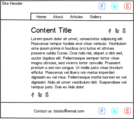
mockup

download bmml source – Wireframes created with Balsamiq Mockups

5
  • The problem is that i have two box (one to share the page in user's account and the other to follow me on social). As you say me too think that the user understands the function of icons... but is a problem with these 2 box... (see the image s22.postimg.org/pzovzqi01/Cattura.png). I'm italian so che text is in italian. but the first is "Share" and second "Follow us on social".... Maybe i must put like first box the "follow box" ? and in this case, the text for two bow it could be "Share" and the other "Follow us" or only "Follow" ?? THANKS A LOT! :) Commented Feb 16, 2016 at 10:59
  • In that case you should differentiate you icons visually by putting the sharing option in the top or the bottom of your content and keep your presence on the social media in a special place in your page. like the footer or the above header navigation. differentiation could be in the styles of the icons, sizes, and location. and I am still recommending not to put a tile over any set of icons and let the user know it by himself.
    – hsawires
    Commented Feb 16, 2016 at 20:35
  • I have just updated my answer
    – hsawires
    Commented Feb 16, 2016 at 21:21
  • hmmm .. I'm understanding in general, however, should not have the two boxes, very close? Commented Feb 17, 2016 at 11:45
  • not only making the two boxes too close but also make a different styles and different location. every location in your front end have a different function.
    – hsawires
    Commented Feb 17, 2016 at 14:19

Your Answer

By clicking “Post Your Answer”, you agree to our terms of service and acknowledge you have read our privacy policy.

Not the answer you're looking for? Browse other questions tagged or ask your own question.