added 251 characters in body
Source Link
Nicholas Pappas
  • 17.7k
  • 5
  • 54
  • 59

I would not use shade. Shade has no conceptual mapping to a score and would be more difficult to distinguish from one shade to the next -- I'm assuming you're using a shade of the same color (e.g., green) vs. different colors. Different colors would still have no visual mapping to "score".

Here is an example:
enter image description here

(note: I've removed some specifics from the image)

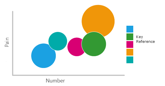
This sounds like what you mean by "size of the circle". This chart gives me an idea of "how many to-do items" and a "pain score" on the axis. The size of the circle reflects how popular the category is.

I can quickly gather that Orange is very "painful", has a lot of "to-do items" associated with it, and by the size I can tell that this area is pretty popular. Alternatively I can see that Blue is not as "painful" as "Red", but is more popular (I can explore to find out why)!

UPDATE:

I would point out though, that you're actually showing four metrics on a 2D graph:

  • Lesson Level
  • Date / Time
  • Score
  • Pass / Fail

So, having the bounding circle to show a 100% threshold does make a lot of sense.

I would not use shade. Shade has no conceptual mapping to a score and would be more difficult to distinguish from one shade to the next -- I'm assuming you're using a shade of the same color (e.g., green) vs. different colors. Different colors would still have no visual mapping to "score".

Here is an example:

enter image description here

(note: I've removed some specifics from the image)

This sounds like what you mean by "size of the circle". This chart gives me an idea of "how many to-do items" and a "pain score" on the axis. The size of the circle reflects how popular the category is.

I can quickly gather that Orange is very "painful", has a lot of "to-do items" associated with it, and by the size I can tell that this area is pretty popular. Alternatively I can see that Blue is not as "painful" as "Red", but is more popular (I can explore to find out why)!

UPDATE:

I would point out though, that you're actually showing four metrics on a 2D graph:

  • Lesson Level
  • Date / Time
  • Score
  • Pass / Fail

So, having the bounding circle to show a 100% threshold does make a lot of sense.

Source Link
Nicholas Pappas
  • 17.7k
  • 5
  • 54
  • 59

I would not use shade. Shade has no conceptual mapping to a score and would be more difficult to distinguish from one shade to the next -- I'm assuming you're using a shade of the same color (e.g., green) vs. different colors. Different colors would still have no visual mapping to "score".

Here is an example:

enter image description here

(note: I've removed some specifics from the image)

This sounds like what you mean by "size of the circle". This chart gives me an idea of "how many to-do items" and a "pain score" on the axis. The size of the circle reflects how popular the category is.

I can quickly gather that Orange is very "painful", has a lot of "to-do items" associated with it, and by the size I can tell that this area is pretty popular. Alternatively I can see that Blue is not as "painful" as "Red", but is more popular (I can explore to find out why)!