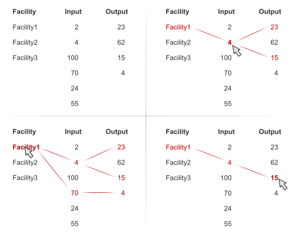
For the moderate sized set the visualization could be as shown. As numbers are shared, duplicates are eliminated. This allows you to watch for all the three parameters.
![enter image description here][1]
UPD. I felt into implementation trap, top right could bring ambiguous results. But the idea is to define which data influence the pointed parameter. So watching for particular parameter becomes easy.
EDIT
[1]May be such views be demonstrative. Although learning curve might be a bit slow, but it's much easy to visually trace the changes than in table. Critical values could be marked in some way. Interactions are supported, too.

Or just simplified version: https://i.sstatic.net/Qa8yQ.png

