Commonmark migration
Source Link

I find that instead of putting in 24 drop downs, A display of selected field works best.

You make a selection in the drop down, the field just indicates what you choose.

In your current form, it would look like -

![enter image description here][1]enter image description here
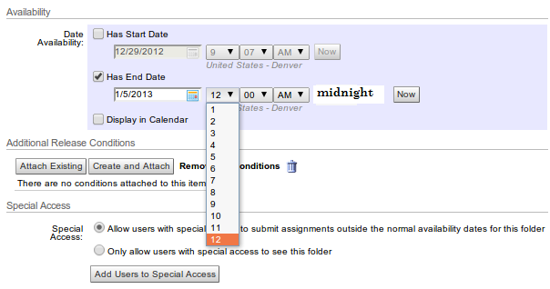
So, whenever you change something in the drop down it shows you what time you selected. For 11 AM, it would say - 11:00 AM. For 12:00 AM, it would say midnight and 12:00 PM it would say noon. Its just a display thing that cannot be edited unless you change the dropdown you selected.

This small display functionality is easy for a form to handle (just getting the value from the drop down and updating itself). It makes it clear for the user what selection he is making; also its not interfering with good interface practice since you are not compromising on your functionality and/or making it any less convenient for the user. [1]: https://i.sstatic.net/walkj.png

I find that instead of putting in 24 drop downs, A display of selected field works best.

You make a selection in the drop down, the field just indicates what you choose.

In your current form, it would look like -

![enter image description here][1]

So, whenever you change something in the drop down it shows you what time you selected. For 11 AM, it would say - 11:00 AM. For 12:00 AM, it would say midnight and 12:00 PM it would say noon. Its just a display thing that cannot be edited unless you change the dropdown you selected.

This small display functionality is easy for a form to handle (just getting the value from the drop down and updating itself). It makes it clear for the user what selection he is making; also its not interfering with good interface practice since you are not compromising on your functionality and/or making it any less convenient for the user. [1]: https://i.sstatic.net/walkj.png

I find that instead of putting in 24 drop downs, A display of selected field works best.

You make a selection in the drop down, the field just indicates what you choose.

In your current form, it would look like -

enter image description here

So, whenever you change something in the drop down it shows you what time you selected. For 11 AM, it would say - 11:00 AM. For 12:00 AM, it would say midnight and 12:00 PM it would say noon. Its just a display thing that cannot be edited unless you change the dropdown you selected.

This small display functionality is easy for a form to handle (just getting the value from the drop down and updating itself). It makes it clear for the user what selection he is making; also its not interfering with good interface practice since you are not compromising on your functionality and/or making it any less convenient for the user.

removed sentence from beginning that said nothing, made several minor corrections to grammar and usage
Source Link

I have an interesting solution to the problem, you be the judge of course.

I find that instead of putting in 24 drop downs, A display of selected field works best.

You make a selection in the drop down, the field just indicates what you choose.

In your current form, it would look like -

![enter image description here][1]

So, whenever you change something in the drop down it shows you what time you selected. For 11 AM, it would say - 11:00 AM. For 12:00 AM, it would say midnight and 12:00 PM it would say noon. ITsIts just a display thing whichthat cannot be edited unless you change the dropdown you selected.

This small display functionality is easy for a form to handle ( justjust getting the value from the drop down and updating itself), it. It makes it clear for the user as well as to what selection he is making,making; also its not interfering with good interface practice, since you are not compromising on your functionality and/or making it any less convenient for the user. [1]: https://i.sstatic.net/walkj.png

I have an interesting solution to the problem, you be the judge of course.

I find that instead of putting in 24 drop downs, A display of selected field works best.

You make a selection in the drop down, the field just indicates what you choose.

In your current form, it would look like -

![enter image description here][1]

So, whenever you change something in the drop down it shows you what time you selected. For 11 AM, it would say - 11:00 AM. For 12:00 AM, it would say midnight and 12:00 PM it would say noon. ITs just a display thing which cannot be edited unless you change the dropdown you selected.

This small display functionality is easy for a form to handle ( just getting the value from the drop down and updating itself), it makes it clear for the user as well as to what selection he is making, also its not interfering with good interface practice, since you are not compromising on your functionality and/or making it any less convenient for the user. [1]: https://i.sstatic.net/walkj.png

I find that instead of putting in 24 drop downs, A display of selected field works best.

You make a selection in the drop down, the field just indicates what you choose.

In your current form, it would look like -

![enter image description here][1]

So, whenever you change something in the drop down it shows you what time you selected. For 11 AM, it would say - 11:00 AM. For 12:00 AM, it would say midnight and 12:00 PM it would say noon. Its just a display thing that cannot be edited unless you change the dropdown you selected.

This small display functionality is easy for a form to handle (just getting the value from the drop down and updating itself). It makes it clear for the user what selection he is making; also its not interfering with good interface practice since you are not compromising on your functionality and/or making it any less convenient for the user. [1]: https://i.sstatic.net/walkj.png

Source Link
user22624
user22624

I have an interesting solution to the problem, you be the judge of course.

I find that instead of putting in 24 drop downs, A display of selected field works best.

You make a selection in the drop down, the field just indicates what you choose.

In your current form, it would look like -

![enter image description here][1]

So, whenever you change something in the drop down it shows you what time you selected. For 11 AM, it would say - 11:00 AM. For 12:00 AM, it would say midnight and 12:00 PM it would say noon. ITs just a display thing which cannot be edited unless you change the dropdown you selected.

This small display functionality is easy for a form to handle ( just getting the value from the drop down and updating itself), it makes it clear for the user as well as to what selection he is making, also its not interfering with good interface practice, since you are not compromising on your functionality and/or making it any less convenient for the user. [1]: https://i.sstatic.net/walkj.png