Removed unnecessary thanks
Source Link
JohnGB
  • 68.6k
  • 26
  • 185
  • 297

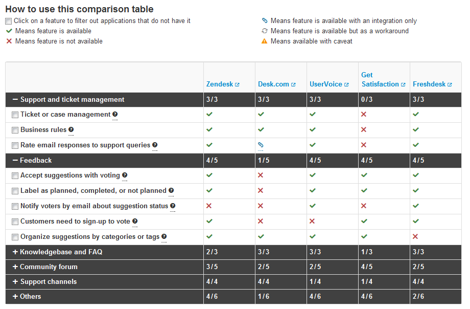
You can see an example here:
enter image description here

As you can see, I am stuck with having to tell the user what each icon means. I also mention what a functionality does, such as "Click on a feature to filter out applications that do not have it".

This takes up a lot of space on the page and it is hampering my efforts in making other types of landing pages.

The user input I have received is that the legend is good because a "warning sign" icon by itself does not tell the user much, for example.

One solution

Have a collapsible legend which is closed by defualt. The problem with this is that all users would want to use the legend.

Second solution

For each icon that is not a CHECK or X, have a tooltip for it. Notice on that page, that one of the icons is underlined. Underlining means there is a tooltip for it. The problem with this is that I don't know if the underlining is a good enough indication to hover your mouse over the icon. The second problem is that there will be more than just icons. As you can see in the legend, it also tells you that you should click the check box.

I am just lost and wondering if anyone has some other suggestions.

thanks

You can see an example here:

enter image description here

As you can see, I am stuck with having to tell the user what each icon means. I also mention what a functionality does, such as "Click on a feature to filter out applications that do not have it".

This takes up a lot of space on the page and it is hampering my efforts in making other types of landing pages.

The user input I have received is that the legend is good because a "warning sign" icon by itself does not tell the user much, for example.

One solution

Have a collapsible legend which is closed by defualt. The problem with this is that all users would want to use the legend.

Second solution

For each icon that is not a CHECK or X, have a tooltip for it. Notice on that page, that one of the icons is underlined. Underlining means there is a tooltip for it. The problem with this is that I don't know if the underlining is a good enough indication to hover your mouse over the icon. The second problem is that there will be more than just icons. As you can see in the legend, it also tells you that you should click the check box.

I am just lost and wondering if anyone has some other suggestions.

Tweeted twitter.com/#!/StackUX/status/232204408610488321
added screenshot
Source Link
Vitaly Mijiritsky
  • 31.5k
  • 13
  • 85
  • 148

You can see an example here: http://saikono.com/compare-customer-support-solutions.html

enter image description here

As you can see, I am stuck with having to tell the user what each icon means. I also mention what a functionality does, such as "Click on a feature to filter out applications that do not have it".

This takes up a lot of space on the page and it is hampering my efforts in making other types of landing pages.

The user input I have received is that the legend is good because a "warning sign" icon by itself does not tell the user much, for example.

One solution

Have a collapsible legend which is closed by defualt. The problem with this is that all users would want to use the legend.

Second solution

For each icon that is not a CHECK or X, have a tooltip for it. Notice on that page, that one of the icons is underlined. Underlining means there is a tooltip for it. The problem with this is that I don't know if the underlining is a good enough indication to hover your mouse over the icon. The second problem is that there will be more than just icons. As you can see in the legend, it also tells you that you should click the check box.

I am just lost and wondering if anyone has some other suggestions.

thanks

You can see an example here: http://saikono.com/compare-customer-support-solutions.html

As you can see, I am stuck with having to tell the user what each icon means. I also mention what a functionality does, such as "Click on a feature to filter out applications that do not have it".

This takes up a lot of space on the page and it is hampering my efforts in making other types of landing pages.

The user input I have received is that the legend is good because a "warning sign" icon by itself does not tell the user much, for example.

One solution

Have a collapsible legend which is closed by defualt. The problem with this is that all users would want to use the legend.

Second solution

For each icon that is not a CHECK or X, have a tooltip for it. Notice on that page, that one of the icons is underlined. Underlining means there is a tooltip for it. The problem with this is that I don't know if the underlining is a good enough indication to hover your mouse over the icon. The second problem is that there will be more than just icons. As you can see in the legend, it also tells you that you should click the check box.

I am just lost and wondering if anyone has some other suggestions.

thanks

You can see an example here:

enter image description here

As you can see, I am stuck with having to tell the user what each icon means. I also mention what a functionality does, such as "Click on a feature to filter out applications that do not have it".

This takes up a lot of space on the page and it is hampering my efforts in making other types of landing pages.

The user input I have received is that the legend is good because a "warning sign" icon by itself does not tell the user much, for example.

One solution

Have a collapsible legend which is closed by defualt. The problem with this is that all users would want to use the legend.

Second solution

For each icon that is not a CHECK or X, have a tooltip for it. Notice on that page, that one of the icons is underlined. Underlining means there is a tooltip for it. The problem with this is that I don't know if the underlining is a good enough indication to hover your mouse over the icon. The second problem is that there will be more than just icons. As you can see in the legend, it also tells you that you should click the check box.

I am just lost and wondering if anyone has some other suggestions.

thanks

Source Link
ehabd
  • 215
  • 1
  • 5

How can I avoid placing a legend on top of the table to tell the user what each icon means?

You can see an example here: http://saikono.com/compare-customer-support-solutions.html

As you can see, I am stuck with having to tell the user what each icon means. I also mention what a functionality does, such as "Click on a feature to filter out applications that do not have it".

This takes up a lot of space on the page and it is hampering my efforts in making other types of landing pages.

The user input I have received is that the legend is good because a "warning sign" icon by itself does not tell the user much, for example.

One solution

Have a collapsible legend which is closed by defualt. The problem with this is that all users would want to use the legend.

Second solution

For each icon that is not a CHECK or X, have a tooltip for it. Notice on that page, that one of the icons is underlined. Underlining means there is a tooltip for it. The problem with this is that I don't know if the underlining is a good enough indication to hover your mouse over the icon. The second problem is that there will be more than just icons. As you can see in the legend, it also tells you that you should click the check box.

I am just lost and wondering if anyone has some other suggestions.

thanks