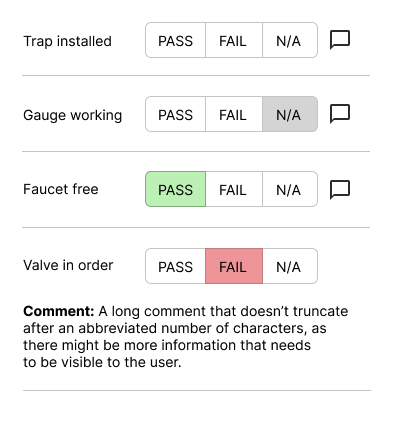
If your user is on a mobile device running the checklist out in the field, you might offer a three-state compound button with an icon that can trigger a comment box.
The horizontal rules can keep the comment contained with the criterion (on Desktop viewports, you'd have room to move the comment to the right of the buttons).
(It's a little unclear whether N./A. should be selected by default, or if there should be an empty state, but this design provides for both.)

